The modernist maestro had carte blanche to build a great museum. The result? A breathtaking icon hopeless for displaying art. British architect David Chipperfield relives his gargantuan repair job
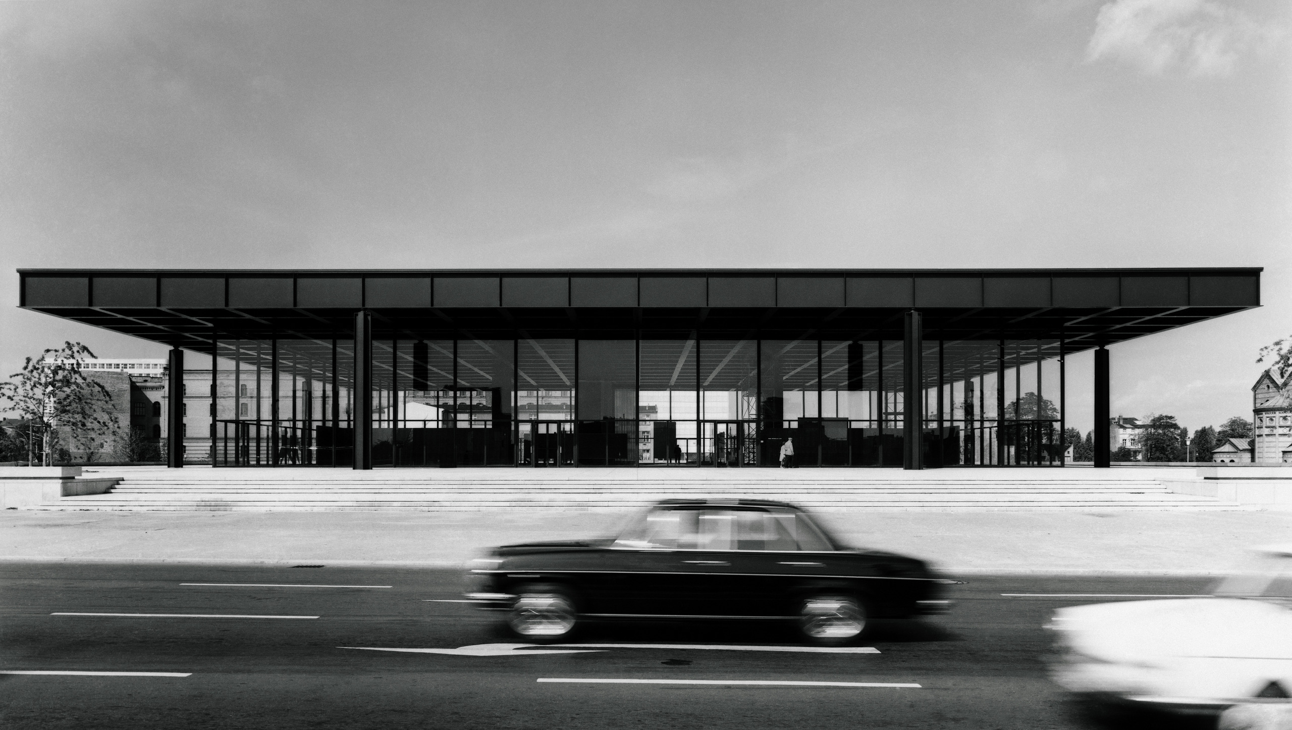
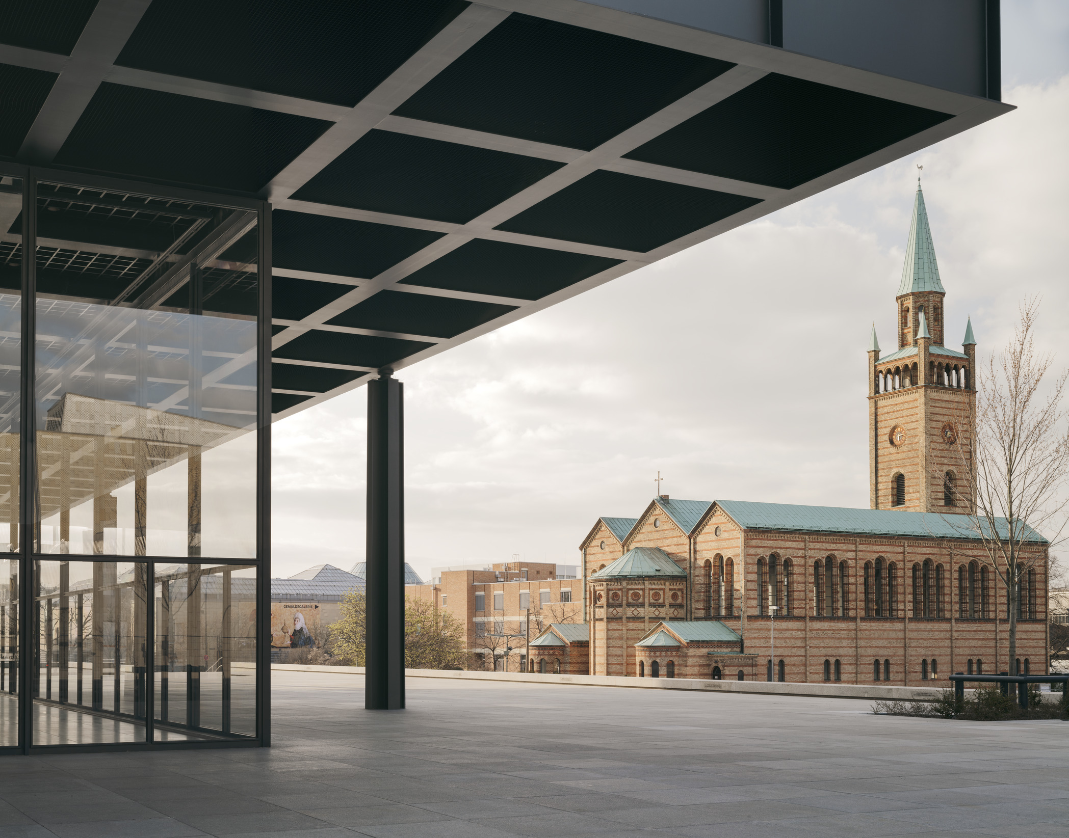
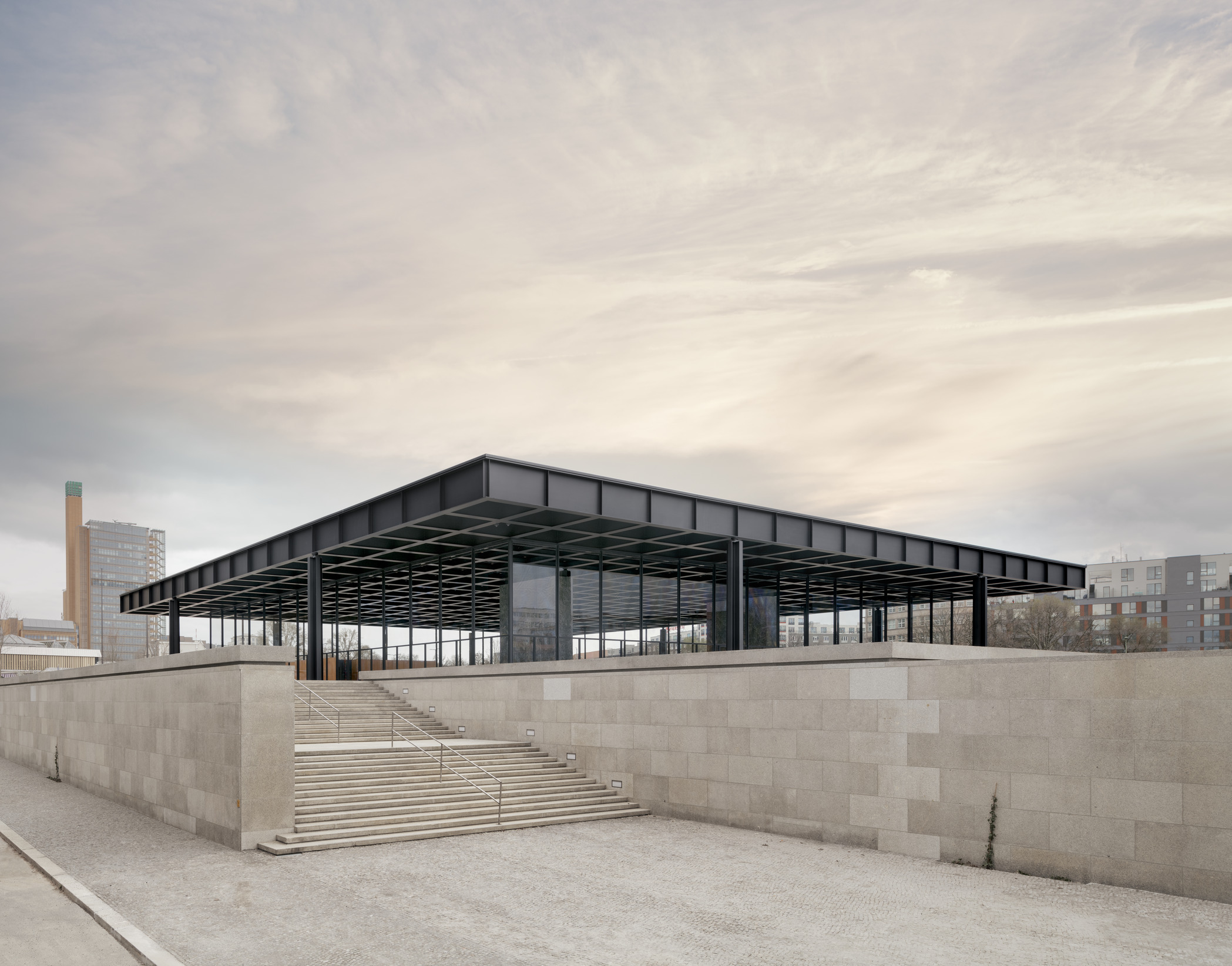
Never has so much praise been lavished on so dysfunctional a building. The last major project of modernist master Ludwig Mies van der Rohe, BerlinŌĆÖs Neue Nationalgalerie is a perfectly square temple of steel and glass, raised above the street on its own granite acropolis. Built in 1968, not far from the recently erected Berlin Wall, it was intended to symbolise the freedoms of the west, its big black roof enclosing an epic column-free hall for the display of modern art. It has long been venerated as a 20th-century Parthenon, the ultimate example of MiesŌĆÖs pursuit of ŌĆ£universal spaceŌĆØ.
But as a museum, it has always been a disaster. Ever since it opened, the New National Gallery has been dogged by cracking windows, heavy condensation and awkward display spaces, presenting a curatorial nightmare for its staff. Beneath the impractical grand hall are subterranean galleries for the permanent collection that have the dreary feeling of a windowless office complex. It is one of the most extreme examples of the quest for purity of form trumping the demands of function.
ŌĆ£People thought it looked like a giant petrol station when it first opened,ŌĆØ says David Chipperfield, the British architect behind its six-year restoration. ŌĆ£But affection grew in the decades since.ŌĆØ A jazzily painted BMW is now parked on the podium, as part of the Alexander Calder reopening exhibition, neatly completing the petrol station look. ŌĆ£ItŌĆÖs surprising how well the building works,ŌĆØ adds Chipperfield diplomatically, ŌĆ£once people surrender to its limitations.ŌĆØ
After a process of forensic archival research and archaeological examination, 35,000 building components have been carefully dismantled, restored and returned to their precise positions in a meticulous Ōé¼140m (┬Ż120m) refurbishment. Not that youŌĆÖre supposed to notice. Unlike his celebrated work on BerlinŌĆÖs Neues Museum, where modern additions were inserted into the bombed-out shell of the 19th-century building, ChipperfieldŌĆÖs task here was to disappear. ŌĆ£As much Mies as possibleŌĆØ was the guiding principle and, comparing the 1960s photographs with todayŌĆÖs, you would be hard-pressed to spot the difference. The glass is clearer, the matte black steelwork more all-absorbing, the granite and timber crisper. But the real change should be felt in how smoothly the place functions.
ŌĆ£A window used to crack once or twice a year,ŌĆØ says head of the gallery Joachim J├żger, standing beneath the five-metre-wide panes that enclose the main hall. ŌĆ£We could never find the same glass to replace them. And the doors were far too small to bring large artworks inside ŌĆō Mies had no idea what the space would be used for.ŌĆØ He lists a litany of practical problems with the vast hangar, from puddles of water forming in the gallery owing to the condensation to the lack of walls to display artwork. Not that any of this would have much bothered Mies.
ŌĆ£It is such a huge hall,ŌĆØ said the 81-year-old architect in response to criticism at the time, ŌĆ£that of course it means great difficulties for the exhibiting of art. I am fully aware of that. But it has such potential that I simply cannot take those difficulties into account.ŌĆØ Such a lofty response was to be expected. After all, this was a man who declared: ŌĆ£We should treat our clients as children, not as architects.ŌĆØ
Arrogance was par for the course with Mies. But the quirks of the Neue Nationalgalerie stem from its origins. By the late 1950s, members of BerlinŌĆÖs senate were growing anxious that the city didnŌĆÖt yet have a major building by its most celebrated architectural son, who was rapidly approaching his 75th birthday. Mies had left Berlin for the US in 1938, after trying and failing to curry favour with the Nazis, and had gone on to build a global reputation as the unparalleled maestro of sleek office towers, apartment blocks and convention centres. Berlin wanted a piece of the action, so the city gave him carte blanche to choose any site and build whatever he wished.
ŌĆ£There was a general suspicion that this was a building Mies had wanted to build elsewhere for a long time,ŌĆØ says Chipperfield, ŌĆ£and he finally got to land it in Berlin.ŌĆØ Mies had designed a similar project in Cuba in the 1950s, as an open-plan office HQ for Bacardi, but it was cancelled because of the revolution. He then recycled the same design for a museum in the Bavarian town of Schweinfurt in 1960, but the director got cold feet.
Intoxicated by AmericaŌĆÖs supersized sense of scale, Mies was desperate to realise the biggest indoor, column-free space imaginable, and he now had his chance in Berlin, liberated from all constraints. It didnŌĆÖt matter what it was for. ŌĆ£He never had to defend his decisions,ŌĆØ says Chipperfield, with a hint of envy. ŌĆ£The politicians said yes to whatever he wanted.ŌĆØ
Half a century on, the British architect had a few more limitations. His Sisyphean task was to fix the buildingŌĆÖs functional flaws and improve its environmental performance without visibly altering the structure. Normally, you can add insulation and double glazing to a postwar building without destroying the original vision, but MiesŌĆÖs work is so stripped back, thereŌĆÖs nowhere to hide. ŌĆ£We decided to restore and repair it as if it was not a building from the 1960s,ŌĆØ says Chipperfield, ŌĆ£but something architecturally sacred.ŌĆØ
Their obsessive approach reached devotional heights. It took four years, and several tours of Mies buildings in the US, to find the right paint to restore the steelwork to its original matte black patina. In visible areas, it has been repainted by hand, using brush, spray, then brush again, as preciously as if it were The Last Supper. Similar lengths were taken to match the brown oak used in the lower levels, tracking down veneers from a dealer in Franconia, Germany, tinged with the particular hue that comes from the wood being infected by the beefsteak fungus. And then there were the windows.
ŌĆ£You see so many Bauhaus buildings where the window frames have been remade twice as big to improve their thermal performance,ŌĆØ says Chipperfield. ŌĆ£We obviously couldnŌĆÖt do that here.ŌĆØ The solution was to replace the single 16mm panes with two sheets of 12mm glass laminated together, made in China and each weighing 1.2 tonnes. The compromise was allowed, provided the upper gallery never shows paintings in summer or winter when the temperatures are too extreme. The ghost of Mies lives on.
ŌĆ£In Germany, you can have a long philosophical conversation about the status of window mullions,ŌĆØ says Chipperfield, referring to the vertical steel bars between the panes of glass, which Mies made famously slender. ŌĆ£Whereas in England it would be impossible. EveryoneŌĆÖs trying to prove you can do it twice as quick with half the money.ŌĆØ
In their exacting Germanic determination to be as faithful to the original as possible, his Berlin team were in danger of being more Miesian than Mies himself. The big surprise, for an architect renowned for his attention to detail, was quite how badly the building was made. ŌĆ£It was like opening the bonnet of a Mercedes and finding ŌĆ”ŌĆØ ChipperfieldŌĆÖs voice trails off and he gives a look of disgust. Walls that looked like solid oak were actually cobbled together from bits of plywood, the concrete under the granite slabs was shot to pieces, and when they took the ceilings down, the electrical and mechanical systems were a mess. ŌĆ£It was as if the surface was holding everything together.ŌĆØ
Similarly, for an architect who espoused ŌĆ£truth to materialsŌĆØ, some of MiesŌĆÖs surfaces were paper thin. The suspended ceilings in the lower galleries ŌĆō which looked like a hi-tech, industrially manufactured system ŌĆō were pieced together from wood and varnished chipboard, reflecting the scarcity of materials in postwar Berlin. ŌĆ£God is in the details,ŌĆØ Mies was fond of saying. But donŌĆÖt look too close.
Other features have been discreetly inserted to meet todayŌĆÖs requirements, including LED lighting, underfloor heating, two new ramps and a lift (concealed behind an existing screen), while a substantial area has been excavated beneath the podium for tech space and art storage. Two rooms have been opened up to house a shop and a cloakroom, exposing the underside of the concrete waffle slab and chunky columns. These were never intended to be visible. It would horrify Mies, but it gives a nice glimpse of the structure behind the scenes.
One tragic victim in the refurbishment were the trees. The galleryŌĆÖs sunken sculpture garden was home to some sturdy specimens, but their roots were pushing up the granite paving. Such chaos couldnŌĆÖt be tolerated. Sadly, they have been ripped out and replaced with neat young saplings, entombed by new stone slabs.
Elsewhere, the pressure to be faithful to 60s tastes trumped practical needs, particularly in the lower galleries, which remain a gloomy timewarp, despite some new lighting. ŌĆ£The carpet was the most emotional aspect,ŌĆØ says Chipperfield, who is more used to specifying shades of polished concrete. ŌĆ£And we had a crisis over the woodchip wallpaper.ŌĆØ In the end, the grey carpet was faithfully replaced, but the textured wallpaper was deemed a step too far for the galleries. It is now confined to the administrative areas.
ŌĆ£We were afraid it would all look too 60s,ŌĆØ says J├żger. ŌĆ£But weŌĆÖre much more relaxed now that we know thereŌĆÖs another building coming next door. This will be the time capsule.ŌĆØ HeŌĆÖs referring to the fact that, having spent Ōé¼140m on restoring this dysfunctional heirloom, the authorities are now constructing a brand new modern art museum across the street, to perform all the functions the hallowed temple cannot.
Designed by Swiss firm Herzog & de Meuron as a big brick barn, and linked to its neighbour by a tunnel, the Museum of the 20th Century has already seen its budget spiral from Ōé¼200m to Ōé¼450m. You can almost hear Mies chortling from beyond the grave.
