'Most of Chipperfield’s buildings look far better in reality than they do in books or magazines.'
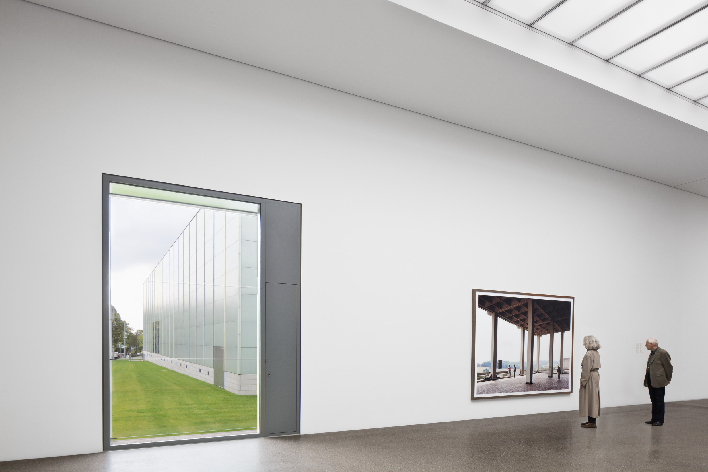
Sometimes buildings look better in photos than they do in real life, but sometimes it’s the other way round. I remember seeing snaps of David Chipperfield Architects’ Museum Folkwang when they first began circulating nearly three years ago and thinking it looked a bit flat, a bit dull, a bit meh. Then I went to Essen to write a report for our Stirling Prize issue - it was shortlisted in 2011 - and realised I was wrong.
During my tour I had quite a few of those moments that anyone who has studied architecture occasionally has and often becomes addicted to; those moments when you recognise the presence of a mysterious quality, that sense of a carefully composed, designed space, rather than one merely built. That I suppose is what architecture is. As Reyner Banham argued, it is the act of drawing that distinguishes architecture, and I think that’s what I felt in Essen: that the spaces I was moving through had first been explored as drawings.
In that respect, architecture transforms the act of building, in much the same way that writing transforms the spoken word. The initial sketch, the plans and sections that conspire to bring about architectural forms and space are much like a script, with dialogue and stage directions, that work in concert to fashion a theatrical play.
Most of Chipperfield’s buildings look far better in reality than they do in books, magazines or on screen. (You could say this about many architects but it’s especially true of Chipperfield.) The thrilling interior composition of the BBC Scotland building in Glasgow for example - an atrium filled with a mountainous sandstone staircase that encloses black-box studios - is one of Britain’s great workplace interiors, but remains curiously under-rated and under-discussed. Its influence upon contemporary London office design is huge yet unacknowledged. Its raw materiality (concrete soffits in the workspaces), circulation system that doubles as break-out space (the sandstone staircase), the democratic nature of the floorplates (all spaces are treated equally): these features are increasingly standard, but they weren’t when it was designed in 2001.
Turner Contemporary in Margate is another Chipperfield project that doesn’t photo nearly as well as you think it would. I visited it twice this summer (to see Curiosity, the Hayward touring exhibition, on both occasions because it really was that good) and was struck by how powerful the views out across the North Sea were. There was something about the proportions of the internal spaces, the size of the windows, the subdivisions - the architecture - that in person was transformational.
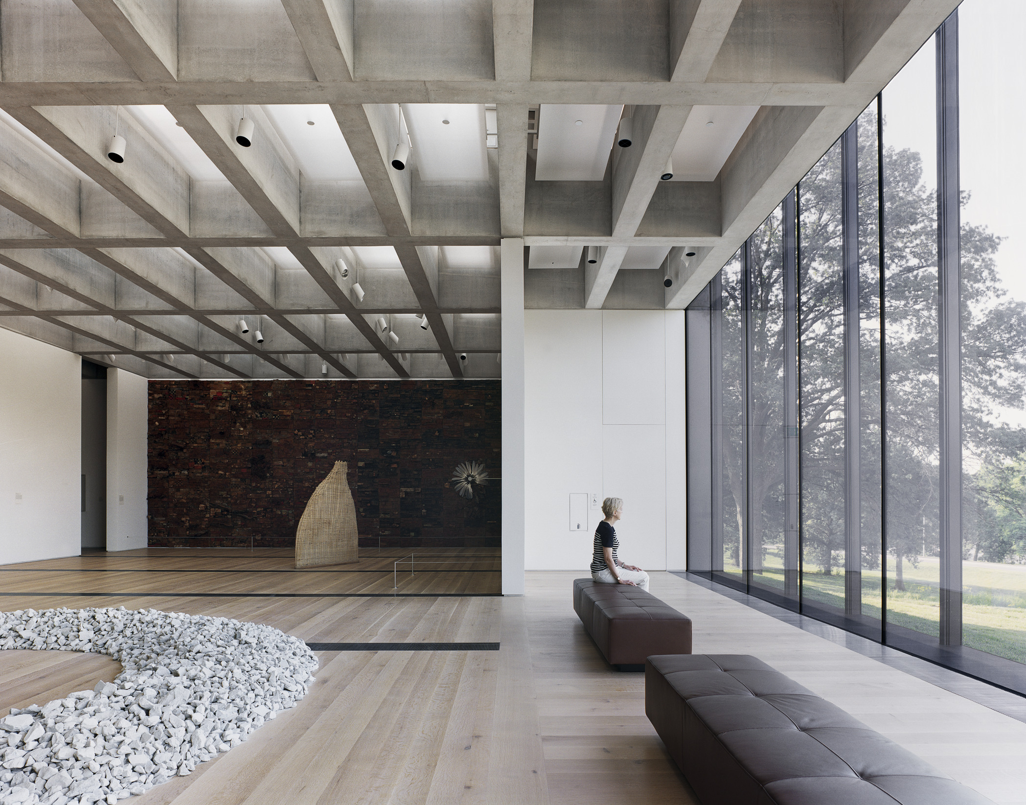
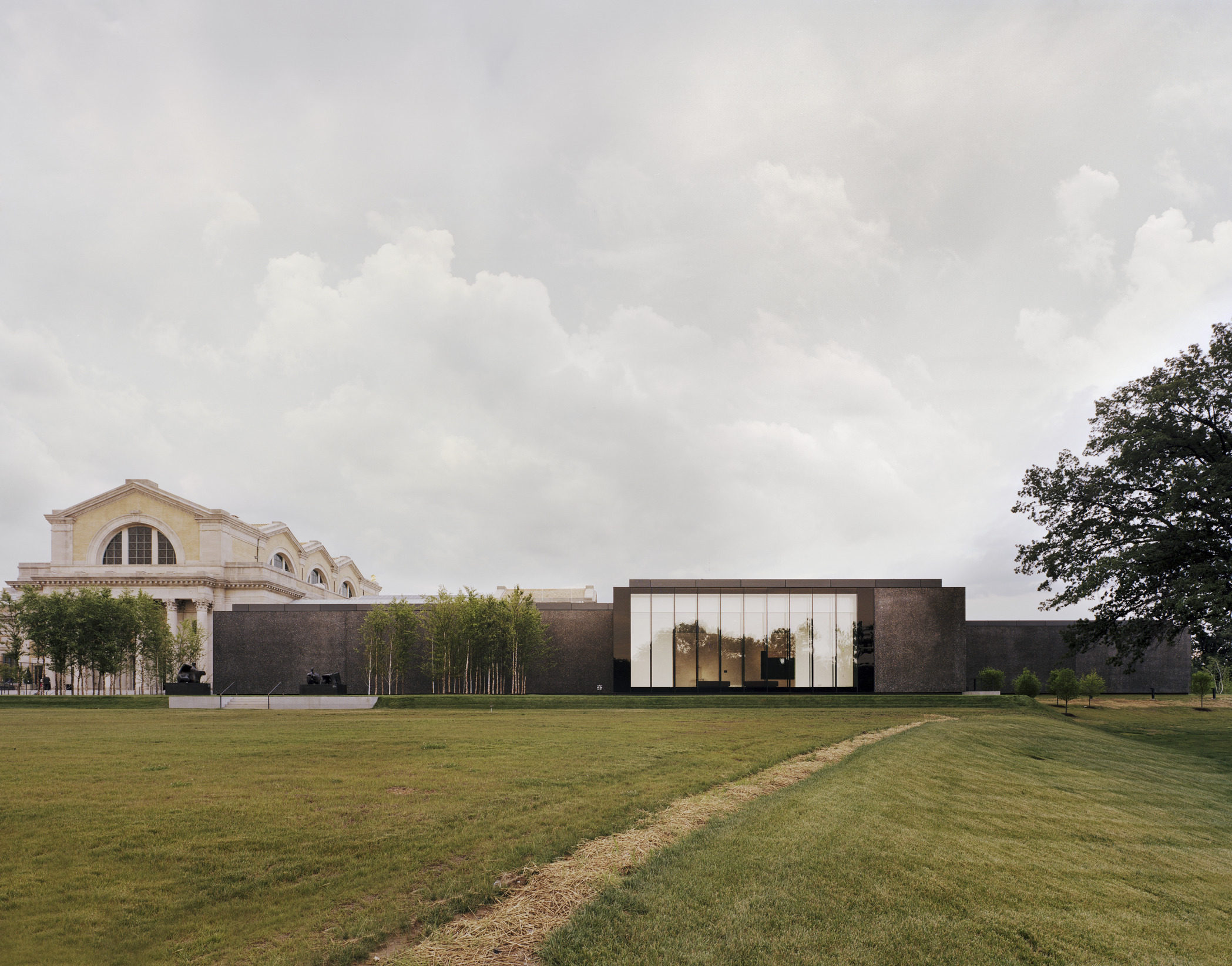
The same is true of the Hepworth Wakefield. It looks more dark and huddled in photos than it does in real life. When I was there the concrete was more colourful and the interiors felt voluminous. (A typical architectural experience in a Chipperfield building is that uncanny feeling of the over-scaled room.)
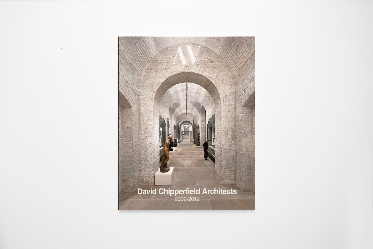
Still, I prefer Chipperfield’s Margate to his Wakefield, even if the architect himself doesn’t. I’m guessing the RIBA Royal Gold Medalist prefers the northerly building because it’s on the cover of the practice’s new 384-page monograph published by Thames & Hudson. It’s a pretty tasty object in itself, with loads of photos of completed buildings, some renders of schemes not quite finished yet, some of projects that never came to fruition, as well as plans and sections too. It hasn’t changed my mind about the disconnection between the photography and reality of a David Chipperfield building, although despite what I’ve written above, Ute Zscharnt’s snaps of Essen and Glasgow and those by Simon Menges of Margate (none of which I’d seen before) close the gap more than most, and are easily the best in the book.
By¬ÝRory Olcayto
The Architects‚Äô Journal¬Ý6 November 2013


