‘The museum’s new building is a gem of clarity and deceptive simplicity’
'Public buildings,' wrote the architect Cass Gilbert (1859-1934), 'best serve the public by being beautiful.' 'Beauty' is not a word much discussed in contemporary architectural and artistic discourse. Since the dawn of modernism, it has been seen as a difficult concept.
Gilbert modelled his massive St Louis Art Museum on the Baths of Caracalla in Rome. It is a Beaux Arts mountain from the architect who is best known for New York’s 1913 Woolworth Building, the skyscraper that set the style for the piercing spires so characteristic of Manhattan’s golden age. Situated atop a hill in the huge park that was the legacy of the Louisiana Purchase Exhibition of 1904, the museum was born as the centrepiece of a world’s fair. Its mission was to impress, with size, stonework and sculpture.
It tries to be beautiful. Really hard. Its vast, vaulted lobby has the scale of a railway station, an imperial building for a city desperately trying to avoid eclipse by its upstart Midwest neighbour, Chicago. Yet the building somehow remained a pavilion, a stiff shell within which the museum was able to show only a fragment of its remarkable collection. The solution has been an extension by the British architect Sir David Chipperfield, now an experienced museum designer with institutions including Iowa’s Figge Art Museum, Wakefield’s Hepworth Gallery and Berlin’s stupendous Neues Museum to his name. The question, then, has to be: does Chipperfield’s new building match up to Gilbert’s demand for beauty as a civic virtue?
I’m glad to report from St Louis that it absolutely does. The $130m building is a gem of clarity and deceptive simplicity. There’s no attempt to compete with Gilbert’s structure, no desire to create a new, self-conscious monument (as so many mid-western and western US museums have done in recent years). Instead there is an elegant gallery that appears to care as much about the art as it does about the architecture.
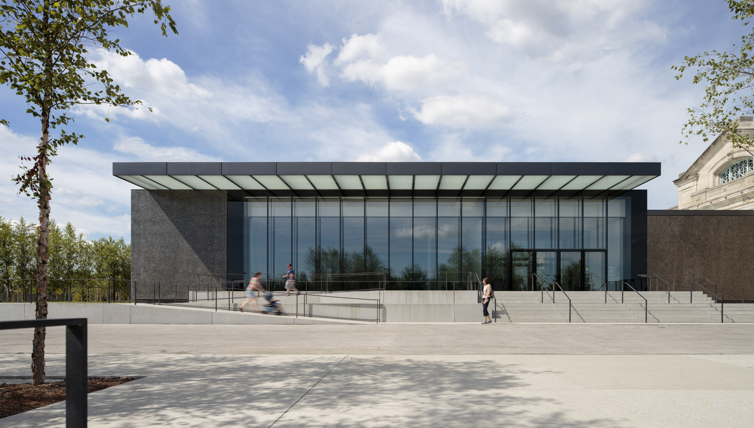
The new East Building presents a façade that is self-contained and severely stripped down but which bows down to the civic presence of its neighbour. The old museum is placed on a podium, reached by the inevitable set of steps signifying the elevation of the arts, and the new structure – designed to flow almost seamlessly through inside – is therefore also raised. The steps, the glazed walls and the overhanging glass canopy give the kind of tripartite classical sub-division that immediately makes proportional sense. But more than that, the glazed canopy at roof level suggests that the interior will be imbued with the same translucent glow seen here – which is exactly the case.
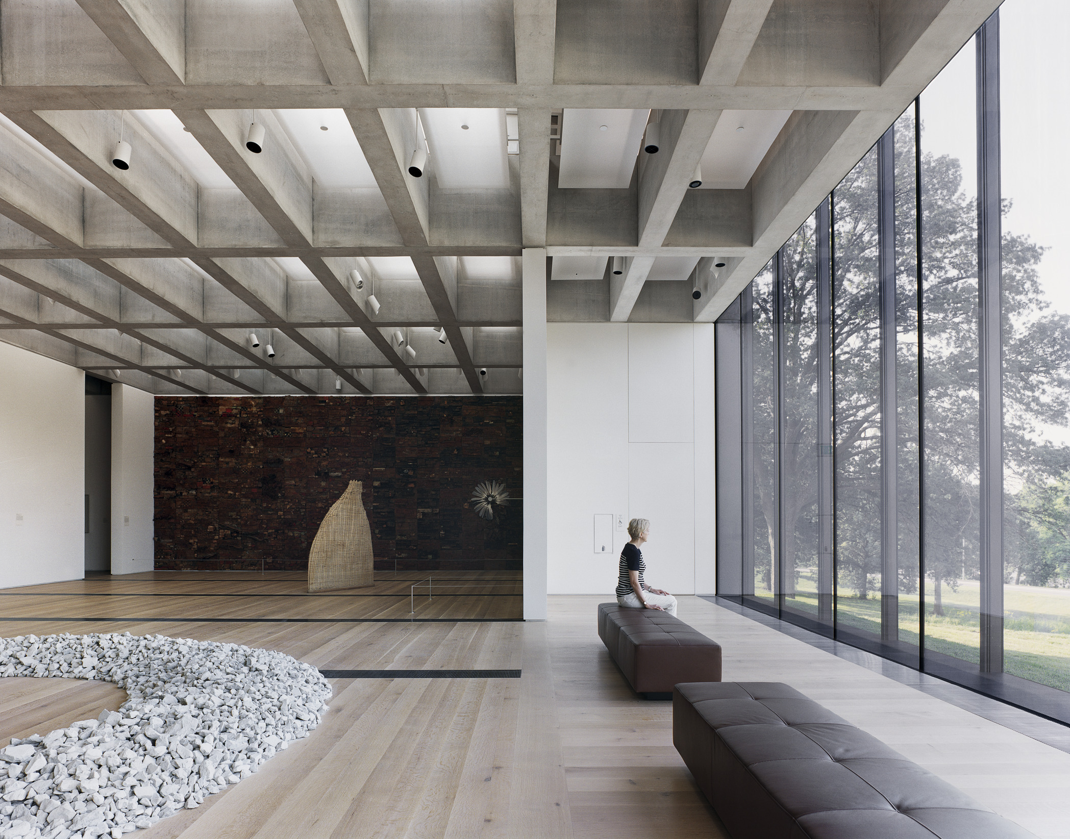
The interior is organised on a simple yet sophisticated principle, with a concrete ceiling grid that runs through the whole structure and creates a framework for walls to slot in beneath. These are walls without doors, thick white surfaces arranged to imply rooms – without ever actually completely defining them. This allows you to see the ceiling stretching away beyond each room, to suggest the infinite space of the ideal modernist grid while creating intimate and flexible spaces for art – most of which is on huge canvases.
Natural light filters in through the concrete waffle ceiling, always mediated by a translucent film through which artificial light is also shone, so that at night or in darker conditions something of the effect of the natural light persists. The concrete glows. It is difficult to reproduce in photos but the quality of light is outstanding; even and surprisingly gentle considering the often fiercely blue summer skies outside.
The collection is very fine, especially the museum’s holdings of modern and contemporary German art. The expressionist works (most notably a vivid collection of Max Beckmann) have mostly stayed on the repainted walls of the old building while the contemporary works sit well in the new galleries. Spectacular, moving works by Anselm Kiefer, Gerhard Richter and others are hung to almost create spaces on their own.
The grid suits minimalism just as well, with Donald Judd’s boxes parading across the floor and Dan Flavin’s fluorescent tubes joyously spoiling the geometry of a white corner. Occasionally the internal white walls give way to the glass envelope and the lush landscape setting of Forest Park. The floor-to-ceiling glazing is a clear nod to Mies van der Rohe, another European architect but one working out of St Louis’ competitor, Chicago. Glimpses of sculpture in the grounds blur even that most diaphanous of boundaries and make it easier to locate yourself in the circuit around the gallery.
There is the usual shop and café but what makes the museum’s new wing rather unusual is the immediate immersion into the art. Chipperfield has deliberately avoided the contemporary malaise of the endless lobby, the trek through the kind of tortuously constructed routes familiar from airports and malls which even Gilbert couldn’t resist with his Roman-scaled foyer. Instead, the new wing deposits you immediately in the midst of the art.
The museum also has fine holdings of antiquities, applied arts and design, Asian and Oceanic art and a mesmerising array of Pre-Columbian and Native American artefacts; in spreading these between the old building, a 1970s annexe and the new wing, gaps have been created that have, on occasion, been ingeniously filled. Most obvious among these is a new basement courtyard which has been filled in monumental style by the British artist Andy Goldsworthy, who has formed 300 tons of stone into a series of arches crammed into the constricted space. Visible from many points in the museum, 'Stone Sea' refers to a Midwest that was once covered by sea, the arches appearing like chaotic waves.
Goldsworthy used Missouri rock for his sculpture, just as Chipperfield used aggregate dredged from the Missouri River to speckle the dark grey polished concrete walls with fragments of the same sandy-coloured stone that Gilbert used to build his museum. It is fascinating to look at the old and new structures together, to see how concepts of architectural beauty have been transformed over little more than a century. Gilbert’s museum is massive and formal, a vision of a thriving America as inheritor of classical European culture. Chipperfield’s wing is, in its way, equally formal – it sits on a plinth and its coffered ceiling gives it the weight and depth of a classical vault – but Gilbert’s sculpted solidity is replaced with a smooth ethereality. It is a building designed to glow inside and out, one that is more about the intangibility of light than about mass reinforced by shadow.
But what they share is the will to represent civic ambition. Atop Gilbert’s building runs the inscribed phrase 'Dedicated to Art and Free to All', a slogan which, unusually, still holds true thanks to a regional property tax. Gilbert represented his age through carved classical bombast, Chipperfield his through a pared-down concrete and glass elegance. 'Art never improves,' wrote T.S. Eliot, St Louis’s most famous modernist son, 'but . . . the material of art is never quite the same.'


