‘A gateway building for the business school HEC Paris delivers classical grandeur on a budget.’
David Chipperfield Architects’ business school at Jouy-en-Josas
The beet fields and sleepy burbs of the Plateau de Saclay, south west of Paris are France’s answer to Silicon Valley. From the late 1950s, the plateau has been home to top flight technical universities and, more recently, to corporate R&D departments. HEC Paris (École des Hautes Études Commerciales), a business school founded in 1881, relocated in the early 1960s, to the walled, wooded grounds of a 19th century chateau near Jouy-en-Josas, a couple of kilometres from the Palace of Versailles.
With 4000 full-time students and twice as many taking short executive education courses on its 340-acre campus every year, the school is big, and ranks high in the Financial Times’ European League Table. Until recently though, the approach of HEC was hardly commensurate with its status: a blink-and-you’ll-miss-it turning off a country road dominated by a large and charmless Holiday Inn. Now, a new building by David Chipperfield Architects acts as a gleaming gateway. Providing teaching space for 600 MBA students along with administrative departments, it also reorganises the campus in anticipation of further development.
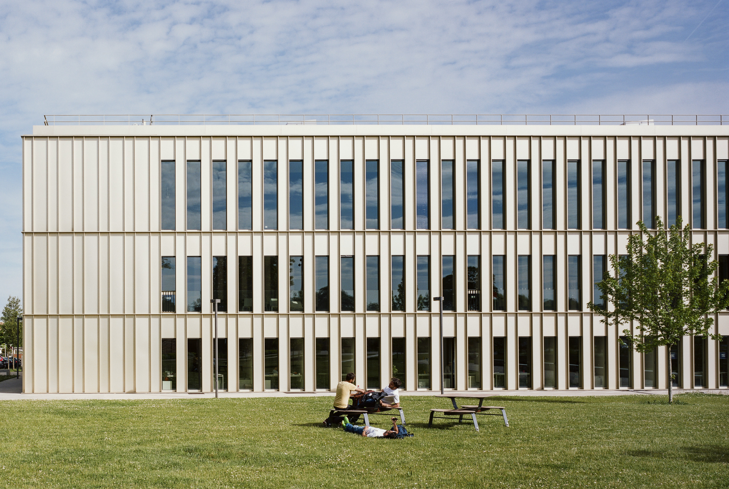
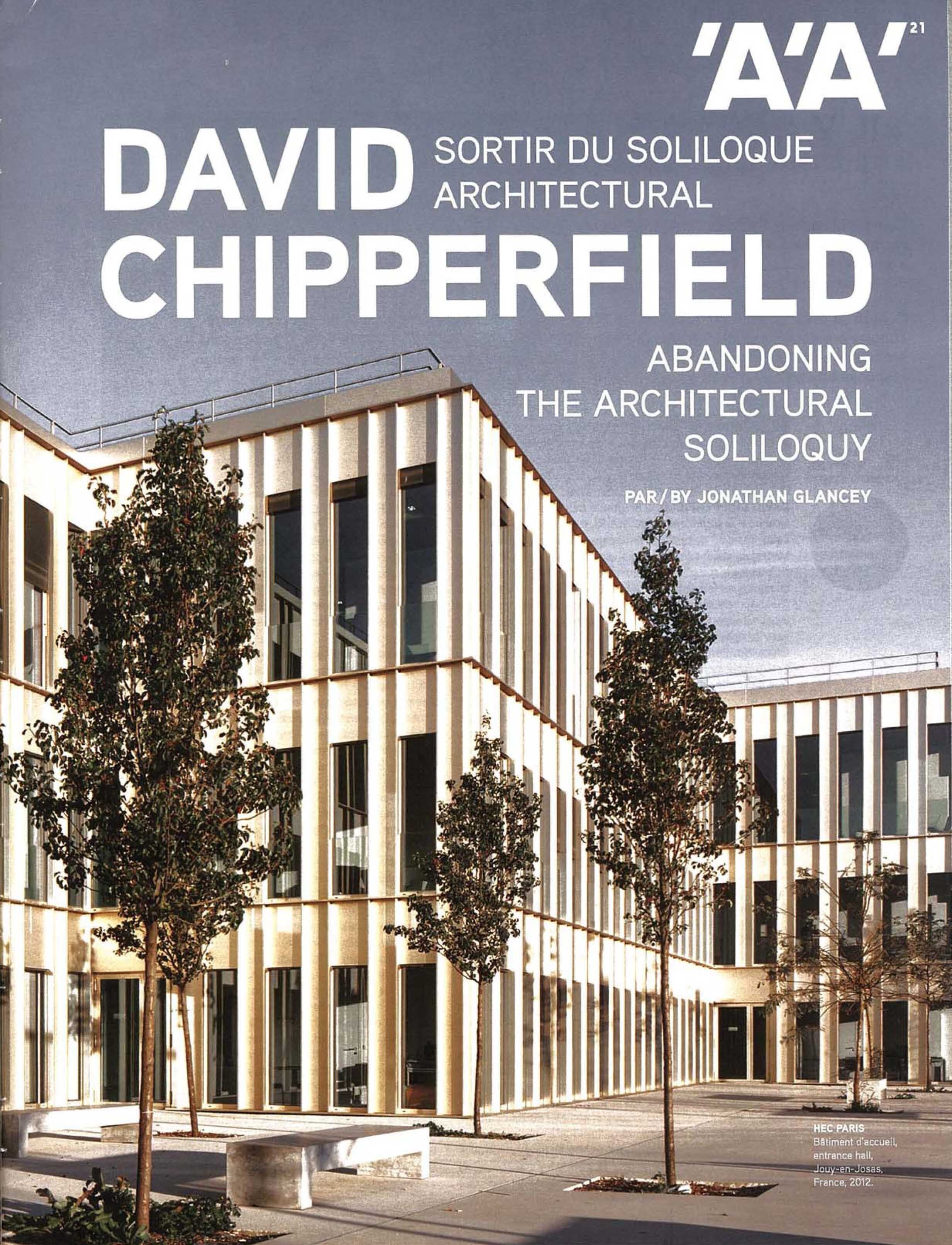
Local height restrictions constrained the massing of the 135metre-long building, so DCA articulated the plan in such a way that the single block suggests an ensemble. The appearance of the champagne-coloured anodised aluminium façade – a nod to HEC’s 1960s buildings – changes with the light, a responsiveness enhanced by vertical and horizontal fins which lend texture and cast shadows across the face of the building.
The façade exemplifies a rigour evident in all parts of the project. Its invariable repetition kept costs low: the 10,824 square metre building was delivered for a modest £1,775/square metre. Within that constraint DCA has not only developed a composition that bestows a classical grandeur on the school – DCA’s Rik Nys suggests a parallel with Renaissance palaces such as the Uffizi, in which highly ordered façades belie a variety of spaces within – but simultaneously satisfied a host of unrelated requirements: for example, the dimensions of 900mm-wide openable window and 400mm-wide loadbearing concrete elements of the façade correspond both to the 1.35m office planning grid and to a rule that windows must admit fire crews.
A similar strategic intelligence is at work internally. Concrete ceilings are left exposed (as are the walls), with suspended ceilings of anodised mesh disguising services above, thus providing an attractive, low-cost finish that also addresses the predicted need to upgrade the school’s IT and AV systems over time.
From the entrance at from the entrance at the single-storey east end og the building, visitors progress either through the building or onto a tree-planted forecourt to the south, which faces the site of planned future development. At the client’s request, office spaces are on the found floor in order to keep the administration in touch with the life of the school. A triple-height hall – what project director Andrew Phillips calls a ‘representative room – separates purely pedagogical parts of the building from those a more public nature. As well as the principal circulation and gathering space within the building, the hall will also be a crossing point between the existing campus to the north and future development to the south. Here, the prosaic act of moving through the school becomes performance, as a heavy concrete stair and landings with elegant bronze handrails wind around the edges of the room.
The upper storeys comprise a variety of lecture theatres in arrangements particular to MBA schools – among them the ‘Harvard’ type, a raked horse-shoe – a nd atoplit 250-seat auditorium, whose beige walls, floor and leather seats suggest unostentatious comfort. The corridors that snake through the building as it shifts in plan borrow light through a series of unprogrammed break-out spaces; David Chipperfield is keen on the importance of ‘useless’ space – surplus capacity available for appropriation by inhabitants as they see fit – and the client found these a compelling part of DCA’s competitive scheme.
As well as the principle circulation and gathering space within the building, the hall will also be a crossing point between the existing campus to the north and future development to the south. Here, the prosaic act of moving through the school becomes performance, as a heavy concrete stair and landings with elegant bronze handrails wind around the edges of the room.
These spaces along with an aesthetic that, DCA’s Andrew Phillips suggests, is closer in spirit to an art school than a corporate office building, combined to create a building that is readily adaptable to the needs of students and flexible enough to encourage different ways of thinking and working, while retaining an air of institutional gravitas.
Schools such as HEC compete intensely for students, and judging by recent activity from Stanford to Sydney, spectacular buildings are seen to offer a competitive advantage. In contrast, HEC’s economical addition seems to exhibit both quiet self-confidence and a good eye for value.
By Chris Foges
Architecture Today February 2013


