'The cultivated simplicity of David Chipperfield’s One Pancras Square makes for an economical yet expressive office.'
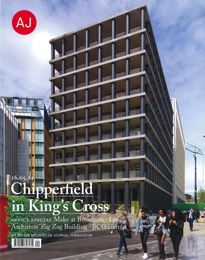
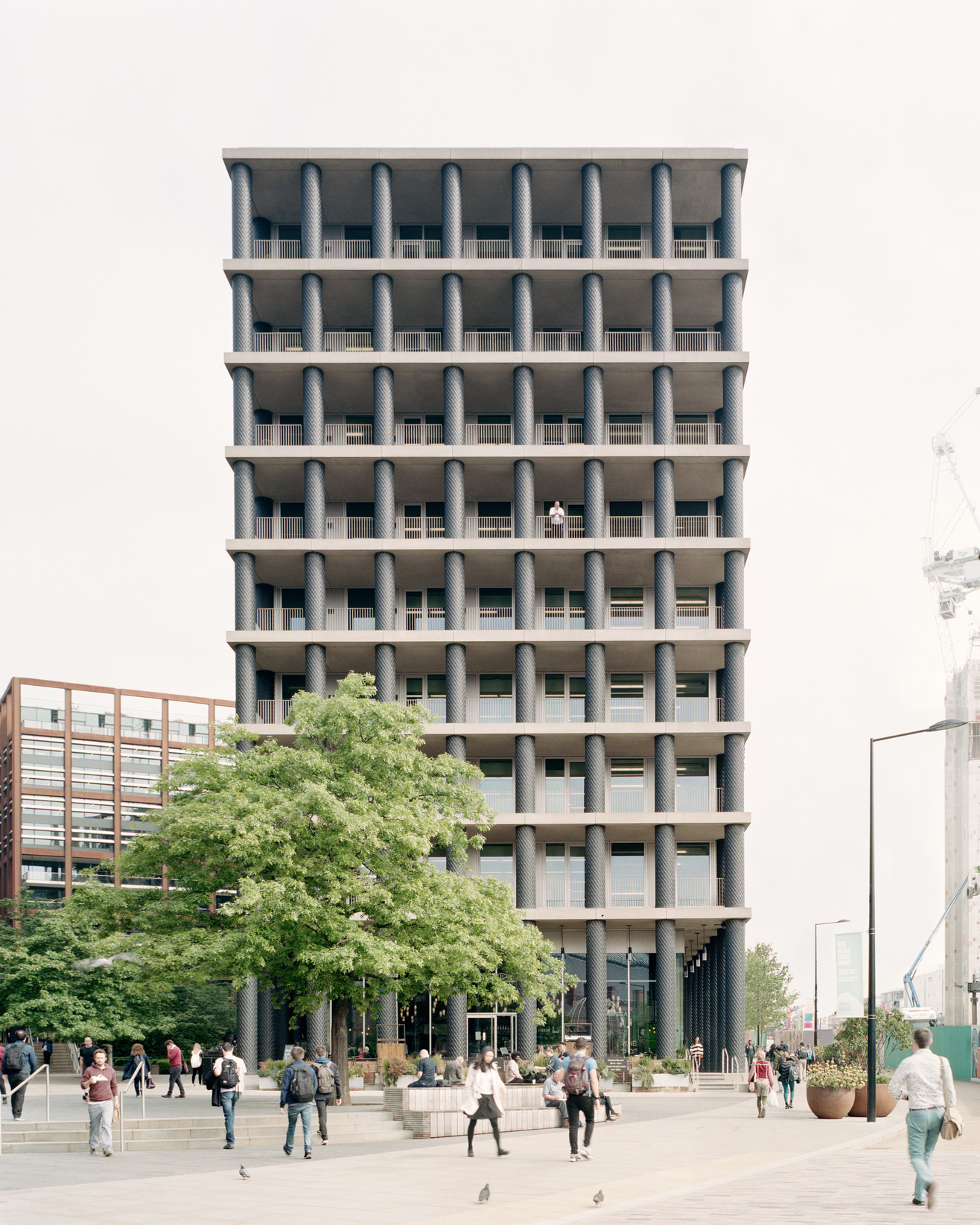
So elemental is the expression of the little office block that David Chipperfield Architects has completed at King’s Cross that its configuration can be described, pretty comprehensively, in a couple of sentences. Nine slabs of the same rectangular plan span between a core and a peristyle of evenly distributed columns. Glazing is recessed from the column line at ground level – forming a continuous colonnade – and across the entirety of the major south-facing elevation – forming balconies – but elsewhere structure and glass align. Judged as diagram, the design of One Pancras Square could scarcely be more economical and yet, for all its cultivated simplicity, the reality proves surprisingly ambiguous in tectonic effect and rich in historic association. Fundamental to that complexity is the energy that the architect has invested in the design of the columns.
In DCA’s early work, columns feature hardly at all, the dominant concern lying with the articulation of space through vividly materialised wall surfaces. However, in the Museum of Modern Literature at Marbach (2006) the practice’s Berlin office coined a language of slender, close-ranged and square-sectioned trabeations that it has continued to explore in schemes such as the James Simon Gallery on Berlin’s Museum Island.
More recently, DCA’s London office has also come to embrace the column’s expressive possibilities, but a different type has found recurrent use: one of circular section and wide – sometimes positively corpulent – girth, rising over the height of a single storey. The monumental brick loggias of its recent houses in Kensington and Buckinghamshire both deploy this motif. The King’s Cross building adopts it too, although here the columns are concrete faced in a sleeve of elaborately moulded cast iron.
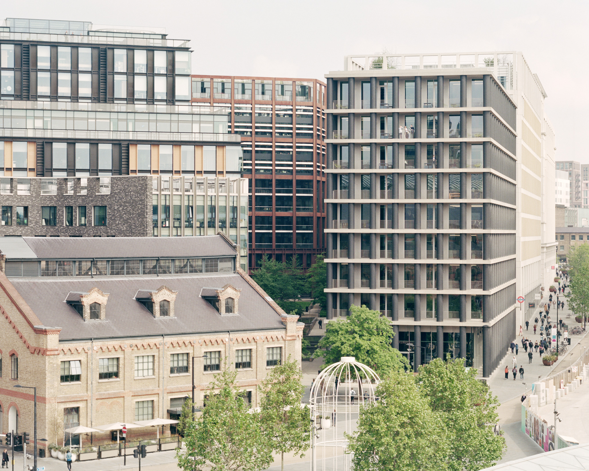
That material choice establishes a strong resonance with the site’s 19th-century industrial heritage, still manifest in the two railway stations that flank its entrance to the south of DCA’s building, and the gas holders and granary building that have been retained to the north. The building also, of course, has a lot of new neighbours. It stands at the south end of the boulevard that forms the main route through the site, a street that has now been substantially built out on its west side but still awaits the construction of the colossal Google headquarters on the other. Allies and Morrison and Porphyrios Associates’ masterplan entrusted DCA with the most prominent location on the street, a situation calling for an expression capable of registering across the square now being established to the south. The principal facade’s symmetry, verticality and depth, as well as the graphic contrast between the black cast-iron columns and the pale precast concrete floor slabs, all contribute to its success in performing that role.
However, the masterplan also determined the building’s volume as the smallest of any on this part of the site, with the aim that it might provide a foil for its bulkier neighbours. In consequence, it presents a curious conjunction of the monumental and the diminutive, suggesting something of the character of a child’s construction set. One can think of more architectural points of comparison too. The oeuvre of Aldo Rossi, for example, abounds in such little buildings of chunky parts. With its main facade of stubby single-storey columns, his Il Palazzo hotel in Fukuoka (1989) might be claimed as a particularly close cousin of One Pancras Square.
A symmetrical facade composed of columns carries an inevitable classical association, and DCA has consolidated that reading through the relationship it has fixed between the proportions of the overall volume and the individual bay. At 38m, the building’s height is all but twice its 20m width. To the eye, the principal façade reads as a double square, a proportion that resonates with the essentially square bay format established by the 2.8m centred columns. That relationship reins the building back from a purely serial expression and the composition has been lent greater specificity still by the treatment of its lowest and uppermost storeys. The base is distinguished by a double-height ground level rising from a precast concrete plinth – which accommodates a 1.8m fall across the site – while an expansion of the height of the final storey by 700mm articulates the top. Yet while a tripartite structure may be in evidence, the building’s classicism remains latent: the variations in the height of the columns are answered by no corresponding expansion in their girth, while the roof slab makes no claim to be read as an entablature.
Manufactured by long-standing Antony Gormley collaborator Hargreaves Foundry, the column facings have been sandcast, using iron recycled from car brake discs, to incorporate a distinctive basket-weave pattern. Highly responsive to daylight, this modelling imbues each shaft with an almost archaic, sculptural presence. Yet the relationship between the column’s tectonic role and the imagery that has been applied to its surface is not straightforward. The architect cites Gottfried Semper’s argument that the origins of cladding lay in weaving as an important – and suitably 19th-century – reference governing its choice of motif. But what are we to make of the application of such filigree imagery to a component that is, at least ostensibly, structural? Are we to take it as acknowledgement of the iron sleeve’s true status as a decorative application? At the very least, it has to be recognised that the pattern has the ambiguous effect of simultaneously confirming and denying the columns’ solidity.
The narrow plan and ample provision of external structure – the architect developed the design on the basis of a ratio of 40 per cent solid to 60 per cent glass – has enabled the creation of a floorplan free of internal columns. It has also allowed the building to be naturally ventilated. The side elevations feature aluminium vents set either side of each half-column. Concrete soffits have been exposed internally, contributing thermal mass. However, a full provision of fan coils and artificial cooling is also available should tenants require and, at least as long as the surrounding environment remains a construction site, it is likely that most will. How much noise the boulevard will generate remains hard to judge: it is currently free of motor traffic but will soon be opened to taxis and couriers.
The building is also set to experience much more intensive pedestrian traffic around its base. A wine bar will take over the unit facing the square, while the north end of the building incorporates the entrance to a tunnel which connects to King’s Cross underground station. The building’s enviable transport connections played an important part in it securing a BREEAM ‘Outstanding’ rating, the first time the award has been given to a speculative office development.
While clearly conceived as a flagship for the King’s Cross Opportunity Area, the project has still been required to stack up as a commercial proposition and to be delivered by means of design and build. Yet if the design faced challenges along the way, the immaculate finish does not betray them. The architect acknowledges that the scheme’s highly reduced nature was of help in this respect: a value engineering exercise would struggle to find much that could be stripped away. However, for all its reduction, the building is by no means simplistic. It is not often that an office block can be said to have made London a more richly particular city, but this one has.
