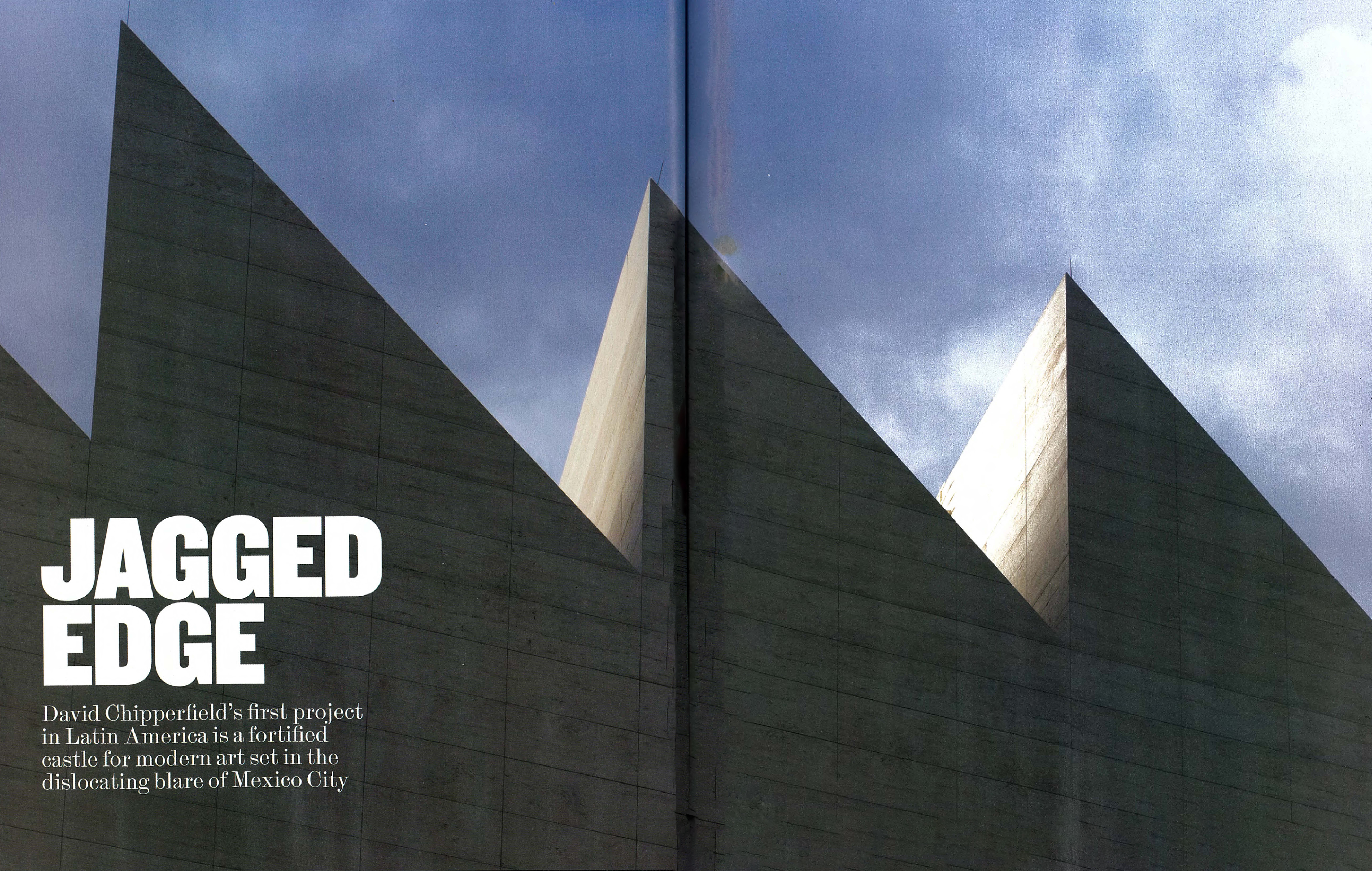
'David Chipperfieldʼs first project in Latin America is a fortified castle for modern art set in the dislocating blare of Mexico City'
The mercurial nature of contemporary art and the lofty ideals of museum architecture have been at odds, perhaps even at loggerheads, for some time. Does the impossibility of knowing what artists − some struggling, others pampered − might produce and expect in terms of display favour an ultimately flexible space devoid of expression? Or, alternatively, is this very uncertainty, this sense of art as somehow provisional, better served by buildings of strong definite character?
The new Júmex Museum in Mexico City seems initially to belong to this latter group. It’s a free-standing pavilion, triangular in plan, more vertical than horizontal and with a memorable sawtooth roof profile. The building is an eye-catching ornament with hints of fortification in this fluid metropolis of more than 20 million inhabitants. Yet inside, the spaces are calm and generous, uncluttered by the ephemera of signature design or by technical paraphernalia. Architecture with a capital A almost slips away. The little castle turns out to harbour galleries of almost Miesian clarity stacked deftly one above the other.
The Júmex Museum is the first project realised by David Chipperfield in Latin America. Indeed it’s one of the first projects to be built by this most English of starchitects outside the advanced construction cultures of Western Europe, Japan and the United States. If many of Chipperfield’s more resonant projects (the Berlin Museum Island; the architect’s own holiday home on Spain’s Atlantic coast) are informed by the morphology, grain and texture of context, here in Mexico City the context is neither traditional nor intimate.
The site is across a busy street − Miguel de Cervantes Saavedra Boulevard − from the Antara shopping centre (Burberry, Brooks Brothers, DKNY) and sits as foreground in front of Plaza Carso, a quintet of glassy high-rises set above another ritzy commercial development (Apple, Saks Fifth Avenue). Planned by local OMA alumnus Fernando Romero, Plaza Carso communicates a mood that is redolent less of, say, Under The Volcano or the works of Luis Barragán, more of contemporary Singapore or the Dutch Randstad with an emphasis on efficiency, consumption and a stylish programmatic mix.
Three cultural components sit forward of Plaza Carso as honorific objects or embellishments in the urban field. There’s the Soumaya Museum, a swirling eruption up out of the ground designed by FR-EE, Fernando Romero Enterprise, to accommodate the collection (Rodin sculpture, Colonial Spanish painting) of Romero’s father-in-law, Carlos Slim, and clad in hexagonal aluminium tiles. There’s an underground theatre, for Broadway musicals and performance, topped by a giant canopy of interlocked, canted steel blades by Madrid’s Ensamble Studio. And then there’s the UK contribution: empirical, understated, luxurious yet sober.
The Júmex Museum is thus something of an interloper in this new upmarket neighbourhood; it attracts attention first by its unorthodox albeit quasi-traditional form and then by a certain muteness of external expression. The triangular plan, which instigates the wedge-like form, derives from the presence on the site of a functioning railway; freight trains continue to slide past between the museum and the theatre canopy several times a day. The museum’s external expression derives substantially from the copious use of travertine, sourced from the state of Veracruz on Mexico’s Gulf Coast. The interior is illuminated not via normative windows punched into the building’s skin but through a few large orthogonal voids in the outer walls and, indirectly, from roof lights that determine the characteristic sawtooth profile.
Thus the museum does not signal its contents or its raison d’être to the outside world in any overt or frenetic way. It draws attention more subtly. The building is massive, reminiscent even of some pre-Columbian forms, with successive floors projecting out very slightly one above the other. A few major apertures cut into this massiveness. At ground level, the building is propped on stubby cylindrical columns so that the plaza, shared with the Soumaya Museum and the theatre foyer, flows directly into the belly of the Chipperfield museum.
The Júmex collection is a key repository of contemporary Mexican, Latin American and international art assembled in just over a decade by Eugenio López Alonso, heir to a Mexican fruit juice fortune. For some years now, art cognoscenti have trekked to view selections from the collection at Júmex’s factory in Ecatepec, far from the metropolitan core. Charging only a minimal admission fee, the museum brings contemporary art to the heart of the Mexican capital for locals and visitors alike; storage and other facilities remain in Ecatepec.
It may seem contradictory, therefore, that the Soumaya Museum, with its wilfully contemporary design, houses works from centuries past whereas López, with his vanguard agenda, selected a comparatively timeless architecture. Temporary projects planned for a prow-like terrace are a rare external sign of vanguard art; for the museum’s inauguration, Mexican artist Damián Ortega has a major installation here in the apex of the triangular plan. The visitor is drawn in from the sunlight to a spacious undercroft with a small café and a trough-like patio opening up between this sheltered foyer and Miguel de Cervantes Saavedra Boulevard beyond.
It’s a surprise to be suddenly reminded of the interior architecture of Mies van der Rohe. A decade and a half ago, Rem Koolhaas riffed on the Miesian pavilion or temple with his ingenious box of tricks for the Rotterdam Kunsthal. In Mexico, Chipperfield seems less concerned with making a provocation regarding museum practice than with realising a sequence of spaces to appeal to our human senses. If a set of large pivoting timber doors recalls the monastic minimalism of local hero Luis Barragán, the travertine floors and walls recall Miesian antecedents like the Barcelona Pavilion, as do the tall sheets of glass rising without interruption from floor to ceiling and held in taut, stainless-steel frames.
The interior spaces are generous, calm and simple, giving the familiar neutral freedom to artists and curators
One of the successes of the Júmex Museum is the generosity of its spaces. The site may be constricted in plan yet Chipperfield has managed to expand the massing in the vertical dimension so that the galleries and public spaces can breathe. Here you imagine the legacy of Adolf Loos, with his theory of Raumplan. If the Júmex Museum suggests Mies’s work in the ambience of individual spaces, perhaps Loos’s theory of rooms is more pertinent to the Júmex’s vertical circulation: to the grand staircase with its black steel balustrade or the lift car large enough to hoist a vehicle to upper floors.
Four floors are above the mostly private basement: the entry or plinth level, with much of its space as loggia on all four sides; the piano nobile, where a rectilinear glass box is set in from the exterior stone carapace; the lower gallery level, notched into by a narrow terrace facing Plaza Carso; and the upper gallery level, occupying the full extent of the truncated triangular plan. This upper gallery is the most dramatic. Preconceptions of ideal gallery space are tested by its non-rectangularity; site conditions below have led to a rather teasing plan as the industrial-scale sawtooth roof sets up its own rhythm above.
Natural light was almost a narcotic for Modernist architects, inspired in part by Le Corbusier’s re-presentation of artist ateliers in the 1920s. That exemplar was quickly followed in Mexico City by the house and studio, at once perky and mechanical, built by Juan O’Gorman for Diego Rivera and Frida Kahlo. Paintings and sculptures produced in that interwar period differ of course significantly from much art today; new art may not need light at all. At Júmex, the rooflights are an emphatic presence, inside and out; their lower ridges seem to dip down into the gallery space as horizontal diffusers in the troughs above help maintain an even light at all times.
The Júmex in its city context, flanked by a busy road on one side and a train track on another. Despite the surroundings, it hold its own
One of Chipperfield’s most intriguing spaces is the room on the piano nobile. Large apertures in the outer wall frame views to the immediate neighbourhood. Indeed, from Plaza Carso there are views through this glassy interior out to the Antara shopping centre. With floor-to-ceiling glass on three of its four sides, this is a room essentially without function. The Júmex Museum, however, is betting that the future of museums is as much about interaction, communication and performance as it is about traditional forms of exhibition. The museum is thus a frame for art practices yet to be imagined.
Chipperfield’s Júmex never attempts the sculptural or theoretical daring of museum buildings by some of his famous contemporaries. He is drawn to beautiful volumes and elegant details rather than to some universal concept of flexible space. In Mexico City, a notion of the museum as a set of stacked halls scrambles Brian O’Doherty’s reading of the ascetic ‘white cube’ with Loos’s Raumplan proposal for interlocking space. In such a structure, distinct experiences await. It is now up to the artists and to the curators to make the place sing.


