ŌĆśMexico CityŌĆÖs new Jumex Museum is a wonderful space for the largest private collection of contemporary art in Latin AmericaŌĆÖ
A trip to the Jumex Foundation used to be quite an experience. There is nothing unusual in factories accommodating art galleries but most of them have long been empty when the art moves in. The Jumex factory, in the midst of the favelas on the sprawling outskirts of Mexico City, is very much still working. You had to pass through huge steel gates, past armed guards who checked your ID, and then into the heart of the complex, dodging trucks full of fruit destined to be squeezed into JumexŌĆÖs ubiquitous juices. There, you found yourself in a cool, contemporary art space, a richly programmed, minimal, industrial-scaled gallery that slotted in seamlessly, if surprisingly, with the warehouses and factory floors around it.
A trip to the new Jumex Museum, which opened with huge fanfare last weekend (see Georgina AdamŌĆÖs Art Market column), is something very different. Although this new building is also sited in a former industrial district (once the home of the big breweries, on the edge of swanky Polanco), the whole area has been redeveloped into a commercial and retail centre, a place with big shiny buildings that could be found anywhere. The shiniest of all is the metal-clad mushroom stalk of the Soumaya Museum, the hideous home of the art collection of the worldŌĆÖs second-richest man, Carlos Slim.
The new Jumex Museum has to contend with this context. The architect chosen to do it was David Chipperfield and, somehow, he has succeeded. The reasons for his success are surprisingly basic, yet seem to have eluded architects elsewhere around the site.
The first is that the building is situated in a semblance of public space. It is true that there is plenty of space around here, but itŌĆÖs undefined, exposed and useless ŌĆō space that needs to be overcome to get somewhere, rather than enjoyed. The second is that Chipperfield has brought some of that public space into the embrace of the building and given it a purpose, creating a shaded caf├®, terrace and balconies that allow the public to be simultaneously inside and outdoors.
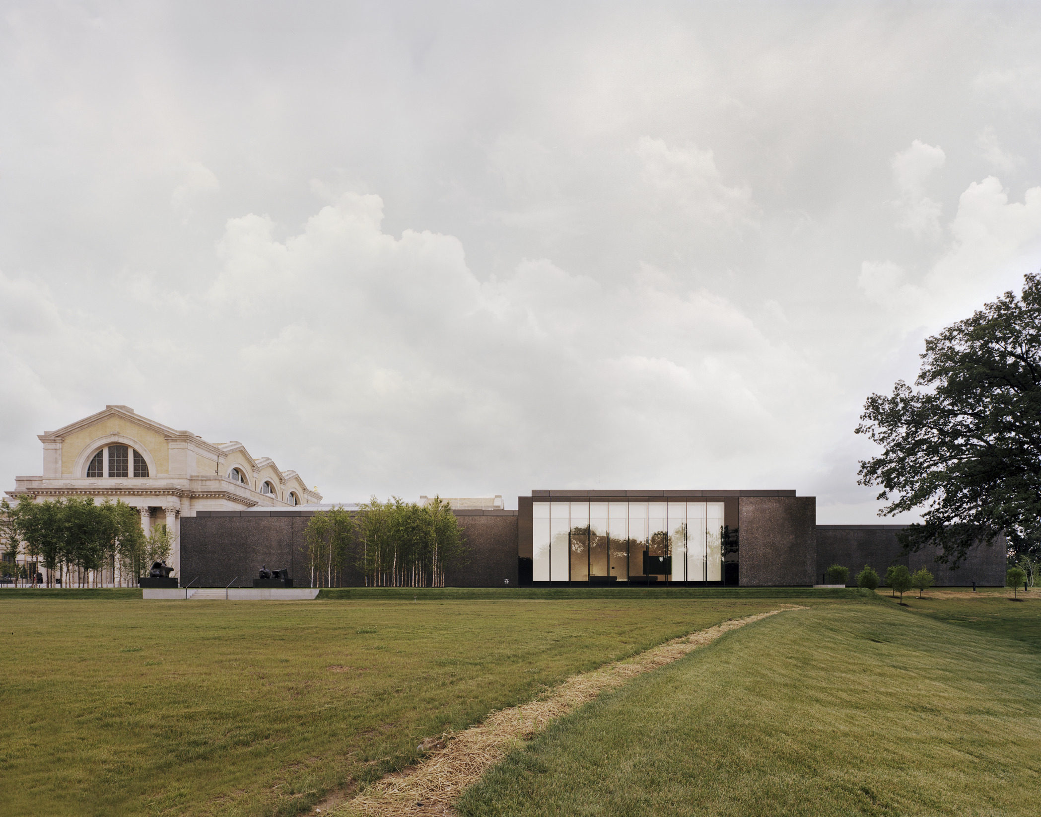
The third reason for ChipperfieldŌĆÖs success is in the creation of a building that looks like a building. If that sounds stupid, just look at the architecture around it. There is the ubiquitous glass cladding of a shopping mall, the silly shape of the Soumaya Museum, the helipad-roofed elliptical tower jammed right up against it, the oddly anti-urban layout of a public space that is divorced from the city surrounding it by freeways and railway lines, and so on. In this setting, the travertine-clad, solid-looking museum seems a little eccentric, a building whose impact comes from avoiding any obviously ŌĆ£iconicŌĆØ gestures. And finally, the reason it is such a good building ŌĆō the most basic reason of all ŌĆō is that it fulfils its function: it contains a wonderful space for showing art.
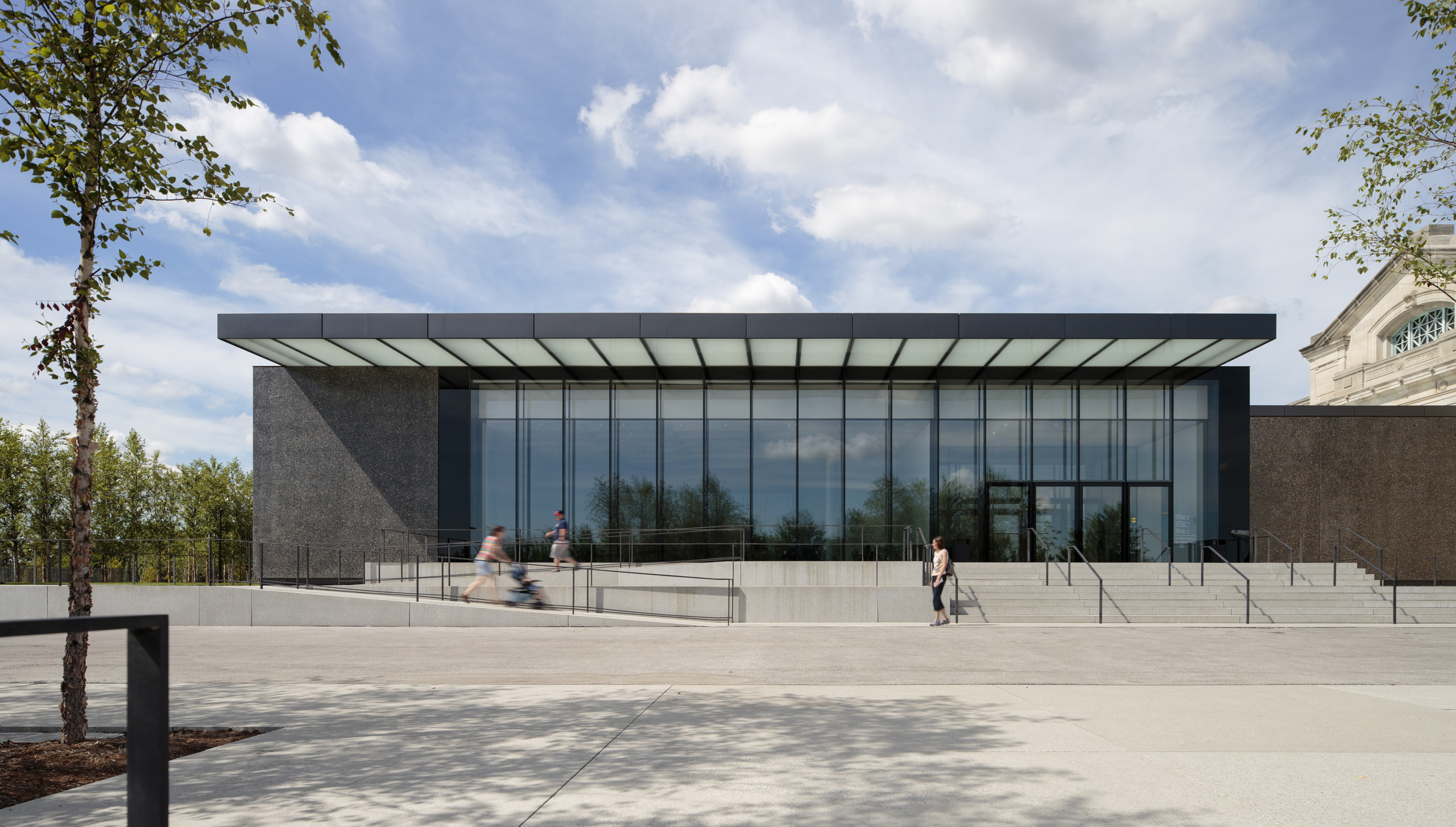
The museum is raised on a plinth that creates an area of public space around and beneath it. Chipperfield has obviously enjoyed the fluidity of the boundary between inside and out that the Mexican climate affords (he has also, remember, designed museums in Anchorage, Alaska, and Wakefield and Margate in the UK). Huge pivoting timber doors open the whole ground floor so that it begins to feel more like a public plaza than a lobby. The first floor, supported on obese columns, is in effect a glass box within a stone box opening out on to broad balconies. The detailing is crisp and minimal, expressed through the language of Mies van der Rohe (whose museums were, incidentally, notoriously useless, sacrificing art to the altar of exquisite architecture). The balconies allow the building to be read as an open, public institution from the city outside, animating the walls of what is otherwise a solid stone structure.
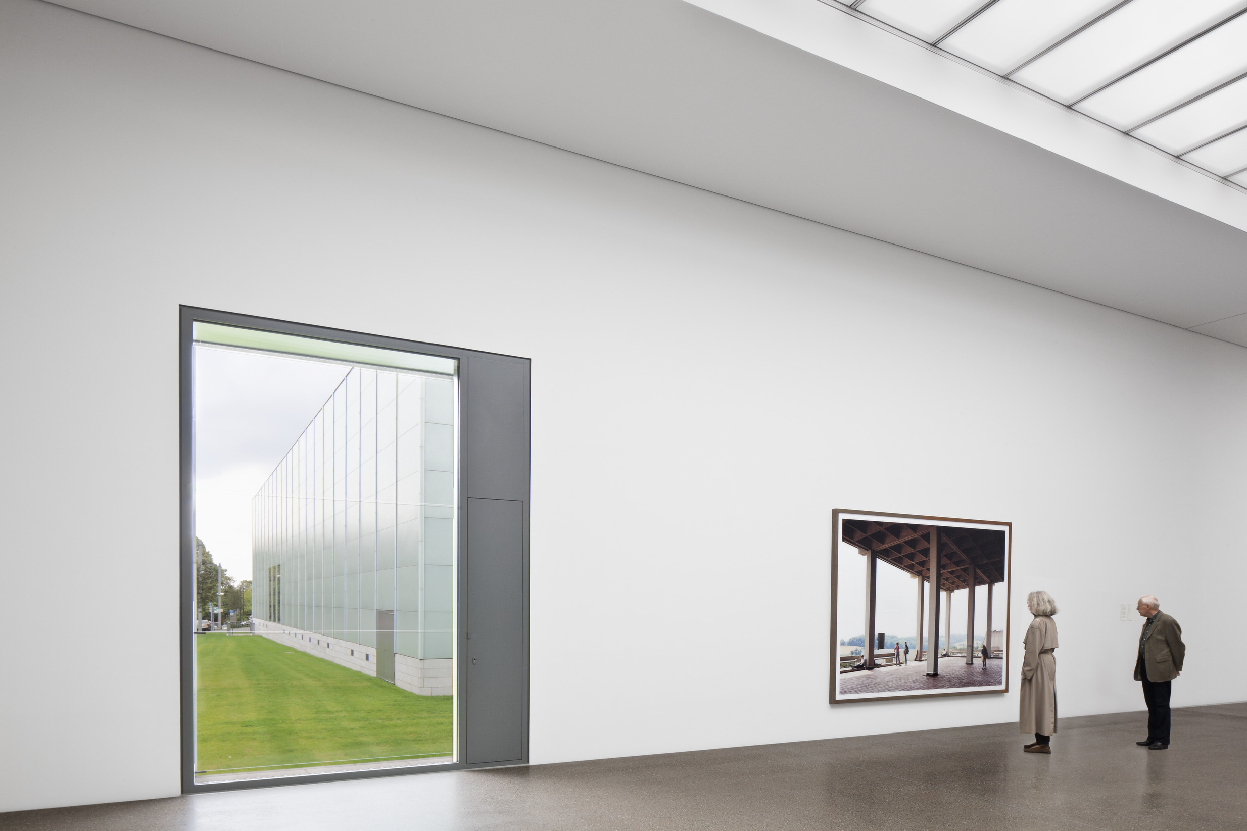
The museumŌĆÖs travertine stairs are clad in black-painted metal sides that fold up like origami through the central circulation and each floor is carefully articulated to be unique, while still feeling very much a part of the whole. Gallery space starts on the second floor, its architecture currently obscured by the inaugural exhibition, a James Lee Byars retrospective. The building culminates, however, in the top-floor gallery, which is an outstanding space. It is here that the effects of the saw-toothed roof are felt, expressed in the ceiling as deep, angular projections gouging into the gallery space and filtering the north light to create an even, ethereal illumination. Despite the brilliant sunshine outside, the effect is more like an evenly lit Scandinavian studio, cool and clear.
Yet it also looks here as if the curators have tried to pack slightly too much in. ItŌĆÖs a reminder that the Jumex exists to display the largest private collection of contemporary art in Latin America. You get the sense that Chipperfield has carefully sought to express the new museum as a piece of the public realm, at least in part to fend off an appearance of the expression of huge private riches in a city struggling with massive disparities in wealth.
Mexico City has, despite a vibrant art scene with international cachet, struggled with a kind of insecurity about its global status. This building is the first major institution in the city to be commissioned from a foreign architect and it could easily have been an alien curiosity. Instead, it may be an expression of serious wealth, but it is also an expression of serious intent, an urbane, open, civic space for art.
By Edwin Heathcote
Finacial Times┬Ā22 November 2013


