Dignified restraint are the first words that pop into my mind when thinking of the architecture of David Chipperfield Architects, modified by the next adjective: ‘clever.’ If many of his works appear to be a return to the box, rather than thinking outside of it, on closer inspection one discovers ingenious plans and impeccably crafted structures that challenge the received notions of typology and craft. His works conform to a post-and-beam Vitruvian tectonics, usually resulting in parallelepipeds, shapes that have always been and that will always fit into every urban context. The materiality of these structures, whether made of concrete, stone, brick, or metal, consistently rewards the visitor with a powerful sense of identity and appropriateness, enforcing a pleasant feeling of minimalist luxury.
Dignified restraint are the first words that pop into my mind when thinking of the architecture of David Chipperfield Architects, modified by the next adjective: ‘clever.’ If many of his works appear to be a return to the box, rather than thinking outside of it, on closer inspection one discovers ingenious plans and impeccably crafted structures that challenge the received notions of typology and craft. His works conform to a post-and-beam Vitruvian tectonics, usually resulting in parallelepipeds, shapes that have always been and that will always fit into every urban context. The materiality of these structures, whether made of concrete, stone, brick, or metal, consistently rewards the visitor with a powerful sense of identity and appropriateness, enforcing a pleasant feeling of minimalist luxury.
In his person and in his buildings Chipperfield represents the paragon of politeness. Never a snide comment, never an offense to a place. His moderation is such that he and his architecture might almost go unnoticed, which stands in direct contrast to the reigning ethic of a media-crazed world seeking glamorous personalities and iconic markers. Despite his prominence as an educator, a curator of exhibitions such as the Venice Biennale, and the master of a prolific international practice, Chipperfield has maintained a discrete profile and in the same manner, very few of his buildings seek attention. Colin Rowe, between one vodka martini and the next, had a favourite party game based on Isaiah Berlin’s concept of human types, going through lists of architects and deciding if they were foxes or hedgehogs, starting with pairs like Michelangelo/Palladio. Chipperfield corresponds perfectly to the latter category, better than either Tessenow or Mies van der Rohe. During his over 30-year career one can recognize cognate ideas from project to project, a consistently slow development of style, a keen interest in the essence of materials, and a tangible sense of honesty in structure, which again contradicts most contemporary practices. His persistent talent for assimilation rather than distinction offers a model of resistance to the violent formal intrusions of more renowned starchitects. Yet despite such a strategy of understatement, he is now considered a global ‘brand.’
In the world of fashion, where Chipperfield’s independent career took off, his architectural brand might be analogous to that of Giorgio Armani: classic, well-made, unobtrusive. From his first shops for Issey Miyake in London and Tokyo he provided pure atmospheres of stark materiality, a contemporary interpretation of wabi-sabi. Despite the jump in scale of his business, which during the past two decades has become transnational, with offices in London, Berlin, Milan, and Shanghai, he continues to produce from major flagships to small concessions for fashion maisons, store concepts that give corporate identity to brands such as Valentino and Brioni. For Valentino, the interior floors, as well as the walls, have been clad in speckled grey terrazzo, a material not usually used on vertical surfaces, creating serene spaces serving a purposely scant display of goods. The message is that this is not a department store for impulse shopping but a luxurious salon for exercising one’s good taste. The New York store fits neatly into its site playing up to the Mad Men context of Midtown 5th Avenue, offering a nostalgic return to the International Style, with an 8-storey black steel and glass curtain wall facade, that in homage to Mies deploys brass aluminum mullions on the first three levels. Inside Valentino one is drawn to the grand stair by a sparkling glass column made of thousands of reflecting translucent fragments, which extends to the upper stories. The racks for hanging the clothes have been deftly cantilevered from the lips of the terrazzo wainscoting, leaving a comfortably open access for a small amount of selected items. The store concept for Brioni fashion house, also in New York City, draws on a similar strategy of using a single precious material, grey marble with white veins, for most of the interior surfaces, in this case even the ceiling at the entrance. Stout columns made of different contrasting colours of marble draw one through the generous spaces, again with only a minimum of clothes on the shelves and hangers. Both stores, with their thoroughly lithic surfaces and serene minimalism avoid any vulgar reference to Pop culture and commercialism, to become slightly chilly mausoleums of luxury and good taste.
Material Boxes
Much research is invested into the materials and rhythms of the elevations of buildings. At the HEC campus, an important business school on the outskirts of Paris, he extended over the lengthy facades repeated rectangular aluminum panels, separated by deep flanges, alternating narrow panels with wider ones framing the floor-to-ceiling window bays. The plan reveals an idea absorbed from Japan, a succession of volumes set in a staggered sequence, such as the layout of the Katsura palace, known to the Japanese as the ‘flock of geese’ plan. This method of breaking down the mass of potentially overwhelming structures by staggering the organization of interlinked blocks reappears in a few other institutional projects designed by Chipperfield, such as the Palace of Justice in Salerno. There he used a prefab concrete panel system on a series of differently scaled boxes, linked to a common plinth with a variety of heights and widths. The boxes are further distinguished by tonalities determined by the clay aggregates mixed into the concrete, warm shades of red, ochre, and grey, the sort of colourful variety one finds in port cities. The project miraculously recuperates the dead lands of an ex-railyard and lives up to the good intentions of Oriol Bohigas’s guidelines for the renewal of Salerno. The project indeed is a cousin to another Palace of Justice, built to Chipperfield’s design, directly across the Mediterranean in Barcelona, where similarly coloured prefab panels distinguish a series of boxy volumes, in this case laid out in oblique patterns.
Chipperfield insists that the basis of most contemporary architecture is resoundingly a concrete frame, which quite logically aspires to be a box. One of his finest boxes, the office building Moganshan Road, was produced in the Chinese city of Hangzhou, where his Shanghai bureau has undertaken several other important works, including the luxury housing at Xixi Wetland Estate and the Liangzhu Museum, which houses a collection of archaeological findings from the Liangzhu culture. The office building Moganshan Road sits free-standing on a dense urban site, a ten-storey structure that with its gridded elevations evokes the early work of Louis Sullivan, in particular the Wainwright Building, even returning to the Chicago window, a central large pane flanked by two narrow panes. The reinforced concrete frame has been generously clad with ruddy-coloured copper cassettes, making it stand out from the drab structures surrounding it. The interior spaces focus on a central core for services and circulation but are otherwise open plan, capable of being subdivided according to need or left as open-plan offices. The unusual sense of luxury for a building of this type in China is reinforced by the interiors clad with oak panelling.
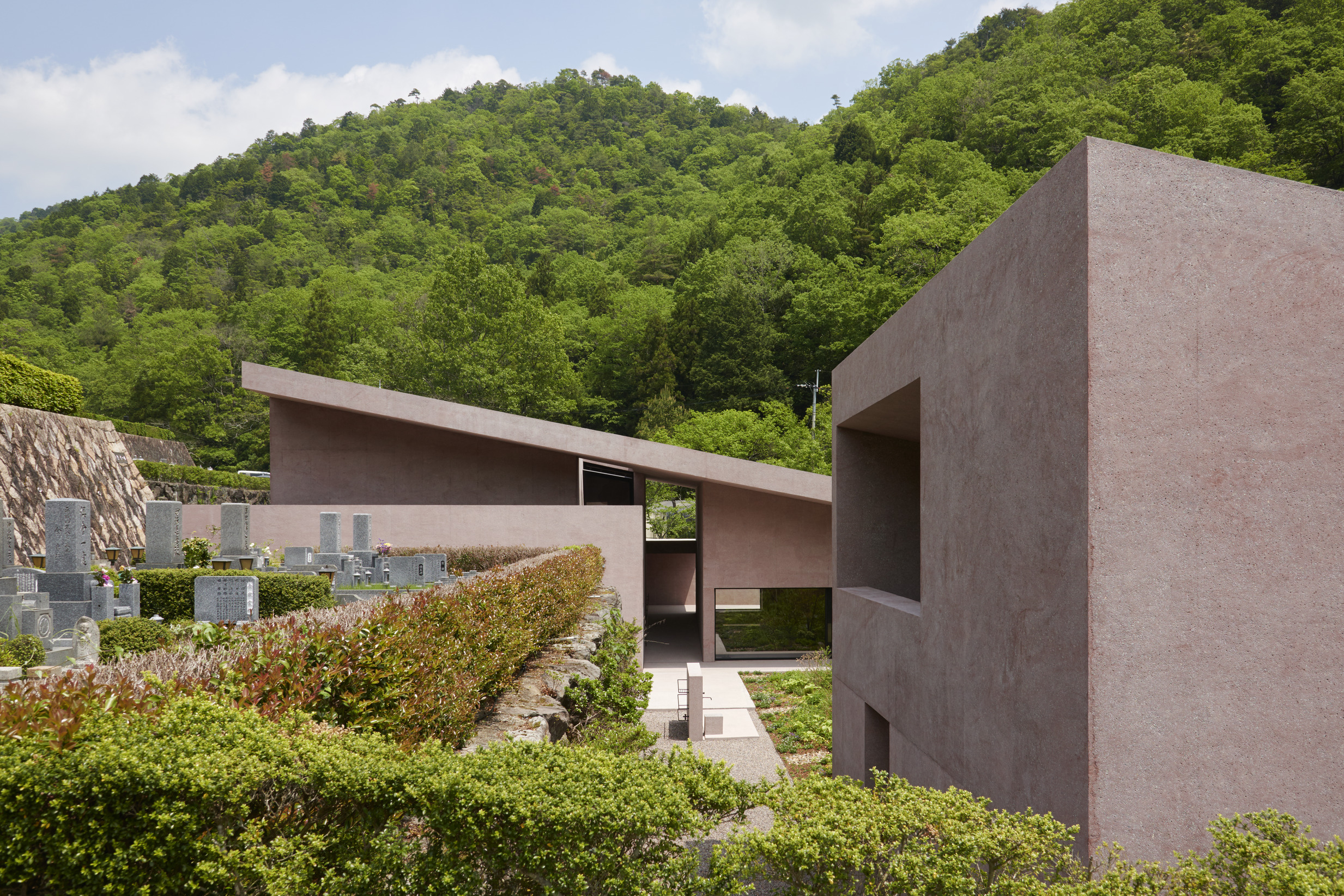
If building with concrete seems nearly inevitable, Chipperfield has frequently attempted to render the substance more comfortable. At the Inagawa Cemetery near Osaka he added a subdued tone of red oxides to the mixture and sandblasted the surfaces, resulting in a decidedly soft, warm feeling. The project is in many ways so discreet it fades into the landscape yet remains one of the most remarkable of the British architect’s oeuvre, a gentle compliment to a country that brought him to professional prominence. The project for a visitor centre and funeral chapel rests at the base of a hill laced with terraces for the tombs, accessed by a grand axial stair that climbs to a shrine at the top. The chapel, visitor centre and several planted courts are all assembled under a single pitched roof, bound by a continuous wall on the side of the parking lot. In plan it conforms to the Japanese love of asymmetry, allowing the stair to penetrate the lower wall and separate the quiet zone of the chapel from the more gregarious area with tables for eating and spaces for gathering. The chapel has an innately sanctified demeanour, similar to the chapel at Las Capuchinas in Mexico City by Luis Barragàn, allowing mysterious indirect light to filter through a barrier of thick walls that orient one’s attention to the end of the room and create a cool, calming atmosphere. One starts to notice in this chapel that the walls, the roof and all of the planes belong to a single, seamless layer of thick concrete, appearing as if carved out of a single block of stone. A thin strip of water trickles down the stairs to terminate in a gentle fountain in the entry court, much like the water features at the Alhambra. Once inside the building the visitor understands without being told or reading that the right side serves for funerary functions and the left with its broad courts for socializing. The role of the plants and the light coming through clerestories moderates the power of the walls and roof to the point that one feels they are in a building that is a landscape.
Scale and Landscape
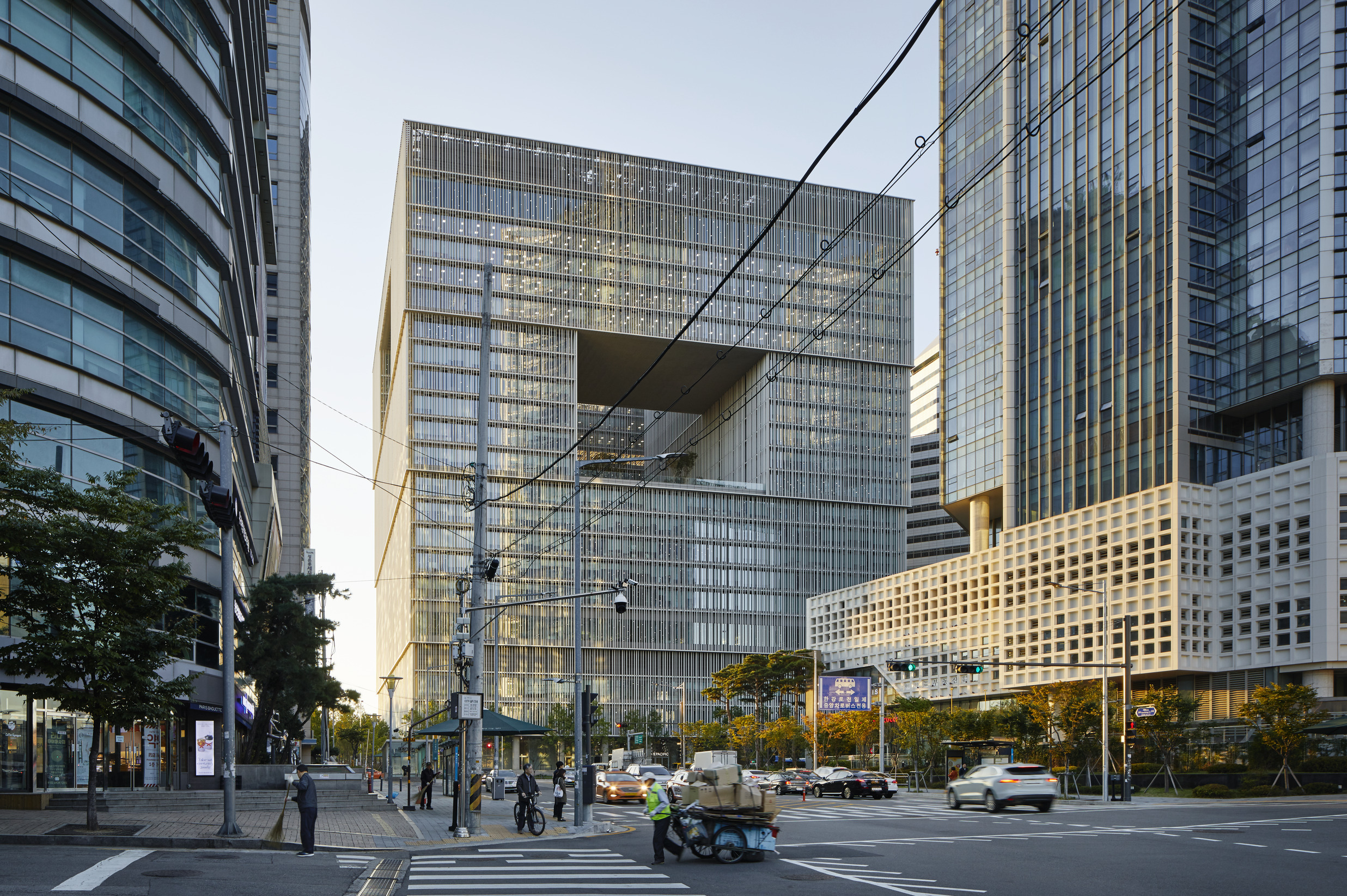
The scale of Chipperfield’s work generally ranges from small to medium: shops, low rise commercial buildings, museums, with only a few very tall structures, such as the Amorepacific headquarters in Seoul. He seems to cherish a primordial desire to make buildings with the intimacy of a home. When he designs houses they invariably have generous courtyards and well-planned zoning of private and public areas. The recent Fayland House, which is really a villa, set in the chalky downs of the Chiltern Hills, extends across an open vale and from above disappears into the surrounding woods due to its planted roof and courtyards. From the lower façade, however, it stretches out like a dam, with eleven stark white brick columns, that would please Palladio, his fellow hedgehog, for their Doric stoutness. The courts that interrupt an L-shaped plan are used to separate the guest quarters, garages, and servant areas from the patron’s areas, which have been arranged with unobstructed views to nature. As with Inagawa the strong structure, in this case clad with chalk-coloured brick, becomes part of the landscape.
As fate would have it, Chipperfield has been rewarded with a return to sources. The Morseletto family of Vicenza invited him to create a performance space in the Cava Arcari quarry where presumably Palladio found the beige sandstone for many of his famous works, including the Teatro Olimpico in Vicenza. Finally the architect was given a chance to design without concrete, transforming a druidic-looking space of grand stone piers into a theatrical setting framed by reflective basins of water. The purity of these rough hewn stones matches the desired affect that one finds throughout Chipperfield’s discreet and solid body of works.


