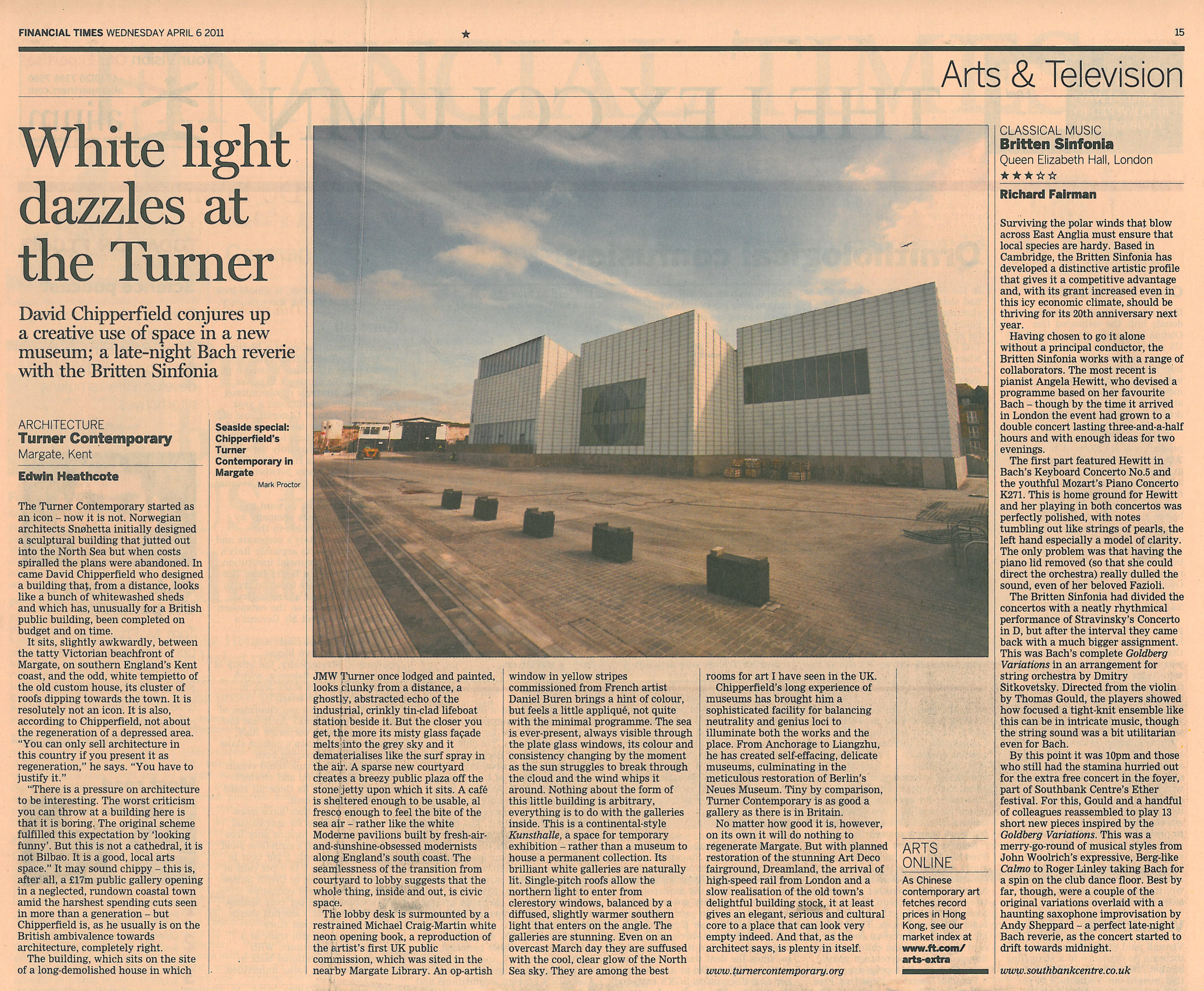
'The galleries are stunning.'
The Turner Contemporary started as an icon – now it is not. Norwegian architects Snøhetta initially designed a sculptural building that jutted out into the North Sea but when costs spiralled the plans were abandoned. In came David Chipperfield who designed a building that, from a distance, looks like a bunch of whitewashed sheds and which has, unusually for a British public building, been completed on budget and on time.
It sits, slightly awkwardly, between the tatty Victorian beachfront of Margate, on southern England’s Kent coast, and the odd, white tempietto of the old custom house, its cluster of roofs dipping towards the town. It is resolutely not an icon. It is also, according to Chipperfield, not about the regeneration of a depressed area. ‘You can only sell architecture in this country if you present it as regeneration,’ he says. ‘You have to justify it.’
‘There is a pressure on architecture to be interesting. The worst criticism you can throw at a building here is that it is boring. The original scheme fulfilled this expectation by ‘looking funny’. But this is not a cathedral, it is not Bilbao. It is a good, local arts space.’ It may sound chippy – this is, after all, a £17m public gallery opening in a neglected, rundown coastal town amid the harshest spending cuts seen in more than a generation – but Chipperfield is, as he usually is on the British ambivalence towards architecture, completely right.
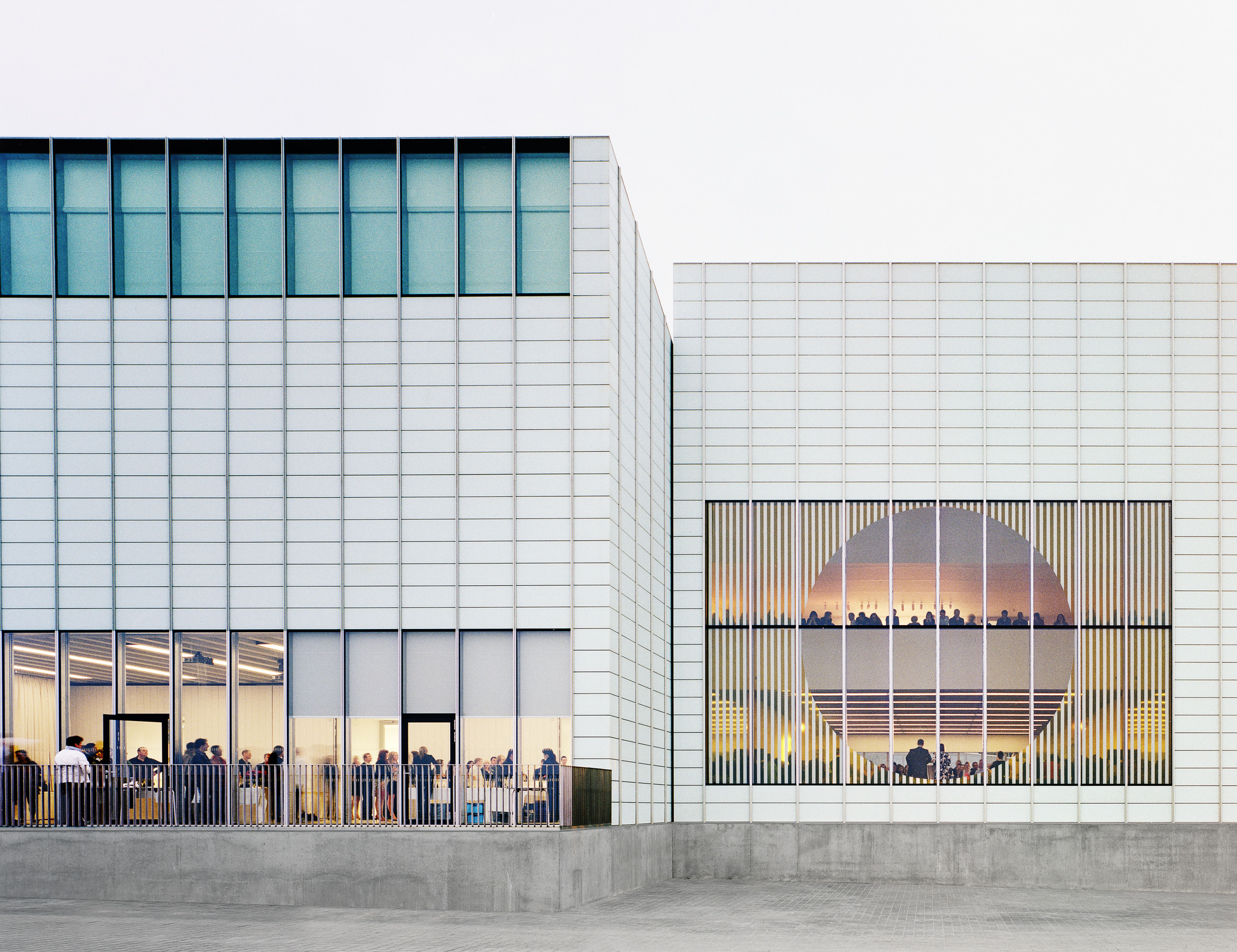
The building, which sits on the site of a long-demolished house in which JMW Turner once lodged and painted, looks clunky from a distance, a ghostly, abstracted echo of the industrial, crinkly tin-clad lifeboat station beside it. But the closer you get, the more its misty glass façade melts into the grey sky and it dematerialises like the surf spray in the air. A sparse new courtyard creates a breezy public plaza off the stone jetty upon which it sits. A café is sheltered enough to be usable, al fresco enough to feel the bite of the sea air – rather like the white Moderne pavilions built by fresh-air-and-sunshine-obsessed modernists along England’s south coast. The seamlessness of the transition from courtyard to lobby suggests that the whole thing, inside and out, is civic space.
The lobby desk is surmounted by a restrained Michael Craig-Martin white neon opening book, a reproduction of the artist’s first UK public commission, which was sited in the nearby Margate Library. An op-artish window in yellow stripes commissioned from French artist Daniel Buren brings a hint of colour, but feels a little appliqué, not quite with the minimal programme. The sea is ever-present, always visible through the plate glass windows, its colour and consistency changing by the moment as the sun struggles to break through the cloud and the wind whips it around. Nothing about the form of this little building is arbitrary, everything is to do with the galleries inside. This is a continental-style Kunsthalle, a space for temporary exhibition – rather than a museum to house a permanent collection. Its brilliant white galleries are naturally lit. Single-pitch roofs allow the northern light to enter from clerestory windows, balanced by a diffused, slightly warmer southern light that enters on the angle. The galleries are stunning. Even on an overcast March day they are suffused with the cool, clear glow of the North Sea sky. They are among the best rooms for art I have seen in the UK.
Chipperfield’s long experience of museums has brought him a sophisticated facility for balancing neutrality and genius loci to illuminate both the works and the place. From Anchorage to Liangzhu, he has created self-effacing, delicate museums, culminating in the Berlin’s Neues Museum. Tiny by comparison, Turner Contemporary is as good a gallery as there is in Britain.
No matter how good it is, however, on its own it will do nothing to regenerate Margate. But with planned restoration of the stunning Art Deco fairground, Dreamland, the arrival of high-speed rail from London and a slow realisation of the old town’s delightful building stock, it at least gives an elegant, serious and cultural core to a place that can look very empty. And that, as the architect says, is plenty in itself.


