Valentino flagship store, Piazza di Spagna
Rome, Italy
2014–15
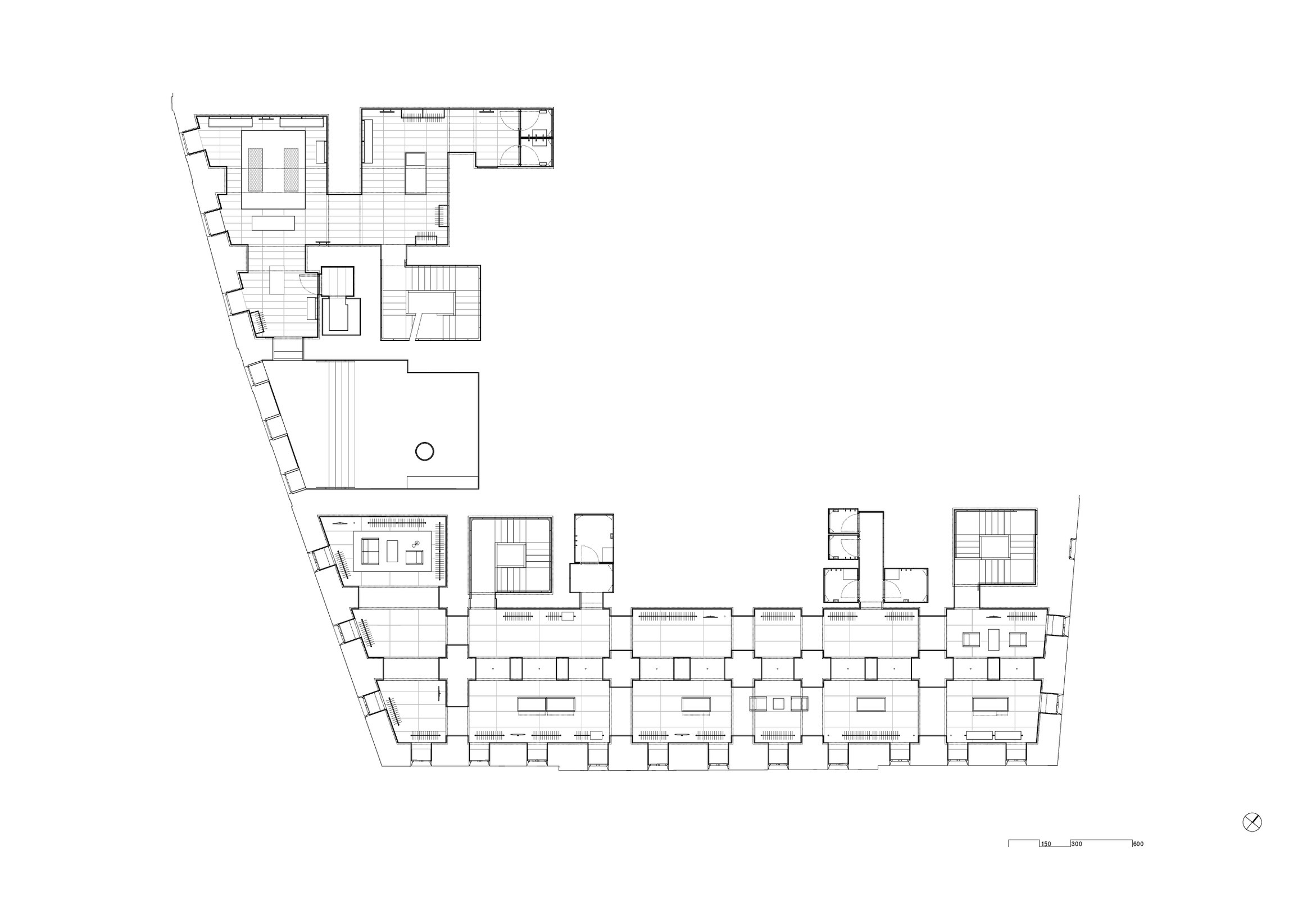
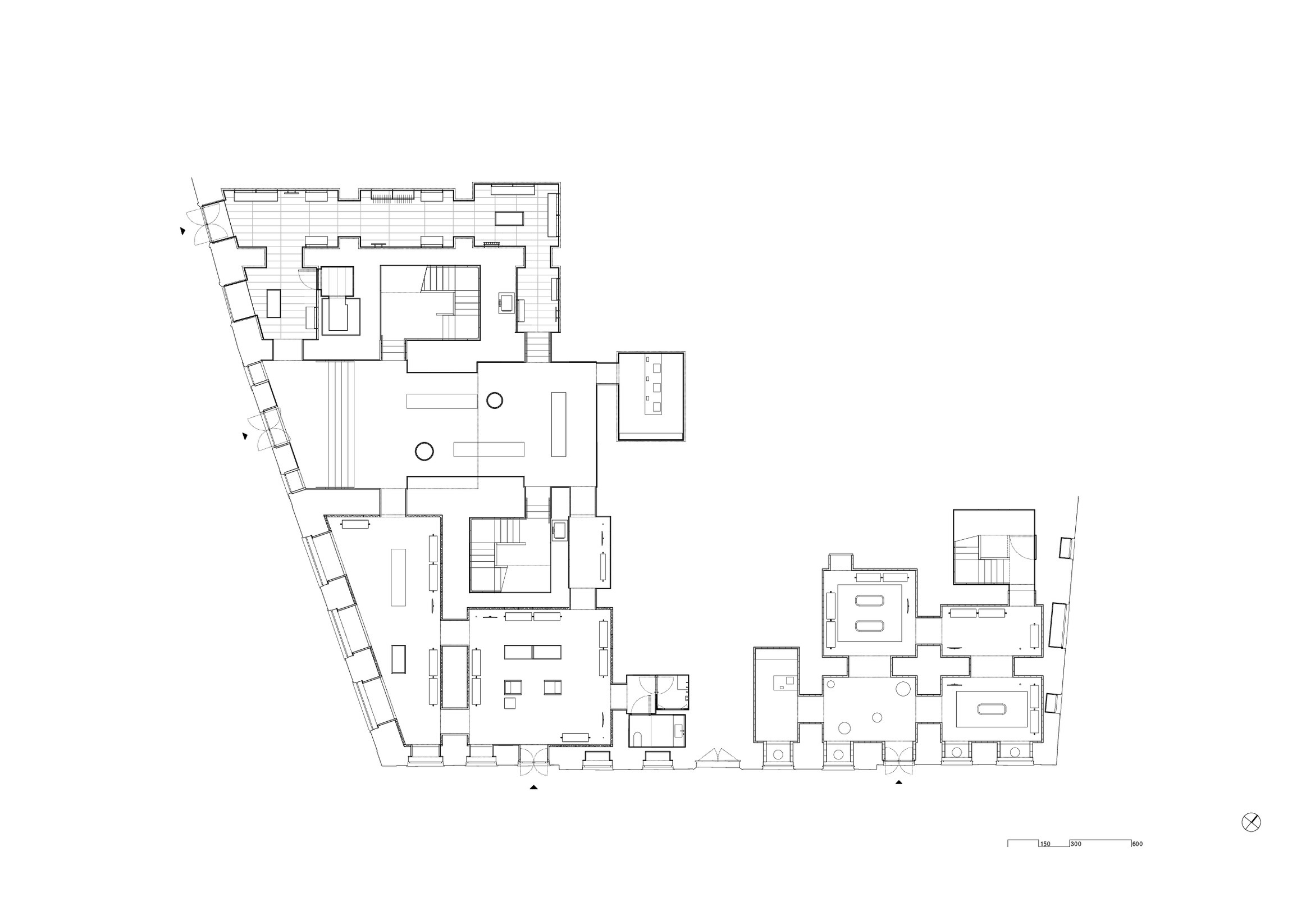
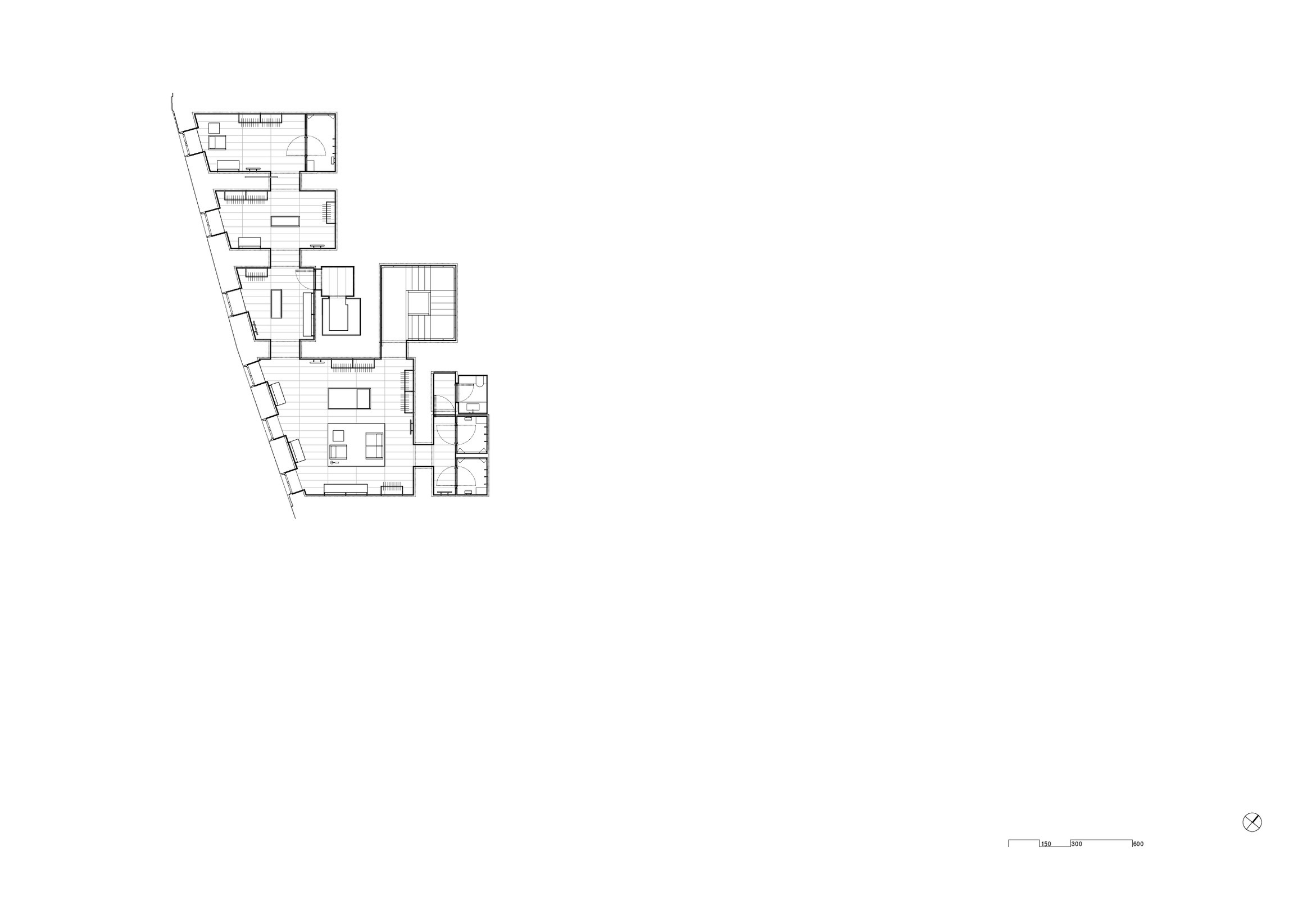
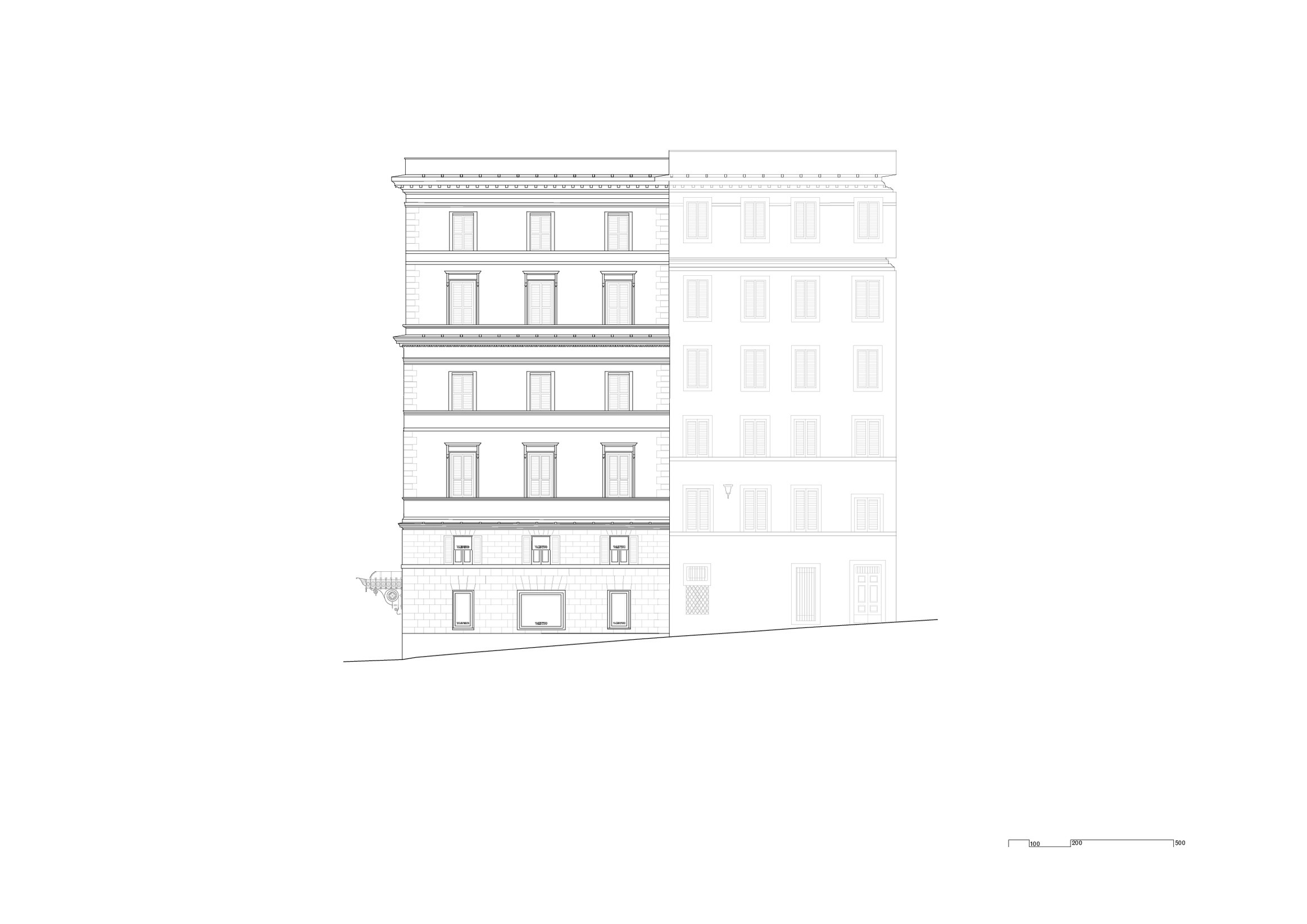
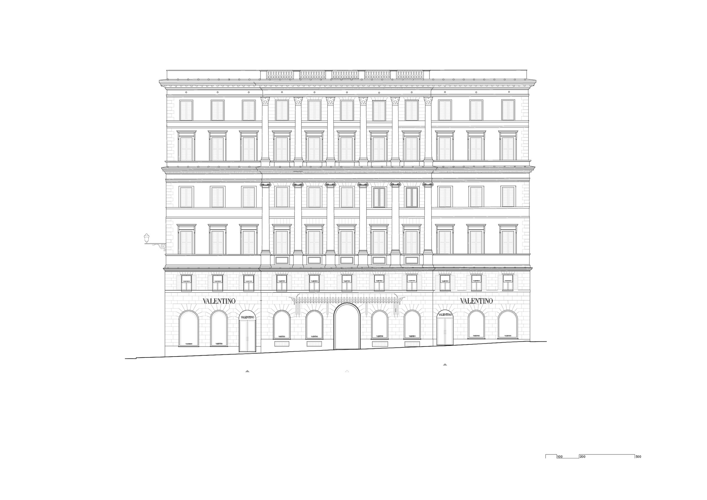
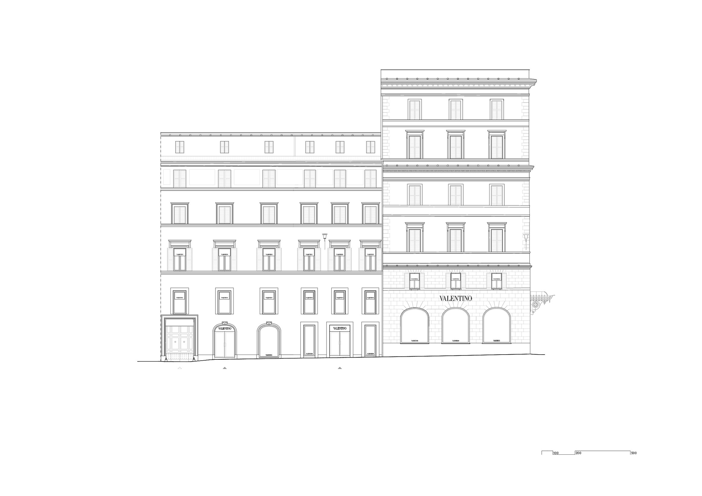
The Valentino Rome flagship store spans several interconnected buildings across Piazza di Spagna and Piazza Mignanelli, in the heart of the brand’s hometown. The project involves the refurbishment of existing buildings, including a former American Express edifice, and neighbours the sixteenth-century Palazzo Gabrielli-Mignanelli, historically the main creative headquarters of Valentino. Choosing to build its most representative boutique in this location, the Fashion House declares its intent to link the brand’s history to its contemporary identity and the project aims to contribute to the urban fabric with continuity and consistency.
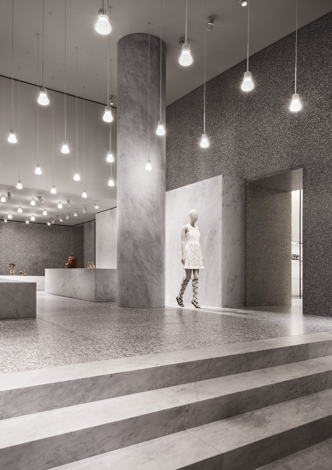
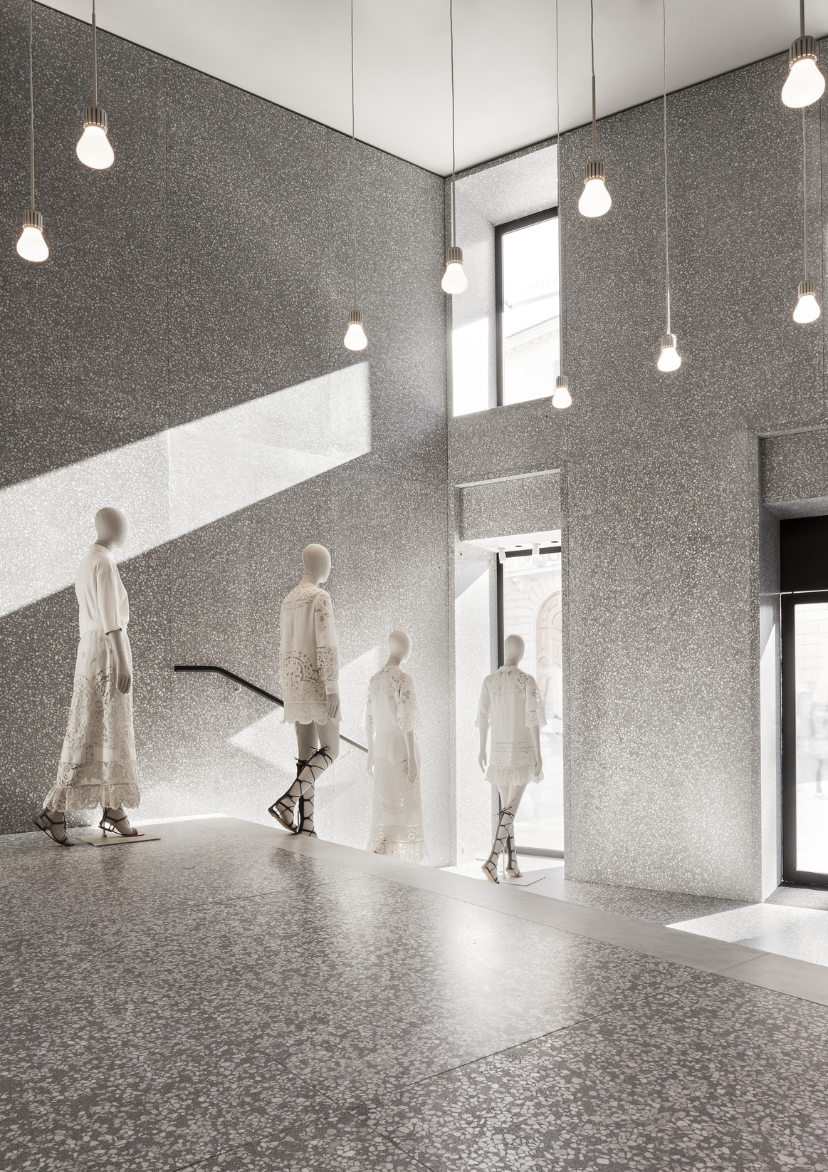
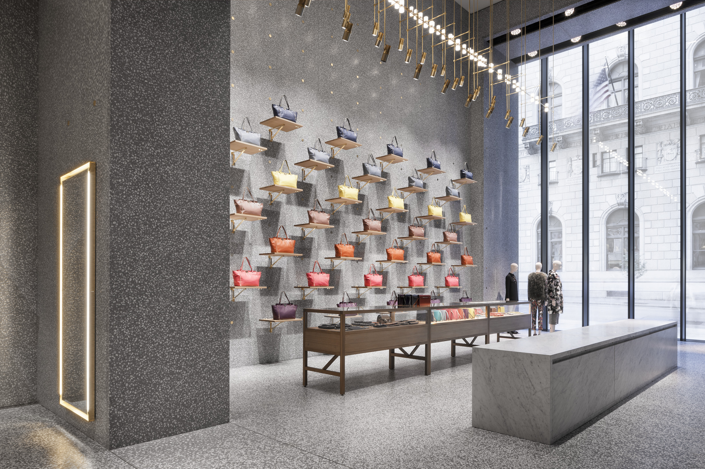
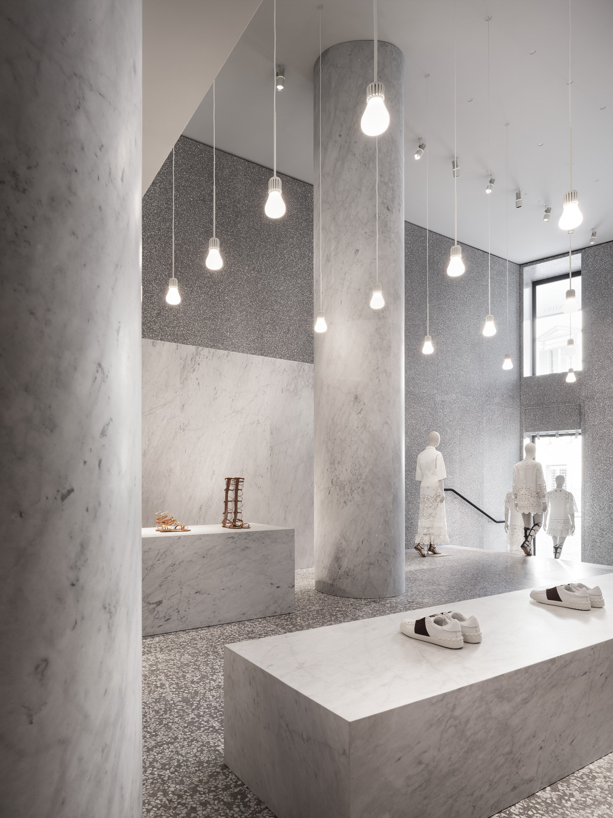
Entrance hall to Valentino flagship store in Rome, representing the concept of creating proper architectures rather than retail fit-outs.
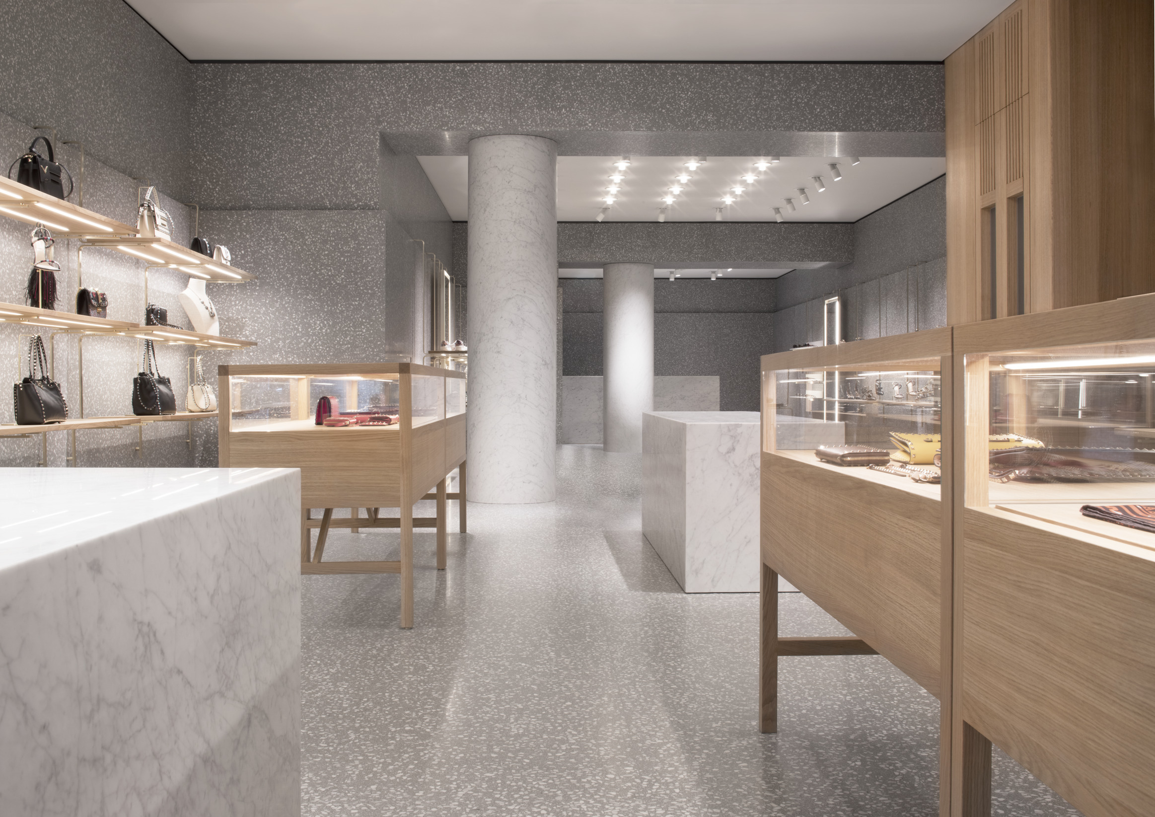
The flagship store follows the principle of combining old and new in a sequence of spaces filled with high-end solid materials and finishes, creating proper architectures rather than showroom fit-outs. The store concept is rooted in the local context and therefore implements a series of variations and emblematic features of Roman vernacular architecture, especially within the building of Piazza Mignanelli.
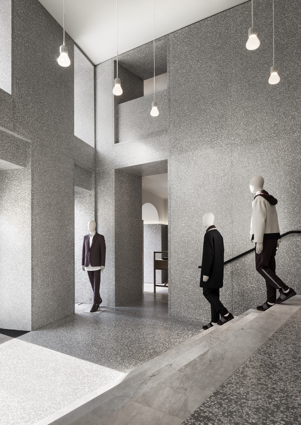
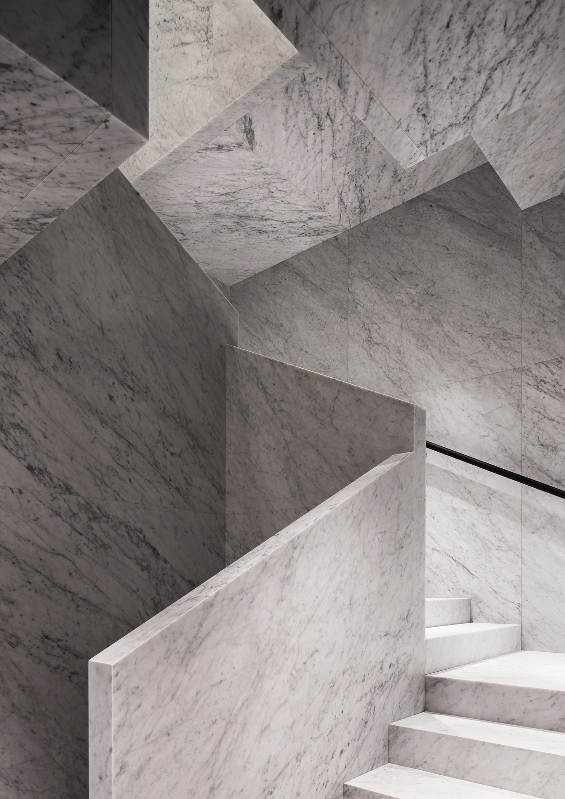
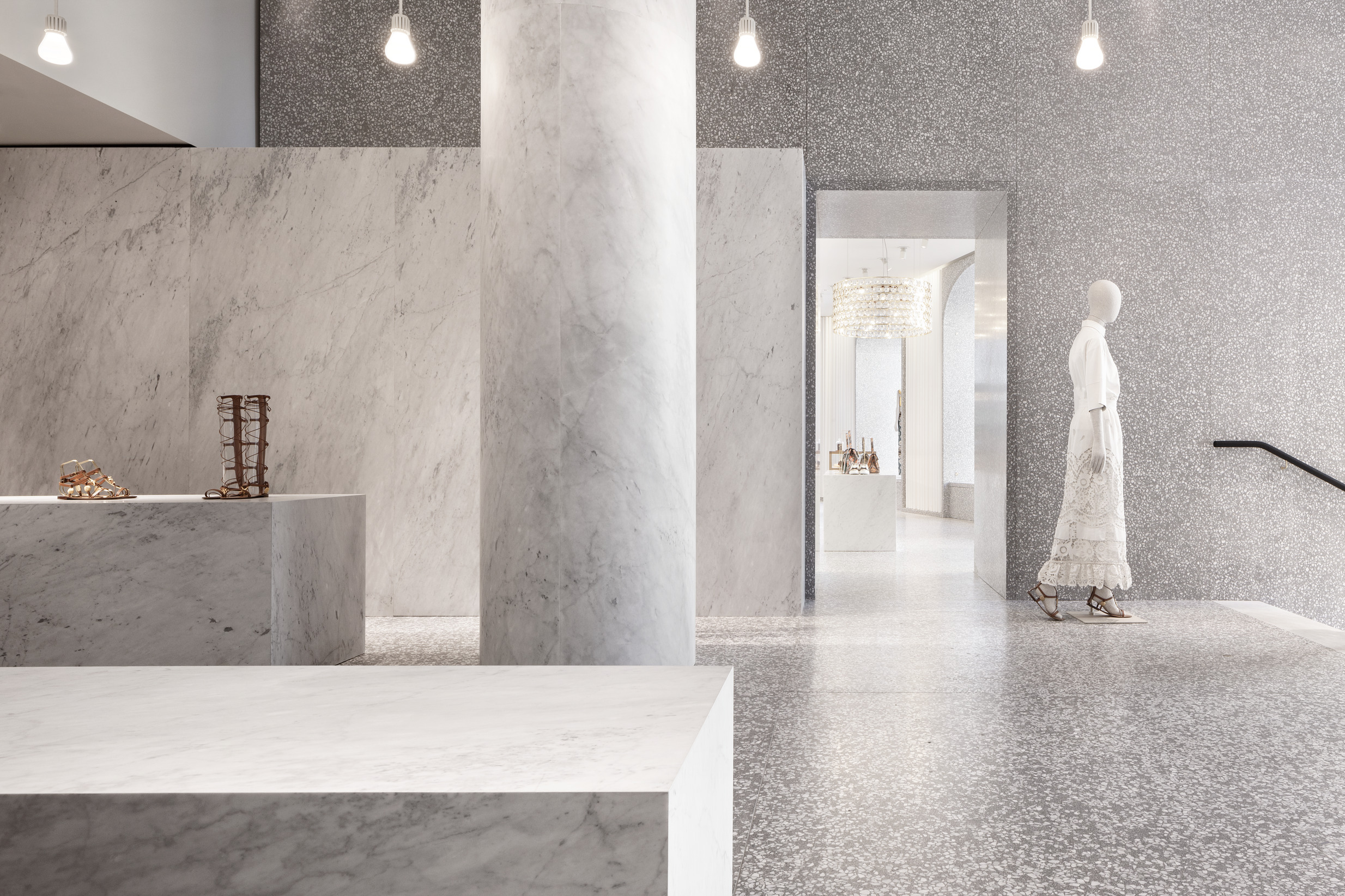
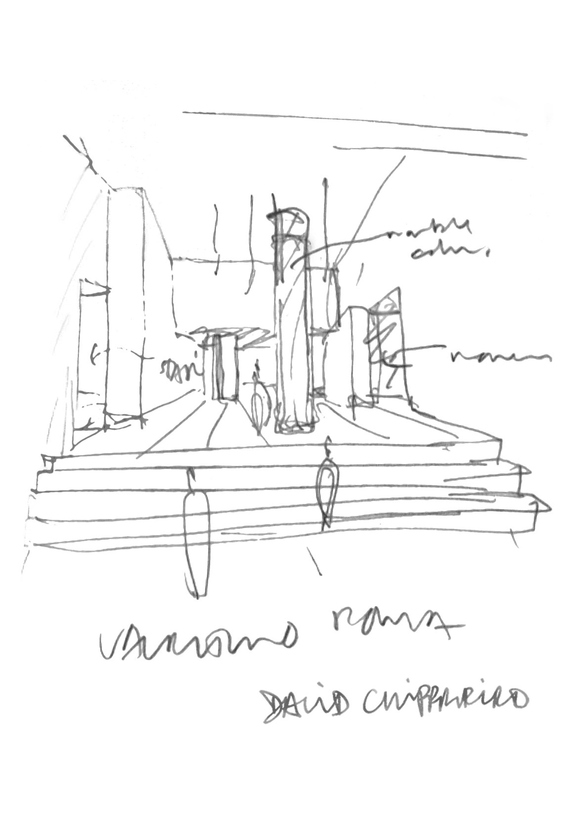
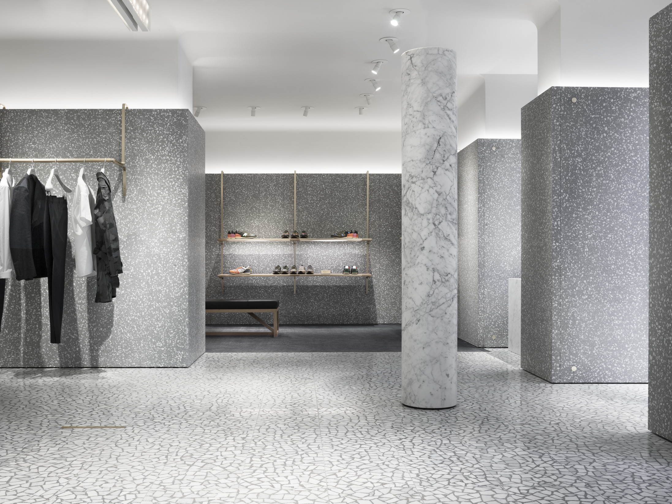
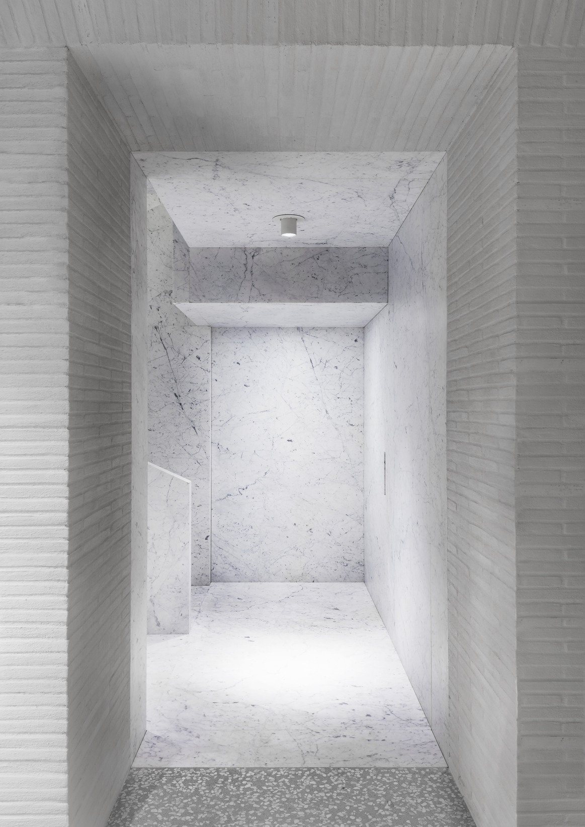
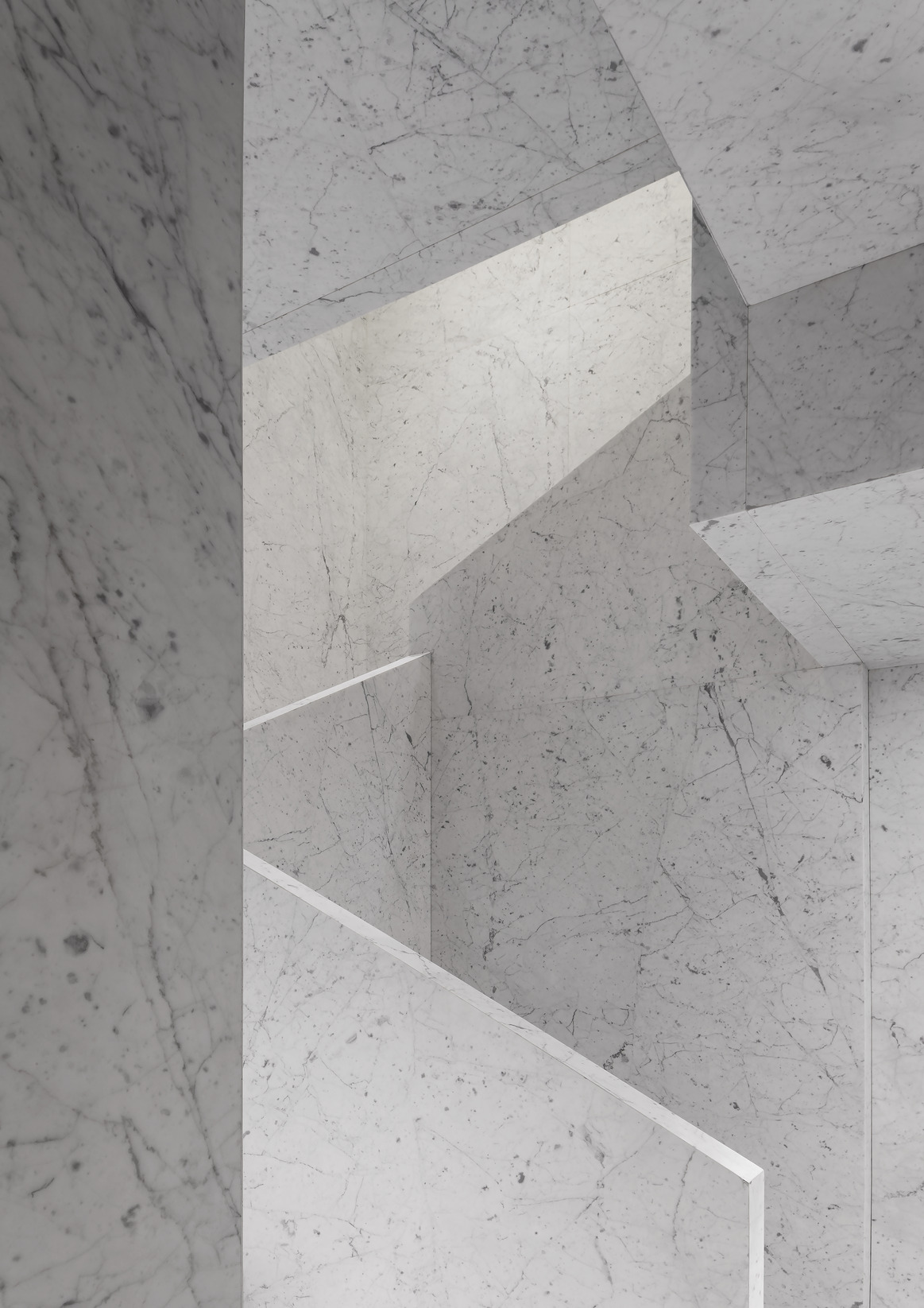
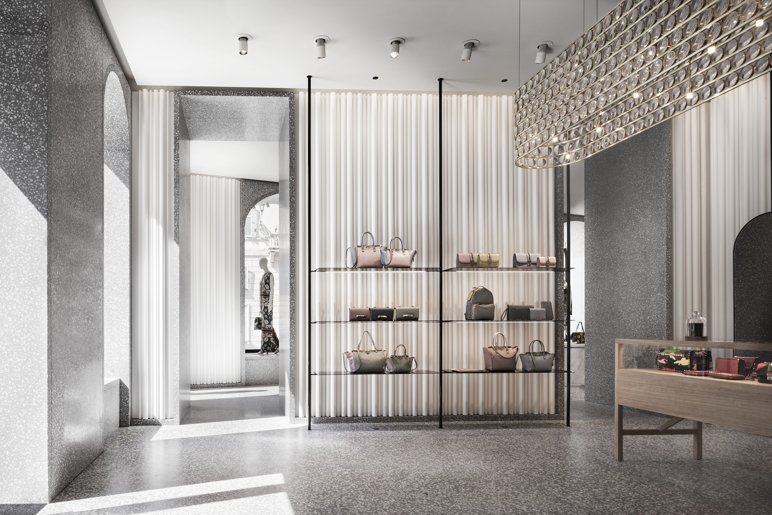
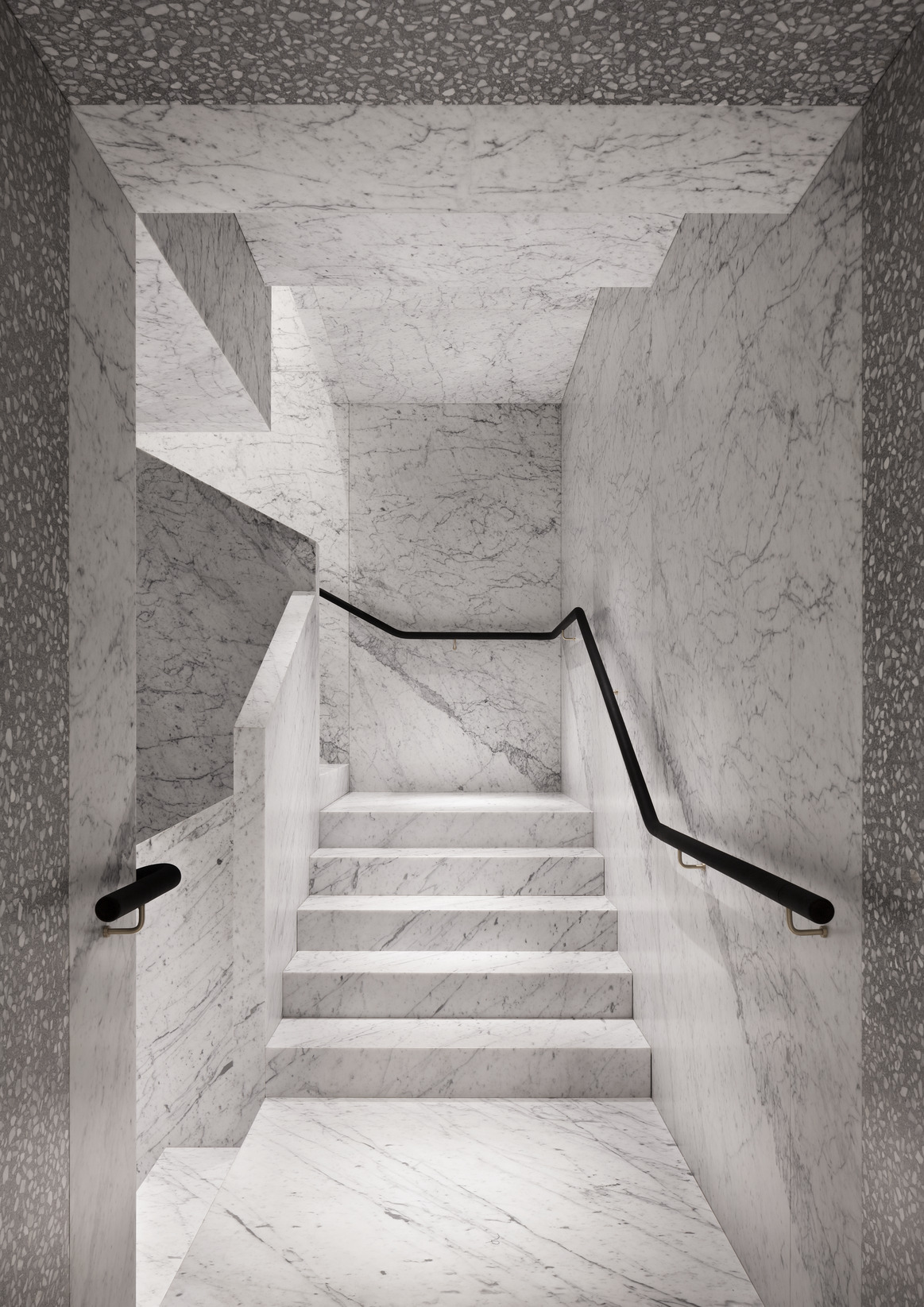
The design plays around solid volumes and pure forms, grounded in a palette of grey Venetian terrazzo with Carrara chippings, timber and marble, allowing the visitor to focus on the collections in an unobtrusive architectural environment. The 6-metre-high store atrium features the solid marble columns that, together with terrazzo walls, act as archetypes of the whole architectural concept. The two main staircases, entirely in marble, appear as though carved from a single block and connect all levels with uniformity and balance.
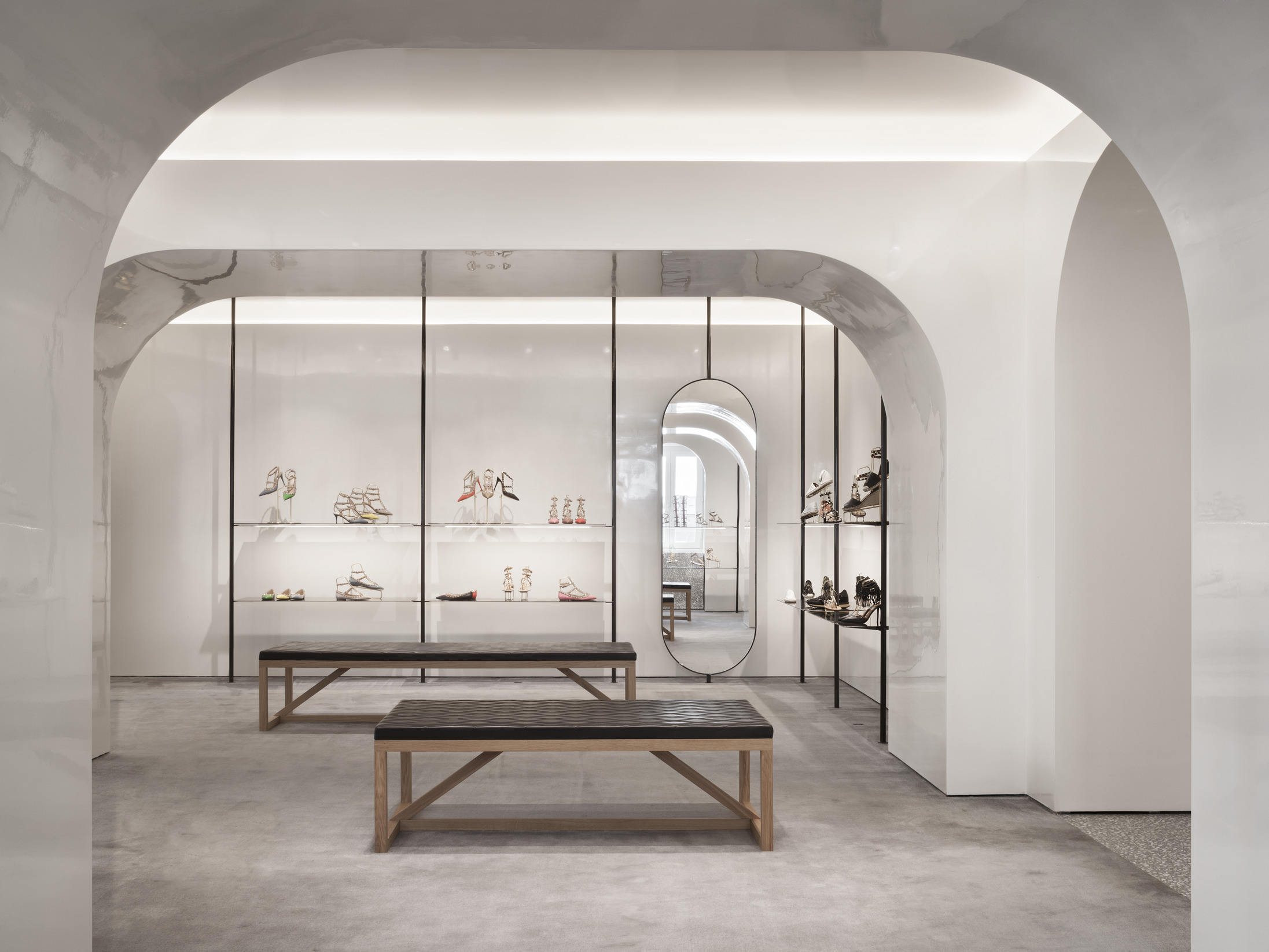
Within the Piazza di Spagna buildings, each ground floor displays the women’s collections within an enfilade of rooms, each differing in atmosphere. This layout not only separates the categories of merchandise, but also allows each room to shape a distinctive character with a customised palette of colours, textures and lights.
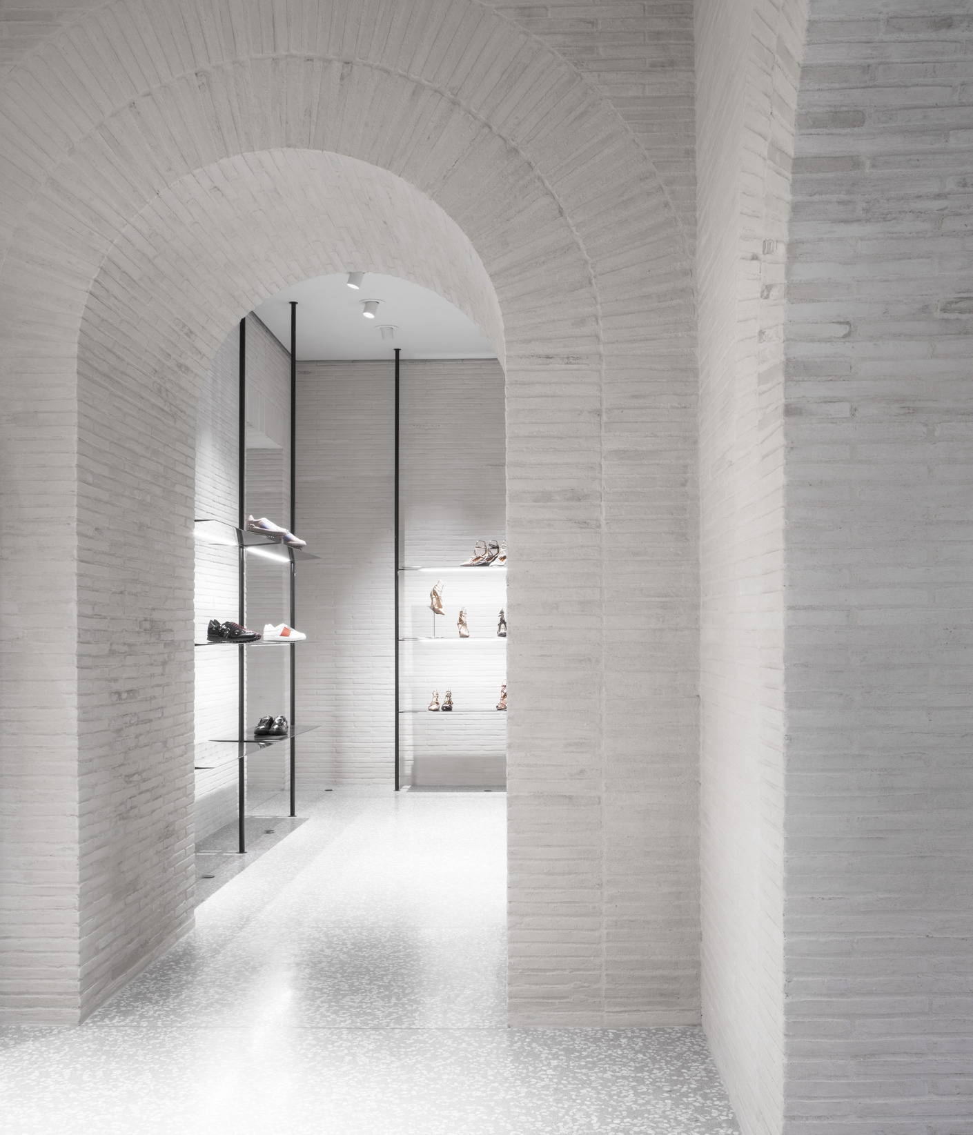
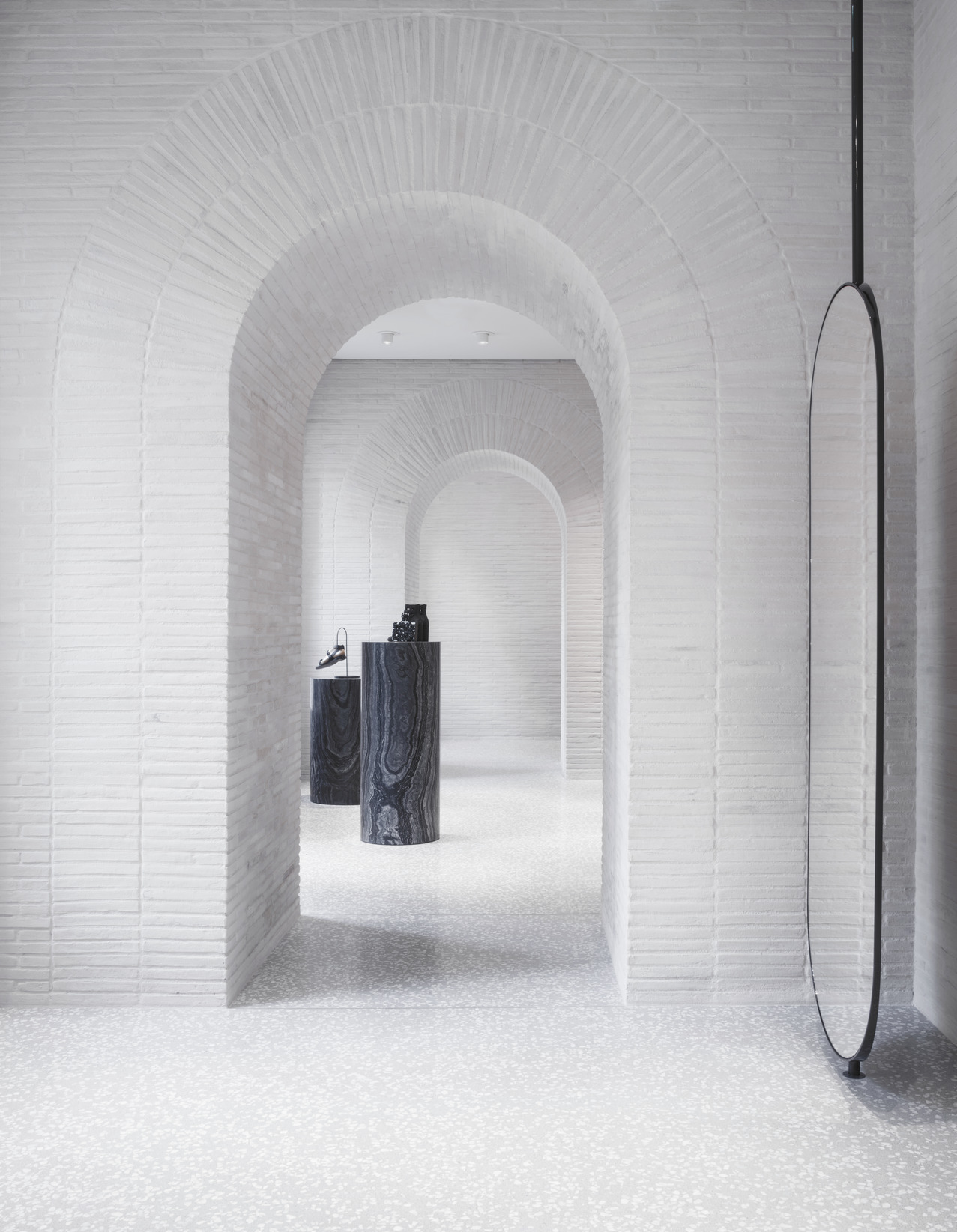
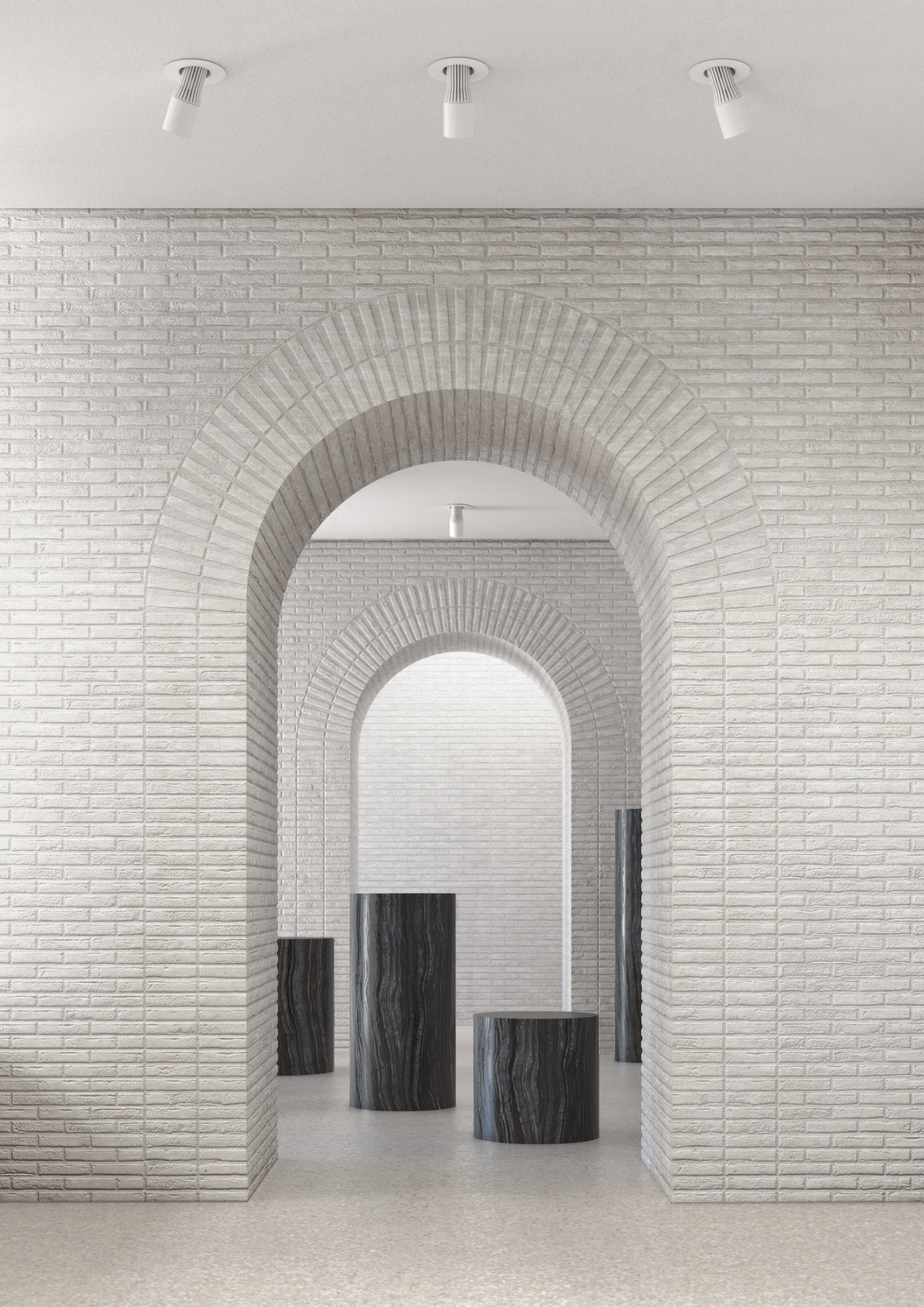
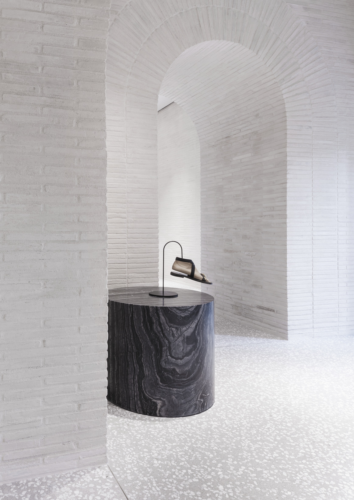
The Roman character within the Piazza Mignanelli building is expressed through a series of rooms on the ground floor, enclosed by thick exposed brick walls connected together by archways. The construction of the arches follows the ancient Roman tradition of combining both a load-bearing and a reinforcing arch. The red brick used was specifically created with a dimension longer than usual. As such, it resembles Roman Bricks and provides a backdrop. The long bricks are then whitewashed to create a more neutral yet textured finish, recalling those realized by the Benedictine Monk and Architect Dom Hans Van Der Laan.
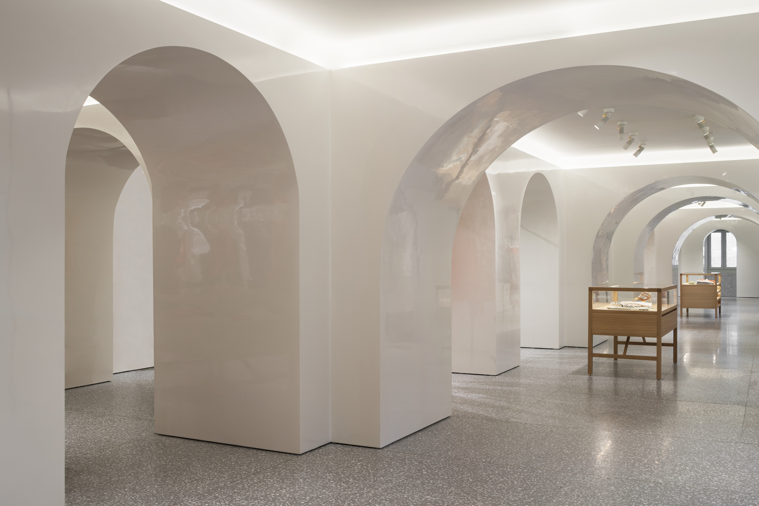
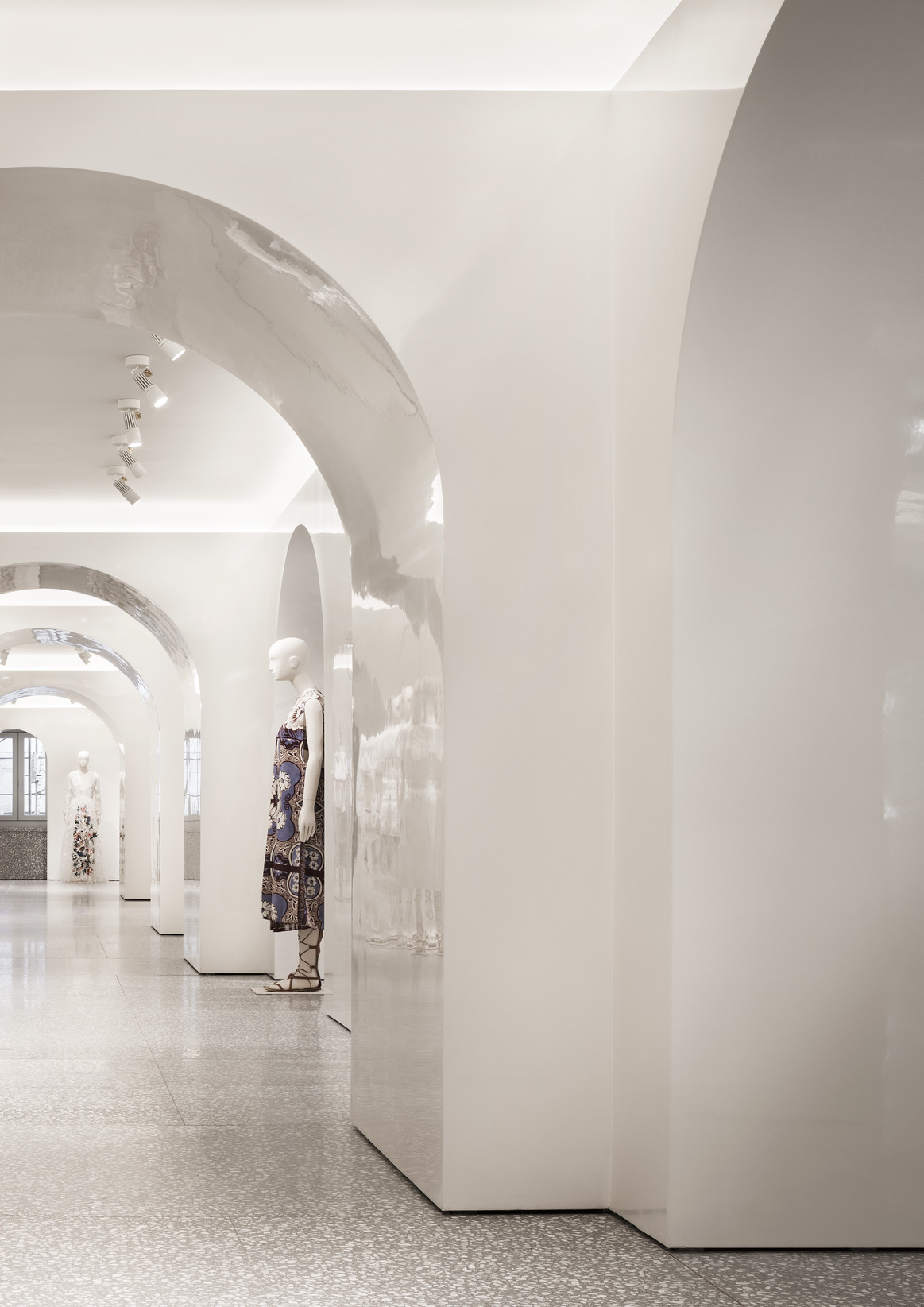
While the thick structural arches at ground level declare their supporting role, the first floor contains light, non-structural arches in polished white plaster to enhance the products. Suspended elements and oak shelving serve to display the collections, supported by polished brass fixtures around the perimeter. On every level, the Man store of Piazza Mignanelli features terrazzo walls and Palladiana floors.
Data and credits
- Project start
- 2013
- Completion
- 2015
- Gross floor area
- 1,470 m²
- Client
- Valentino SpA
- Architect
- David Chipperfield Architects Milan
- Directors
- Giuseppe Zampieri
- Associate Directors
- Giuseppe Sirica
- Associates
- Marie Mincke
- Project architect
- Marie Mincke, Federica Zerbo
- Project team
- Filippo Carcano, Francesca Carino, Tommaso Certo, Salvatore Contaldo, Paolo Dell’Elce, Matteo D’Errico, Tsukasa Goto, Maris Kojuharov, Eugenio Matteazzi, Stefano Penazzi, Lorenzo Rossettini, Letizia Somenzi, Claudia Soricelli, Paolo Volpetti, Carlo Zucchia
- Local architect
- Polis Srl
- General contractor
- Sice Previt
- Structural engineer
- Sic-Consulting, Scl Ingegneria Strutturale, Gruppo Sintesi
- Lighting consultant
- Viabizzuno Srl
- Facade consultant
- Ditta Riva Srl
- Photography
- Santi Caleca
- Stone/terrazzo supplier and installer
- Laboratorio Morseletto
- Site surveyor
- Milano Rilievi
