Valentino flagship store, Fifth Avenue
New York, USA
2013–14
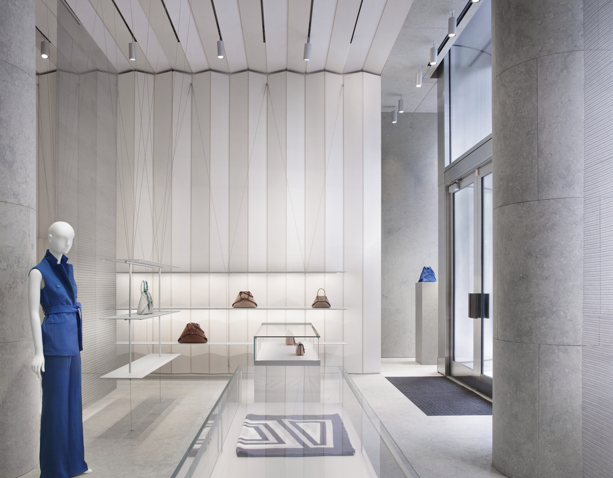
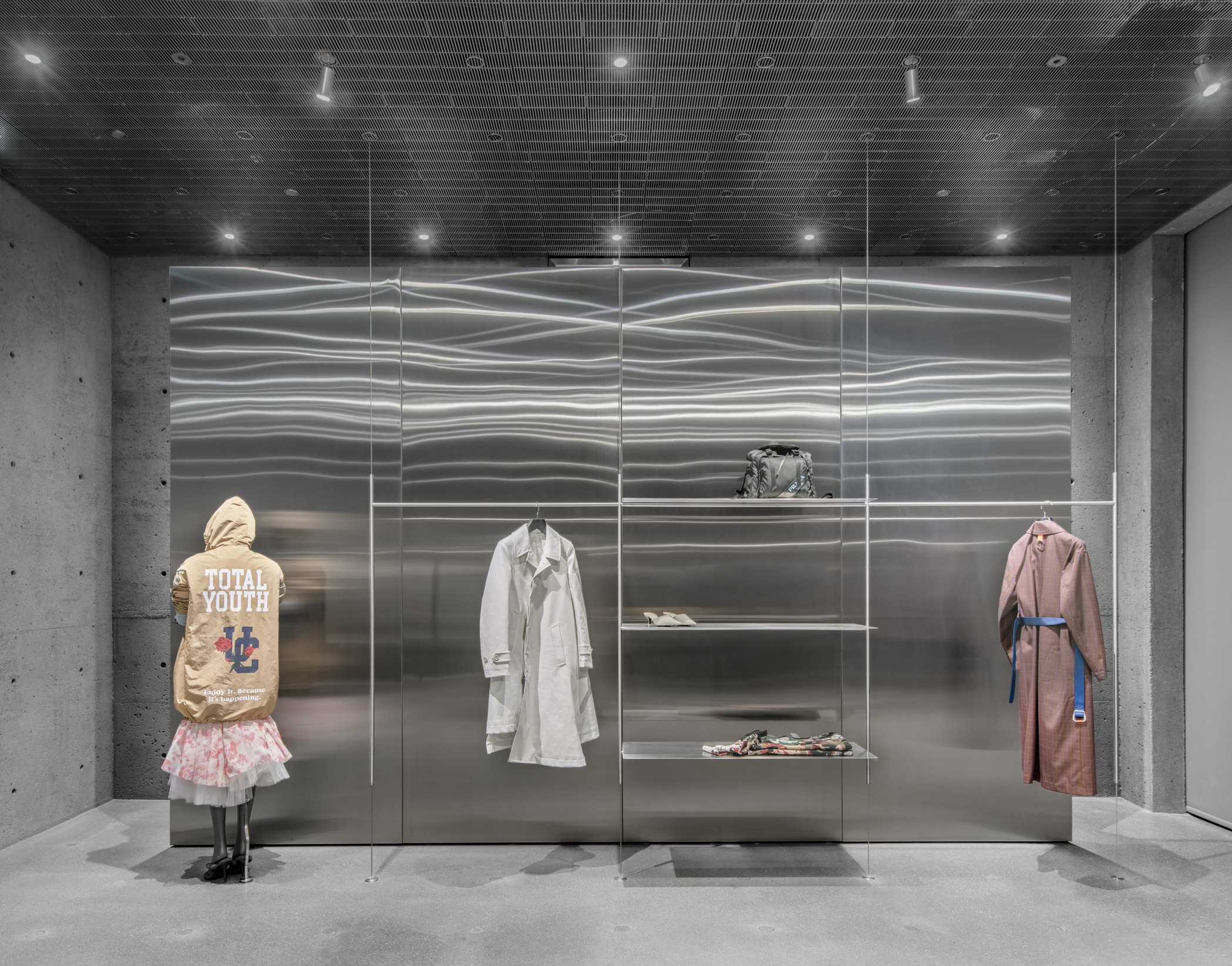
Located on Fifth Avenue in the former Takashimaya Department Store, designed by John Burgee and Philip Johnson, the Valentino New York flagship store expresses a combination of old and new. The 1,100 square metre store generates a palazzo-like atmosphere, steering away from a traditional showroom approach and promoting a more architectural retail format instead, while still maintaining the brand’s values of craftsmanship, romanticism and classical style.
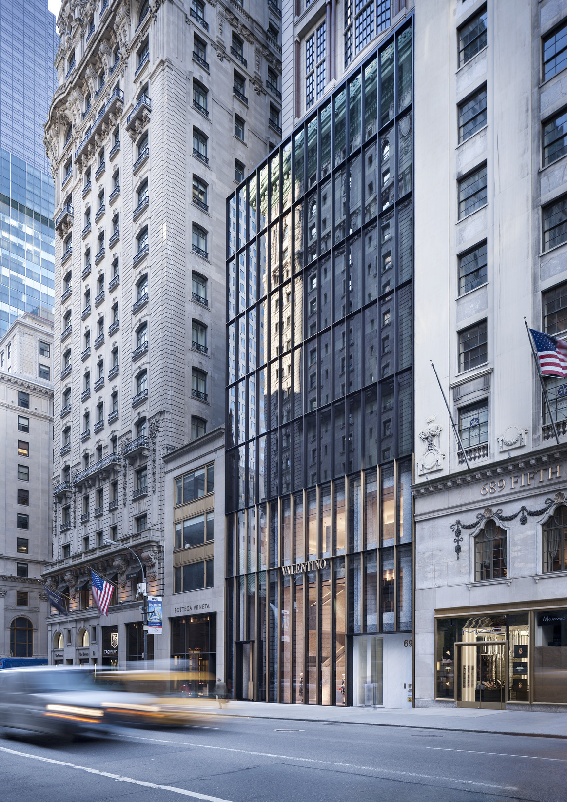
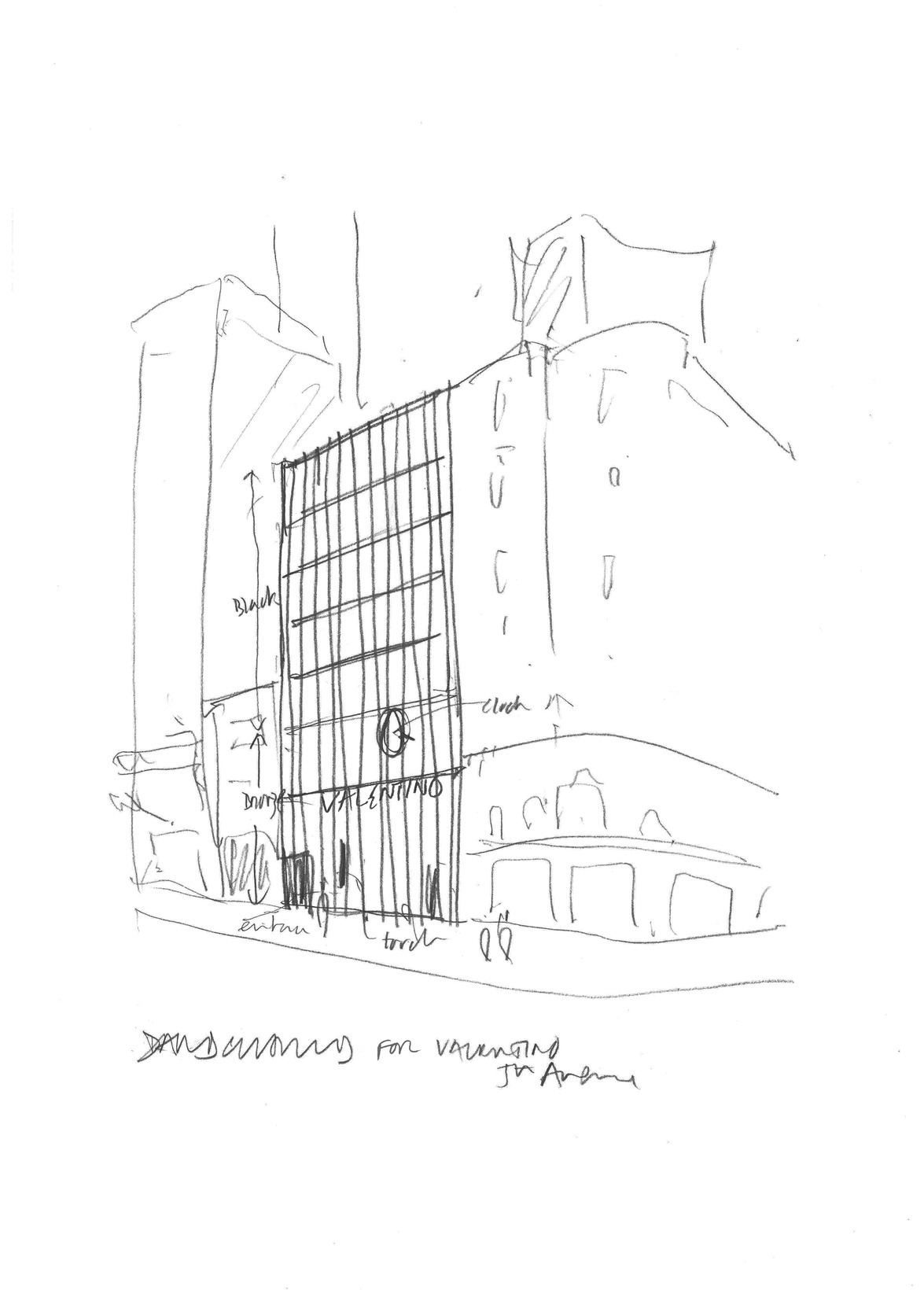
The façade of Valentino flagship store on Fifth Avenue pays homage to the city’s modernist icons, such as Mies van der Rohe’s Seagram Building.
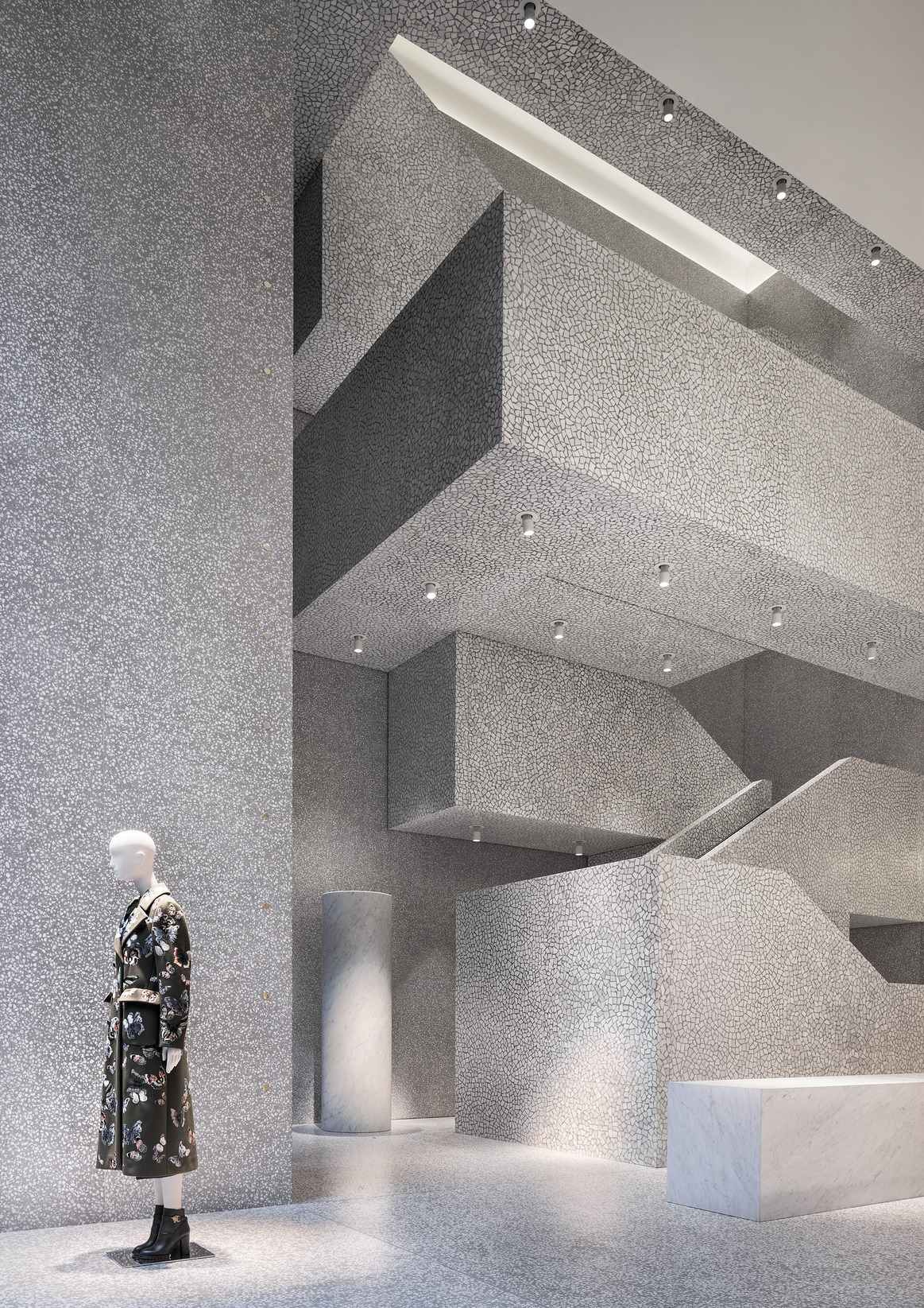
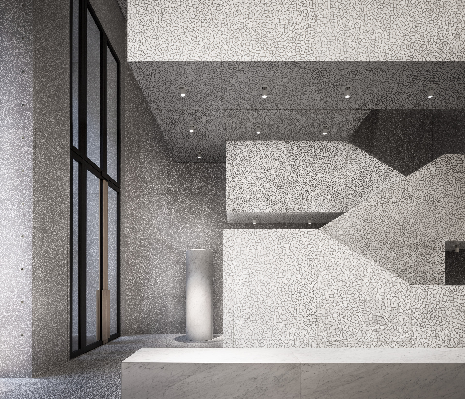
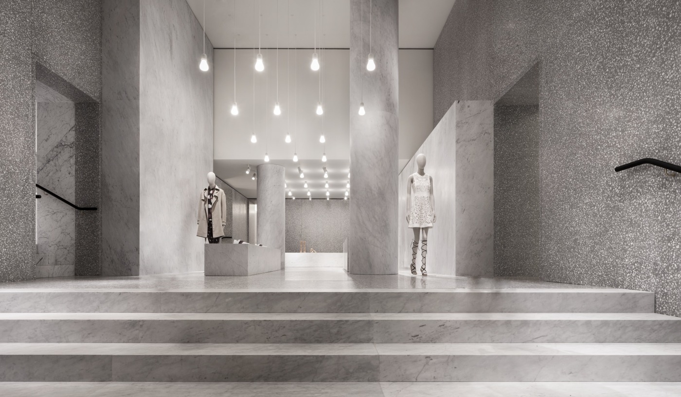
Architecture is brought into the store rather than remaining on the exterior alone. The concept thus creates a proper interior scenography, through architectural features such as staircases, walls and columns, which remain exposed to reveal their intrinsic materiality and to complement the collections on display. A sense of permanence and purity imbues the store to enhance the quality of the products.
While the store concept has been implemented in numerous locations worldwide, the Fifth Avenue flagship store distinguishes itself for specific developments, starting from the custom-designed transparent eight-storey façade. Composed of black steel and aluminium, it is inspired by some of the city’s modernist icons, such as Mies van der Rohe’s Seagram Building. At the lower part of the façade, the vertical bars have a brass finish as to unify the three retail levels, while the five upper floors remain black.
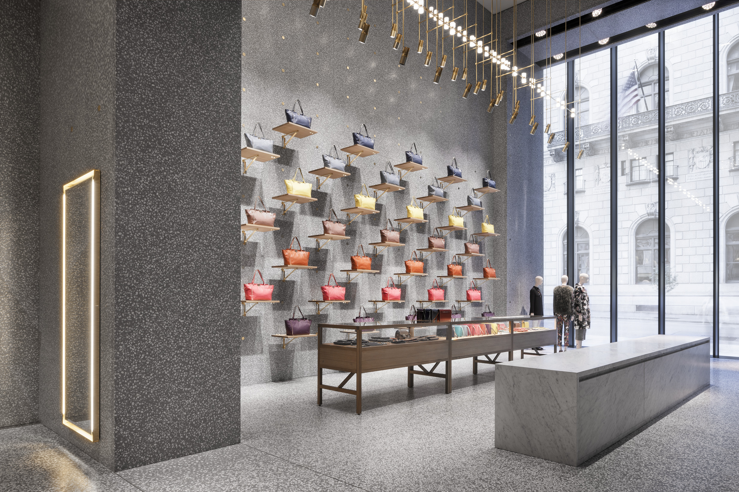
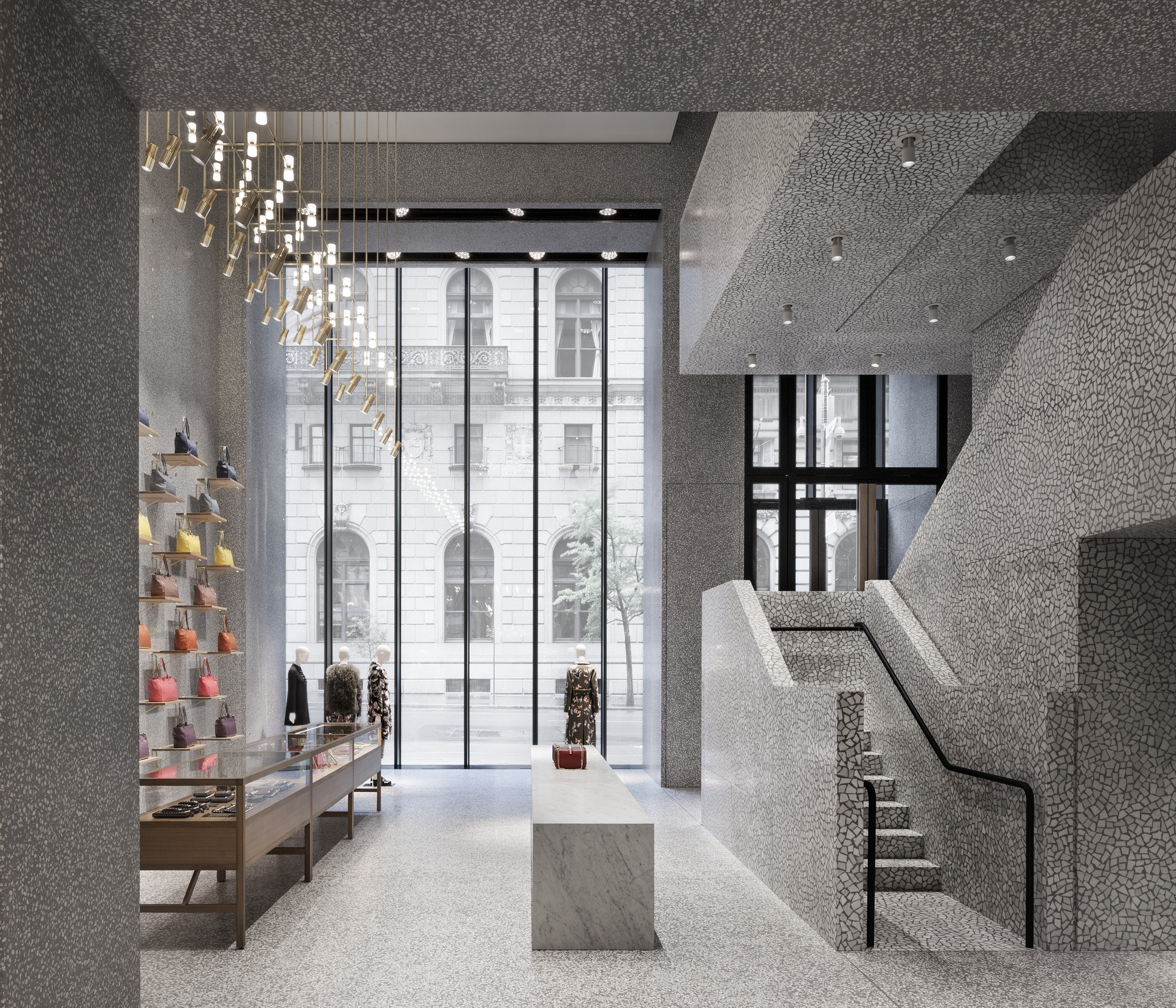
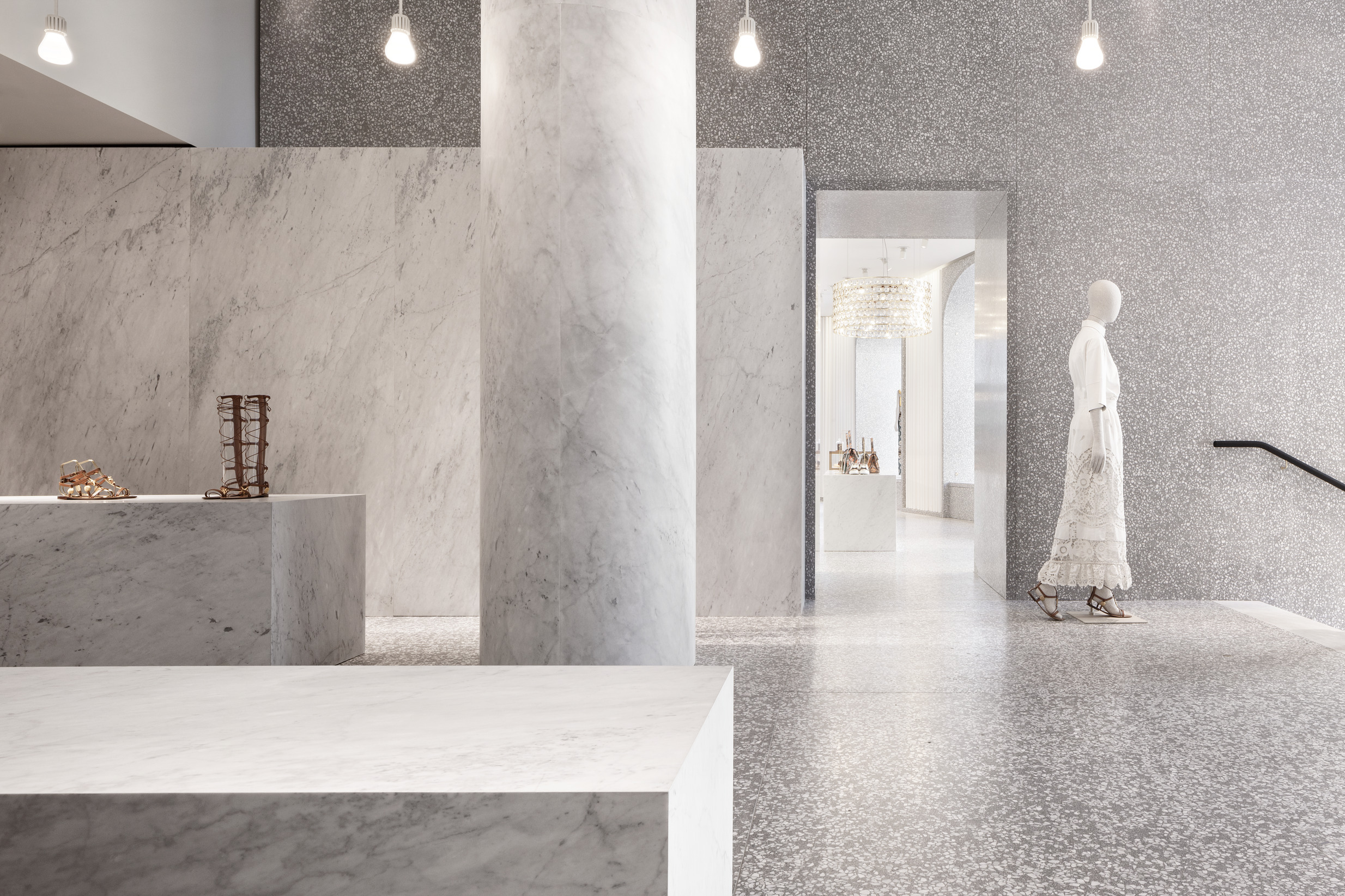
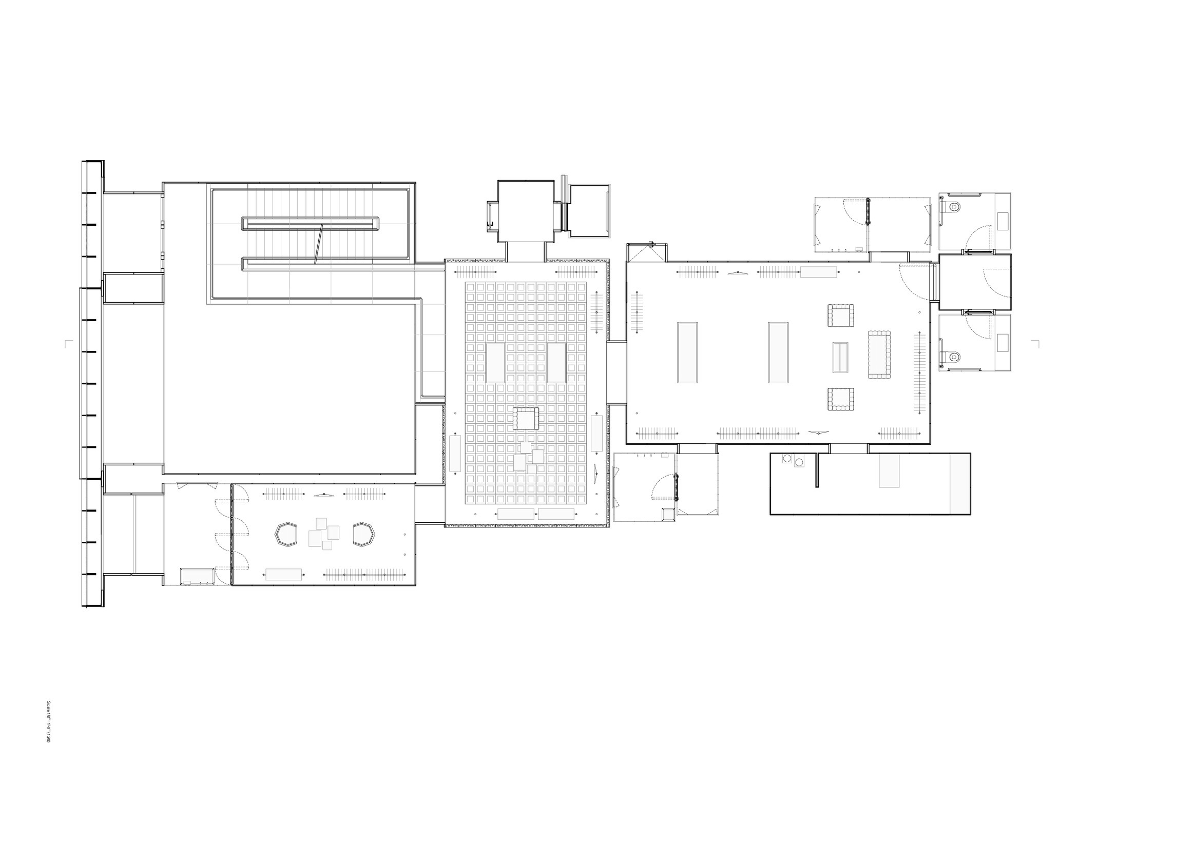
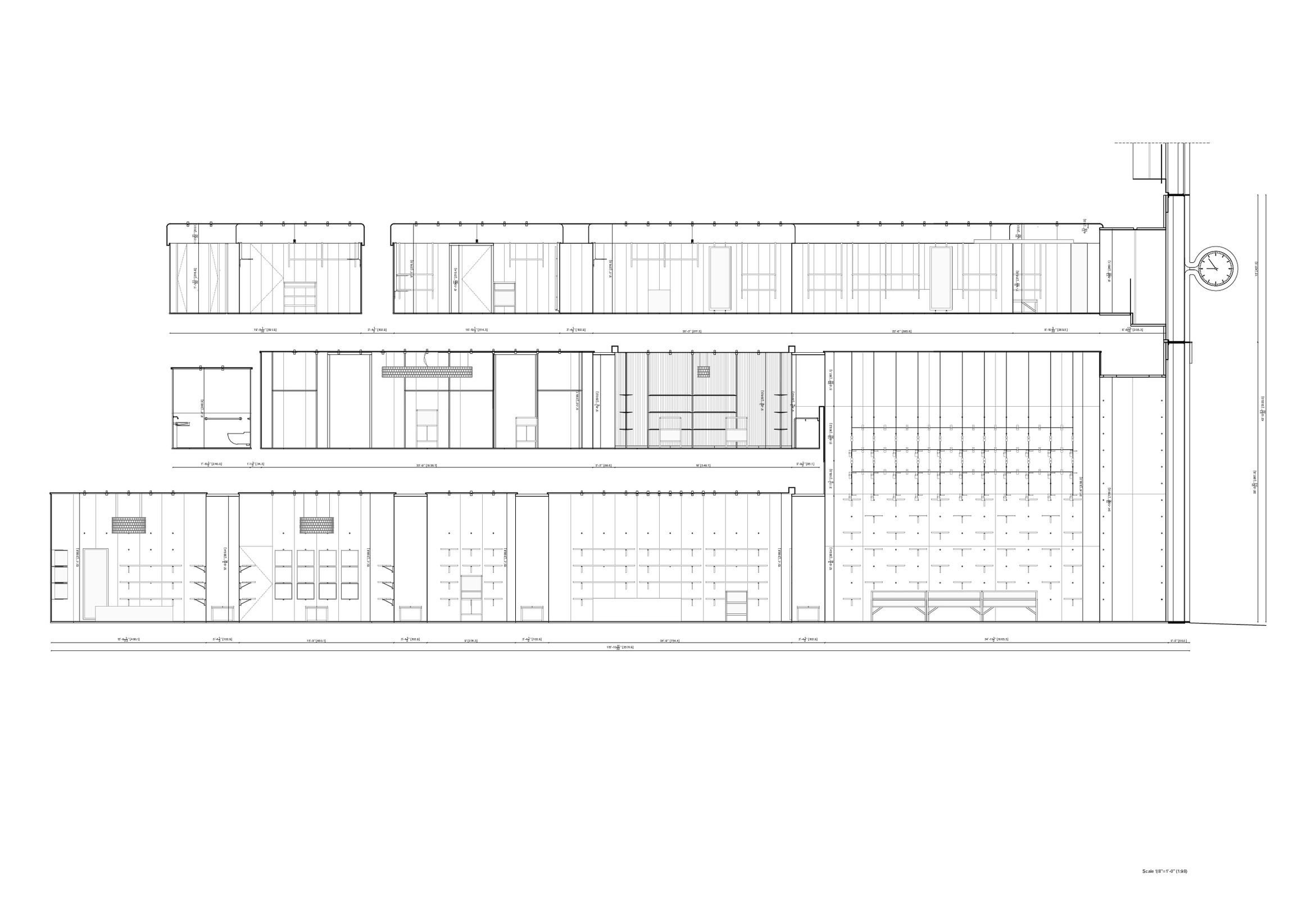
Getting inside the store, a double-height space houses a monolithic staircase made of Palladiana at the entrance. It connects all levels, taking the customers on an ascending tour to the upper floors. This entrance space is made of terrazzo and features a display area especially designed for accessories. Here, terrazzo perimeter walls house brass and oak shelves for product display, while timber display cabinets sit in conjunction with long marble volumes, acting both as plinths and furniture.
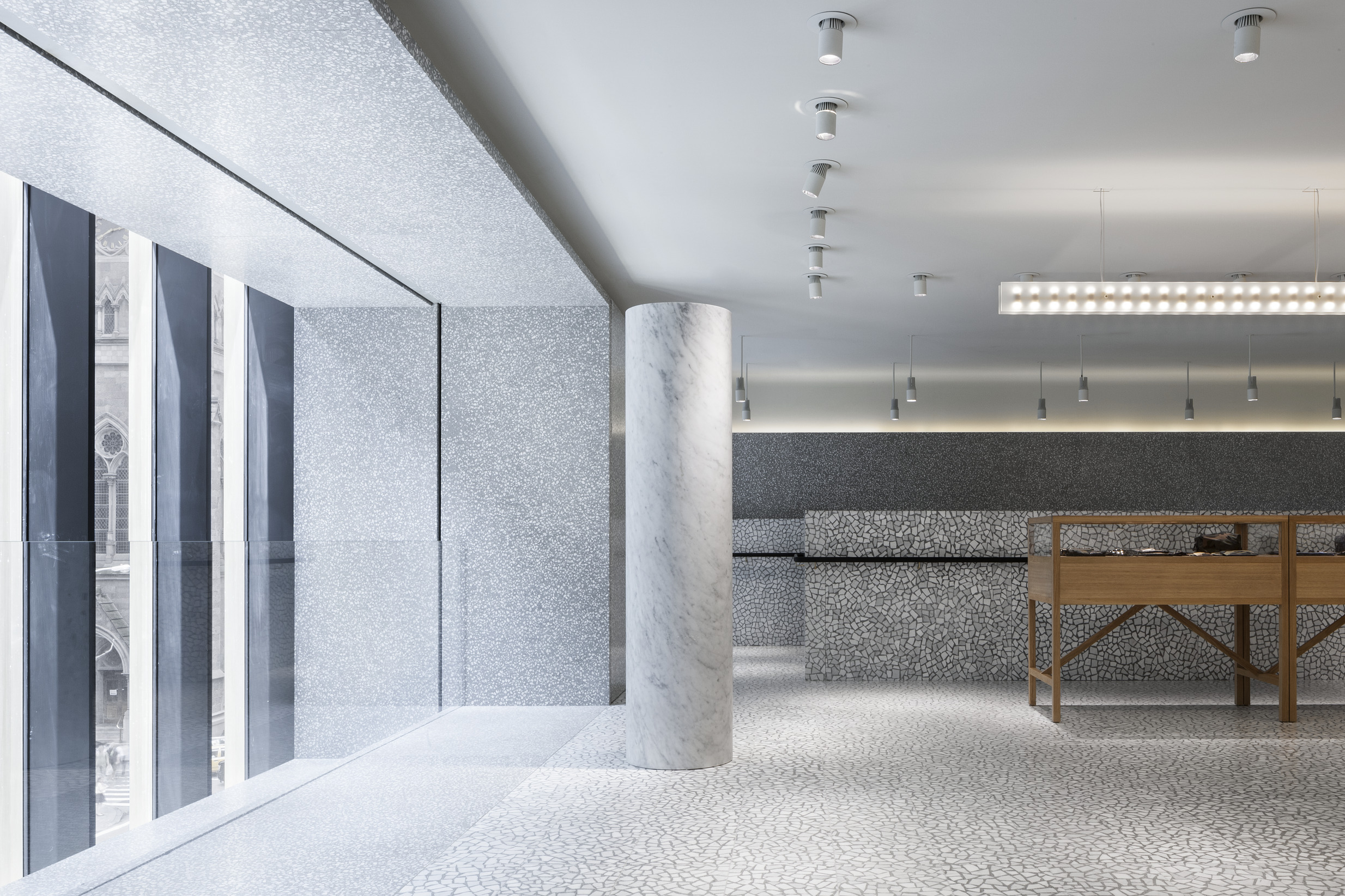
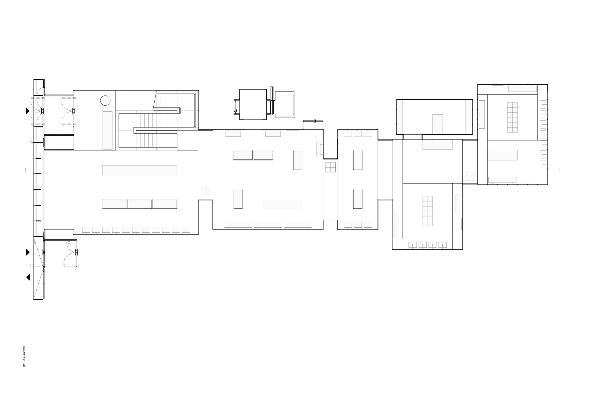
The upper level for women collections develops through an enfilade of rooms, each with different architectural characteristics and a distinct atmosphere generated by a custom palette of colours, textures, and lights for the different types of products. Materials span from grey Venetian terrazzo with Carrara chippings to timber, marble, leather, carpet and carbon fibre, all employed to put the focus on the collections and to create intimacy in the environment.
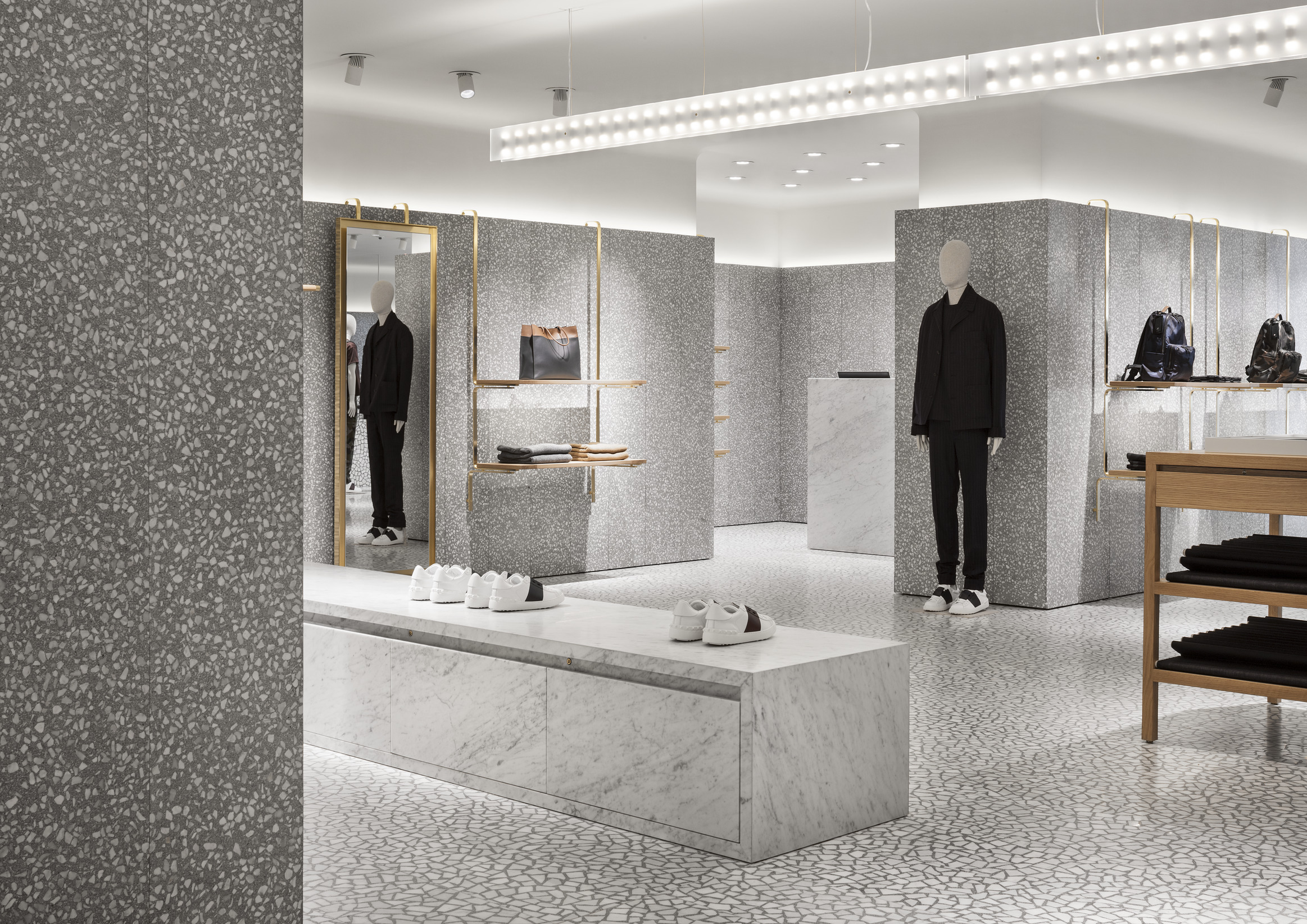
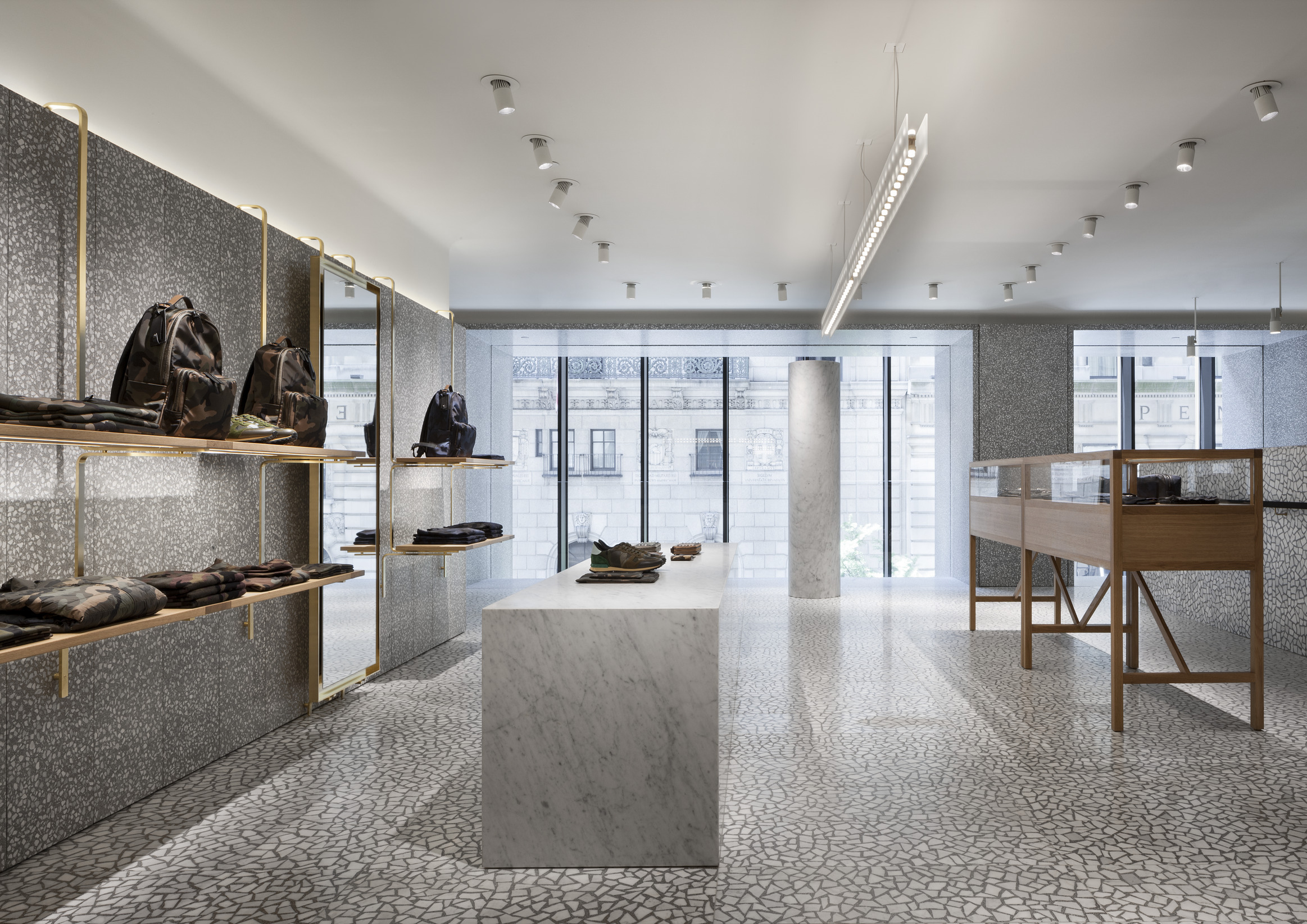
On the top store level, the man store concept proposes terrazzo walls and unified floor surfaces of Terrazzo and Palladiana. The display system is made up of oak shelving and hanging elements, supported by polished brass fixtures around the perimeter. These features incorporate LED lighting, allowing each shelf or display to be discreetly illuminated. Marble blocks and free standing marble columns act as a fil rouge with the ground floor, making the store concept unified and coherent. The lighting system is able to adapt to the variety of spaces and finishes. Overhead lighting combines concealed ambient lighting and clear white product lights on the periphery of the rooms, with warm lighting or decorative chandeliers at the centre.
Data and credits
- Project start
- 2013
- Completion
- 2014
- Gross floor area
- 1,258 m²
- Client
- Valentino SpA
- Architect
- David Chipperfield Architects Milan
- Partners
- David Chipperfield
- Directors
- Giuseppe Zampieri
- Associates
- Giuseppe Sirica
- Project architect
- Adolfo Berardozzi
- Project team
- Cosmin Amato, Corrado Bongiorno, Margherita Capra, Tommaso Certo, Andrea Cocco, Salvatore Contaldo, Alessandra De Stefani, Francesco Fusillo, Emmanuele Garau, Tsukasa Goto, Jacopo Irace, Maris Kojuharov, Nicola Lorusso, Eugenio Matteazzi, Marie Mincke, Vincenzo Polsinelli, Michelle Riboldi, Sara Russo Esteves, Paolo Volpetti, Federica Zerbo
- Contact architect
- Tricarico Architecture and Design PC, Wayne
- Project coordinator
- Studio 3 Architetti Associati srl, Milan
- Structural engineer
- Eipel Engineering Group DPC; New York Scl Ingegneria Strutturale, Milan
- MEP
- Rosini Engineering PC, New York
- Facade engineer
- Seele Inc., Gersthofen
- Facade consultant
- Heintges & Associates, New York
- Facade contractor
- Seele Inc., Gersthofen
- Lighting design
- Viabizzuno srl, Bologna
- Stone and terazzo
- Laboratorio Morseletto srl, Vicenza
- Photography
- Santi Caleca
