Kunsthaus Zürich
Zurich, Switzerland
2008–20
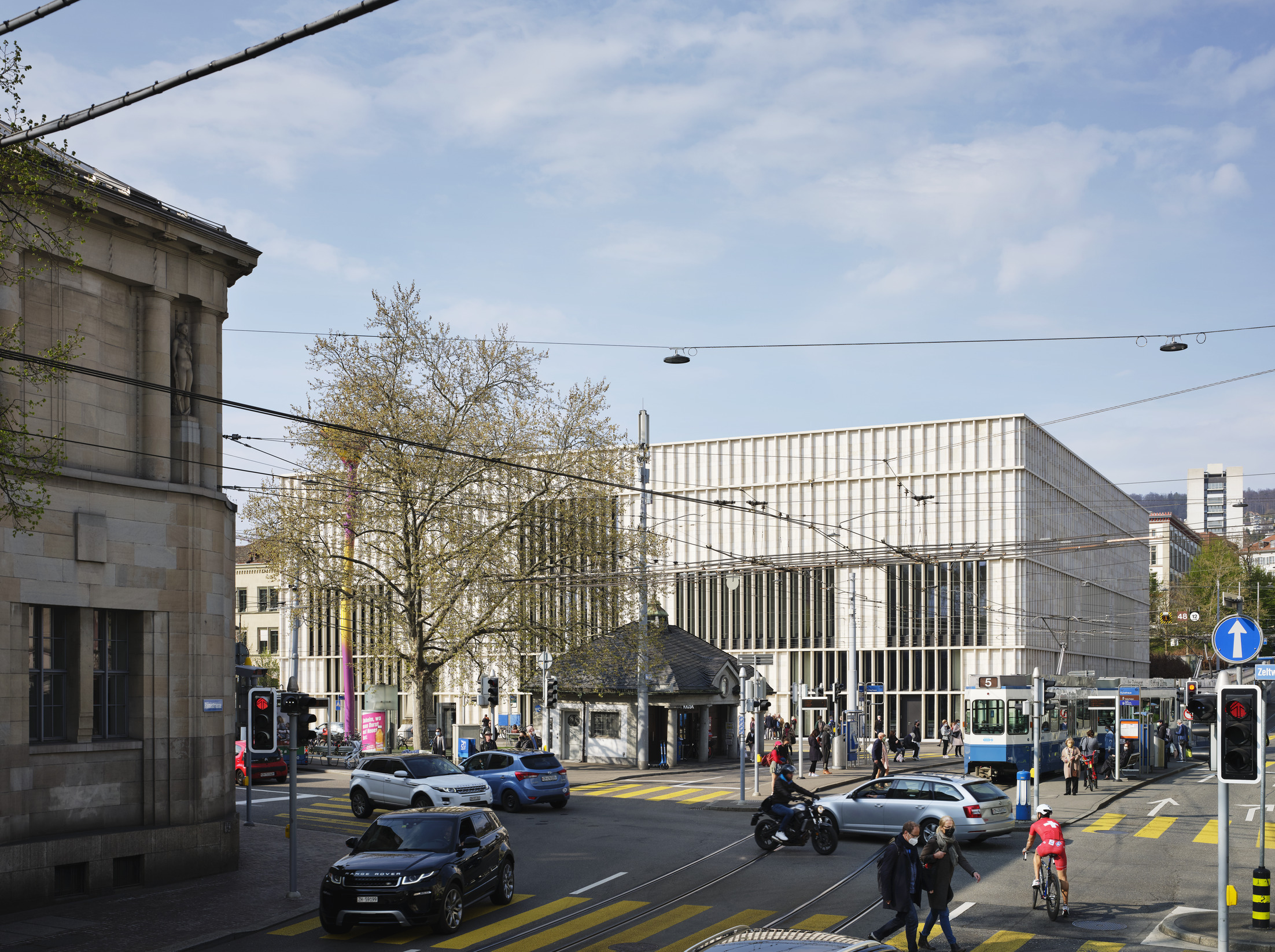
The new Kunsthaus Zürich extension expands the existing Kunsthaus museum, situated between the Grossmünster church and the university. The Kunsthaus Zürich now represents the largest art museum in Switzerland, comprising four buildings from different eras – the Moser building dating 1910, the Pfister building dating 1958, the Müller building dating 1976 and the Chipperfield extension dating 2020. The new freestanding building houses the collection of classic modernism, the Bührle collection, temporary exhibitions and art from 1960 onwards.
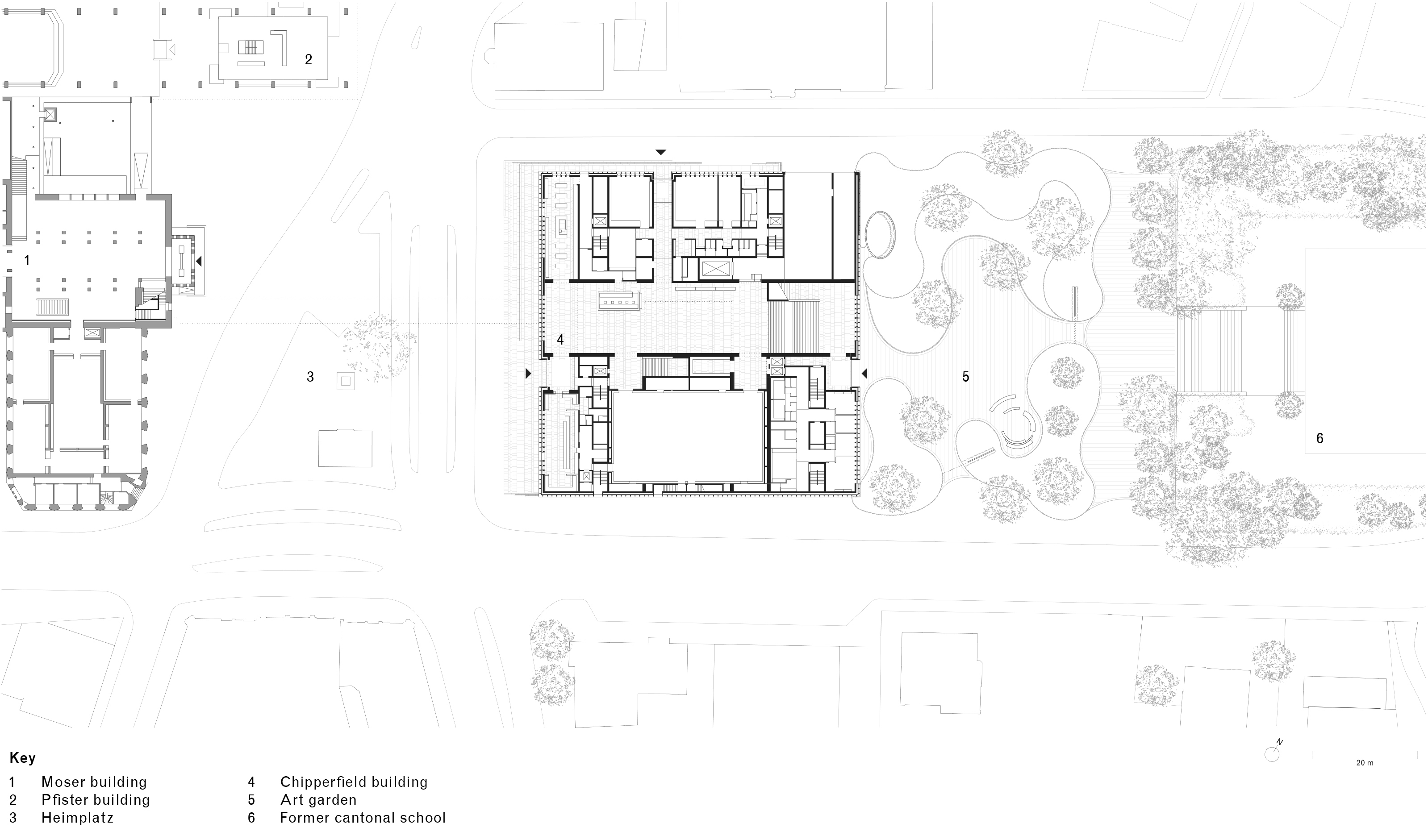
Based on the 'Central Campus' masterplan published in 2007, the museum buildings and the Schauspielhaus theatre located on the east side of the urban square Heimplatz, form a 'gateway to the arts' as an urban entry to the 'education mile'. Here, the large freestanding buildings of Zurich’s universities are lined up like a string of pearls leading northwards.
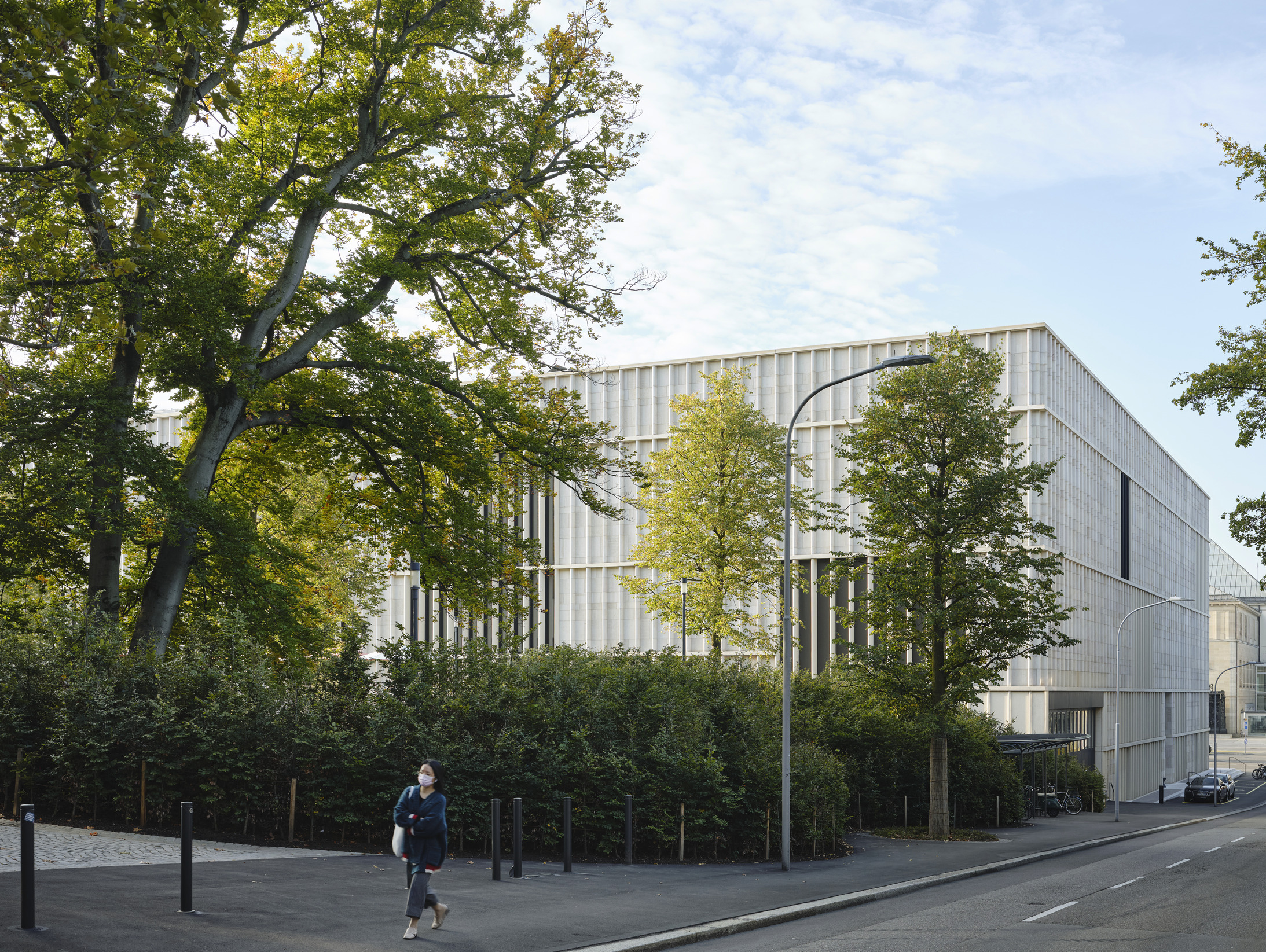
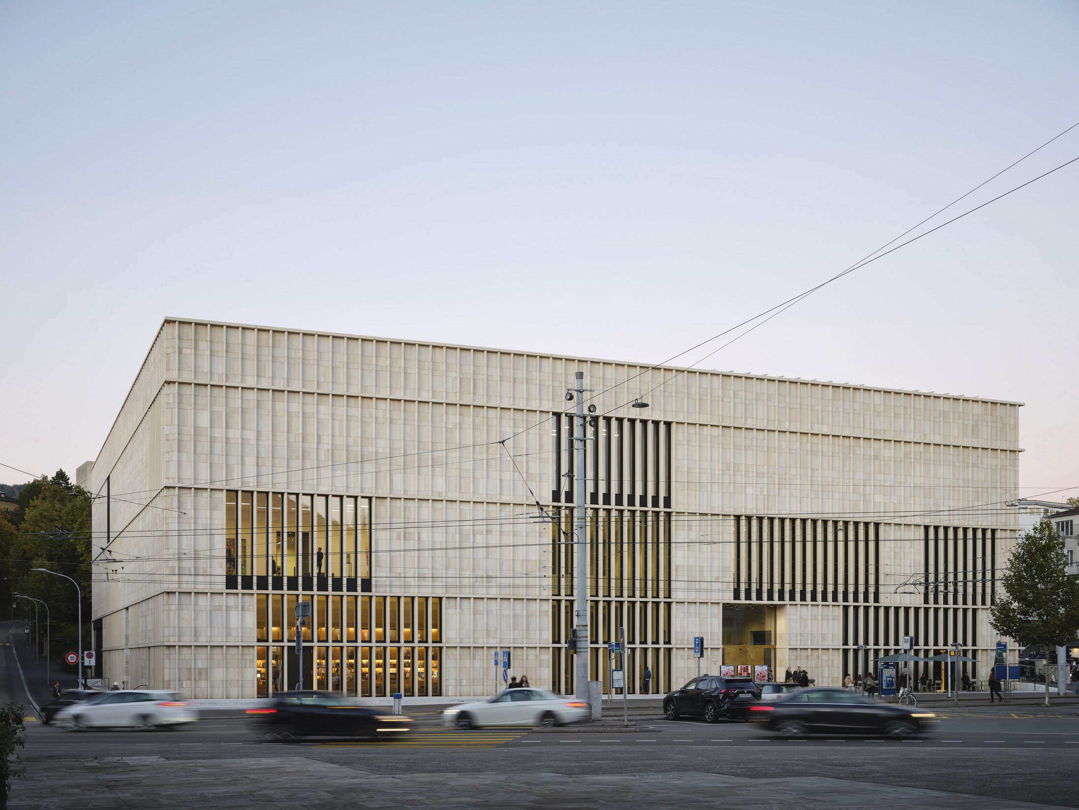
The urban concept for the extension envisaged the placement of a clear geometric volume on the northern edge of the square. The building form takes inspiration from the old cantonal school, built in 1842 to the north of the site, which defines the urban frame with its architectural clarity. The urban plan defines two new external spaces: the urban square to the south, framed on all four sides by buildings and the new art garden to the north as an open and permeable natural environment.
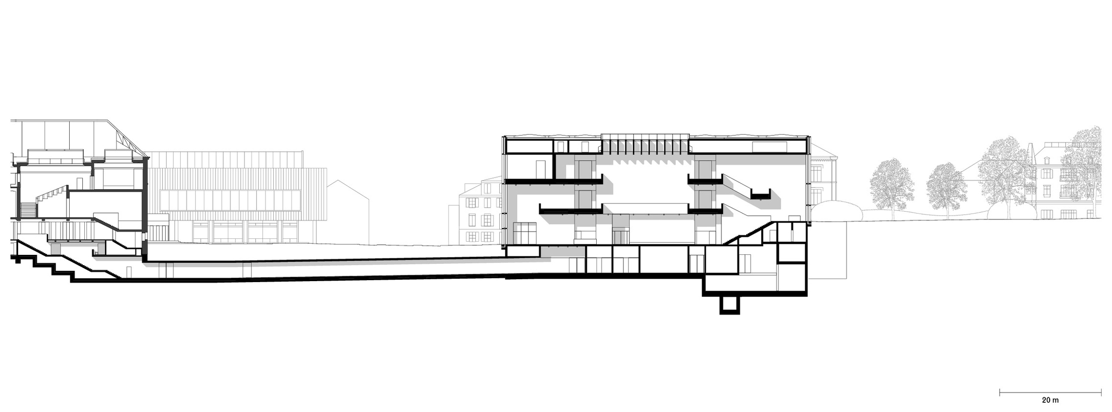
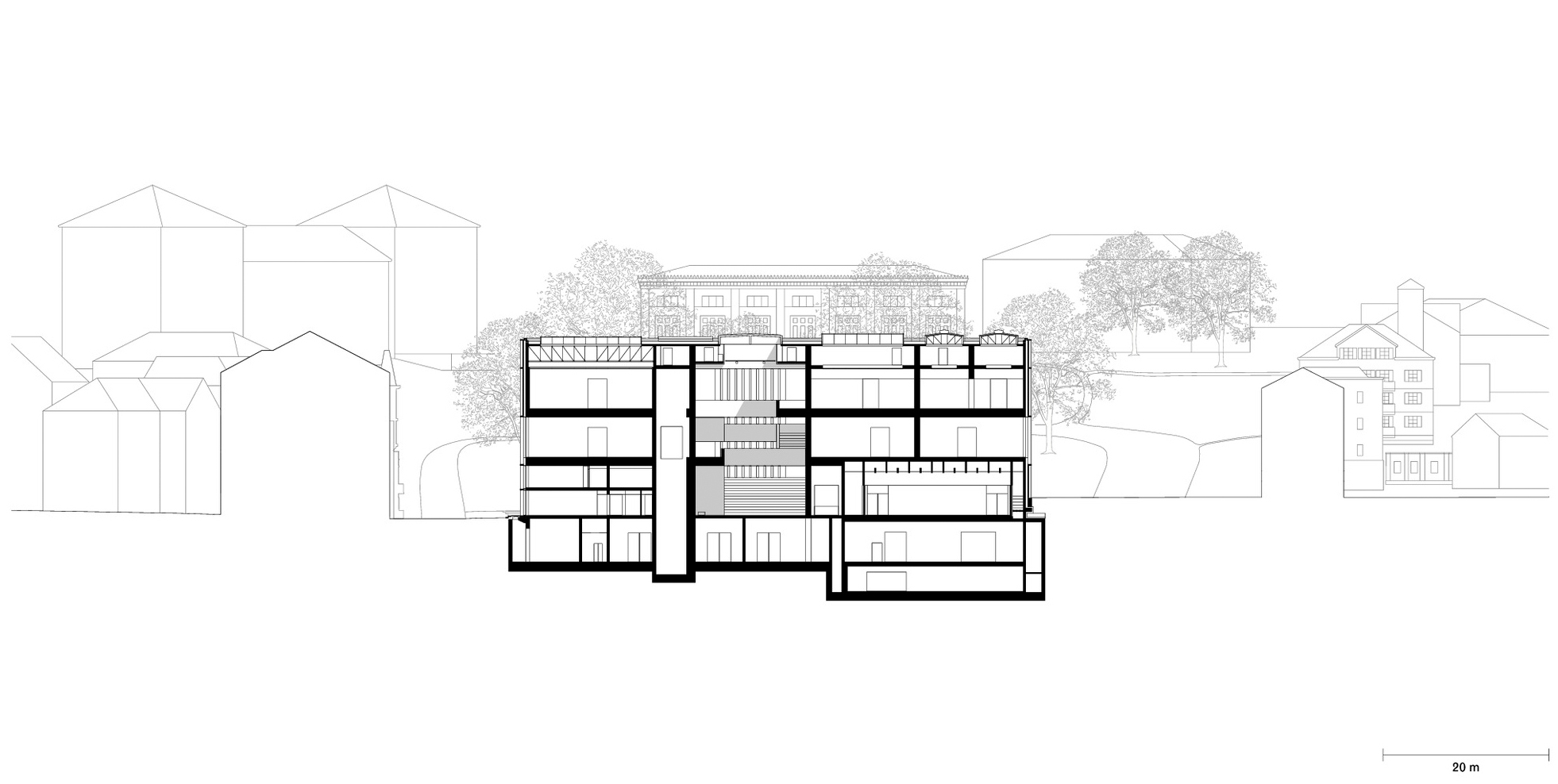
An expansive entrance hall, spanning the full length of the building, creates a link between the two new urban spaces with its floor-to-ceiling windows. Due to its low-threshold accessibility it likewise acts as a public link between the institution and the city. A visitor passageway running underneath the square connects the new building with the existing Kunsthaus, creating one institutional entity.
Section through entrance hall and passageway to Moser building
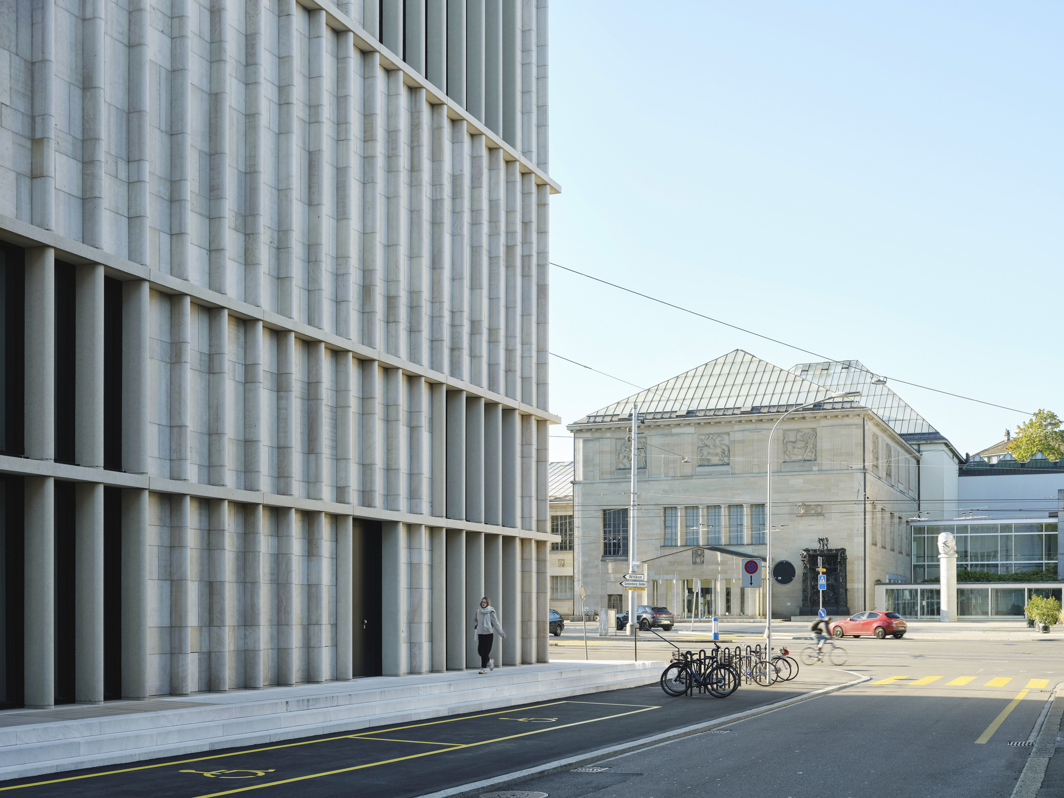
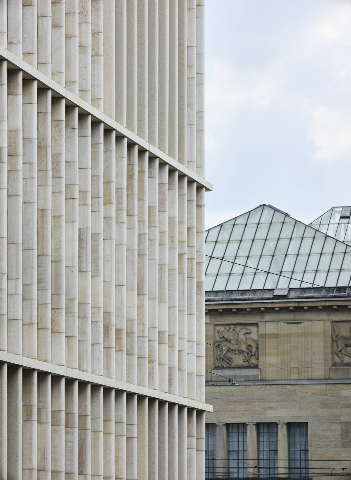
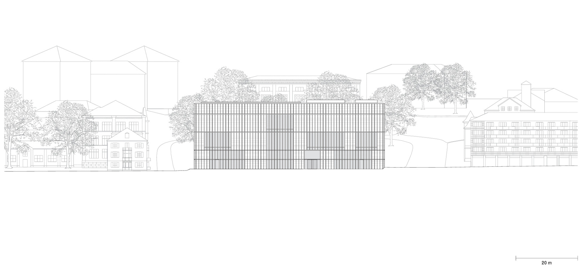
The architectural identity is modelled on traditional stone façades, as found in the existing Kunsthaus and many other significant public buildings in Zurich. The new building combines tradition and innovation through slender vertical fins crafted from local Jurassic limestone with sawn surfaces and placed at regular intervals in the façade, embedding the building in its urban and cultural context in a contemporary manner.
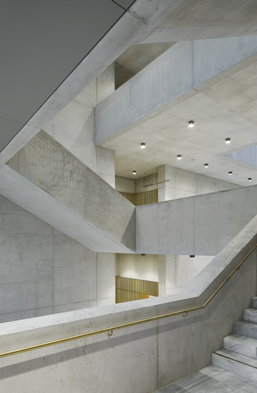
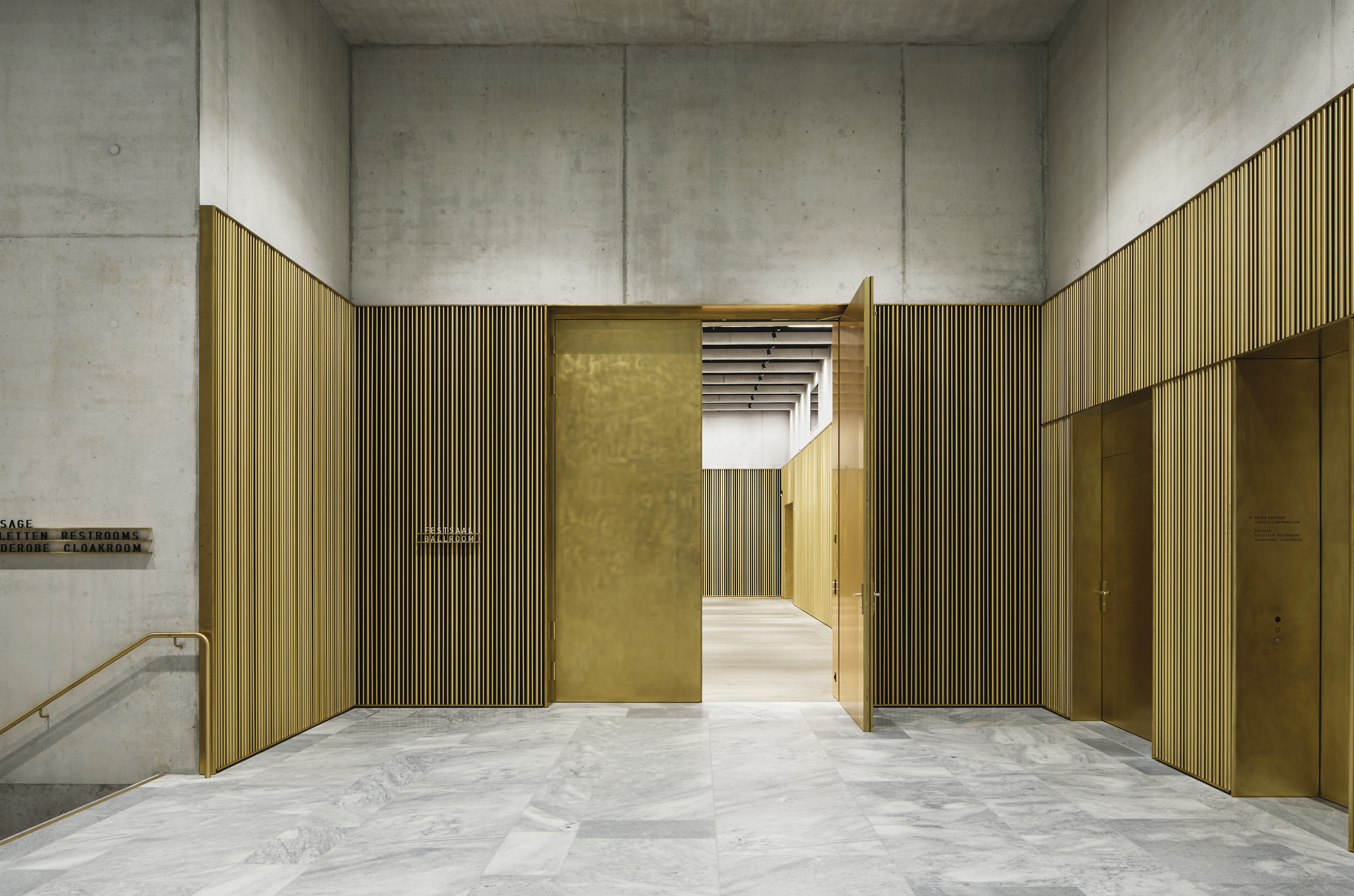
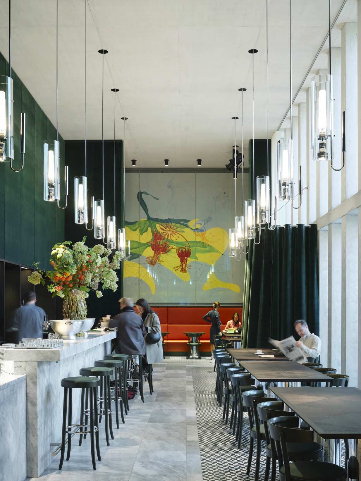
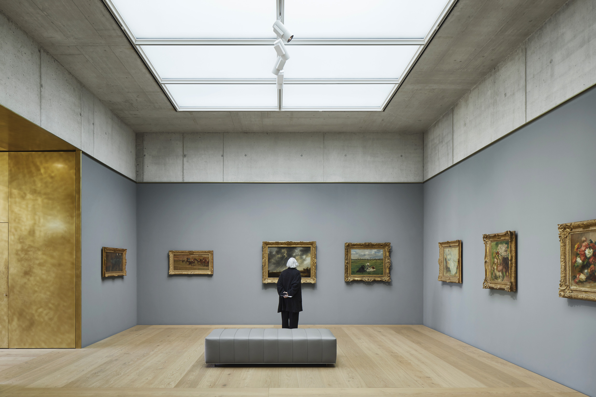
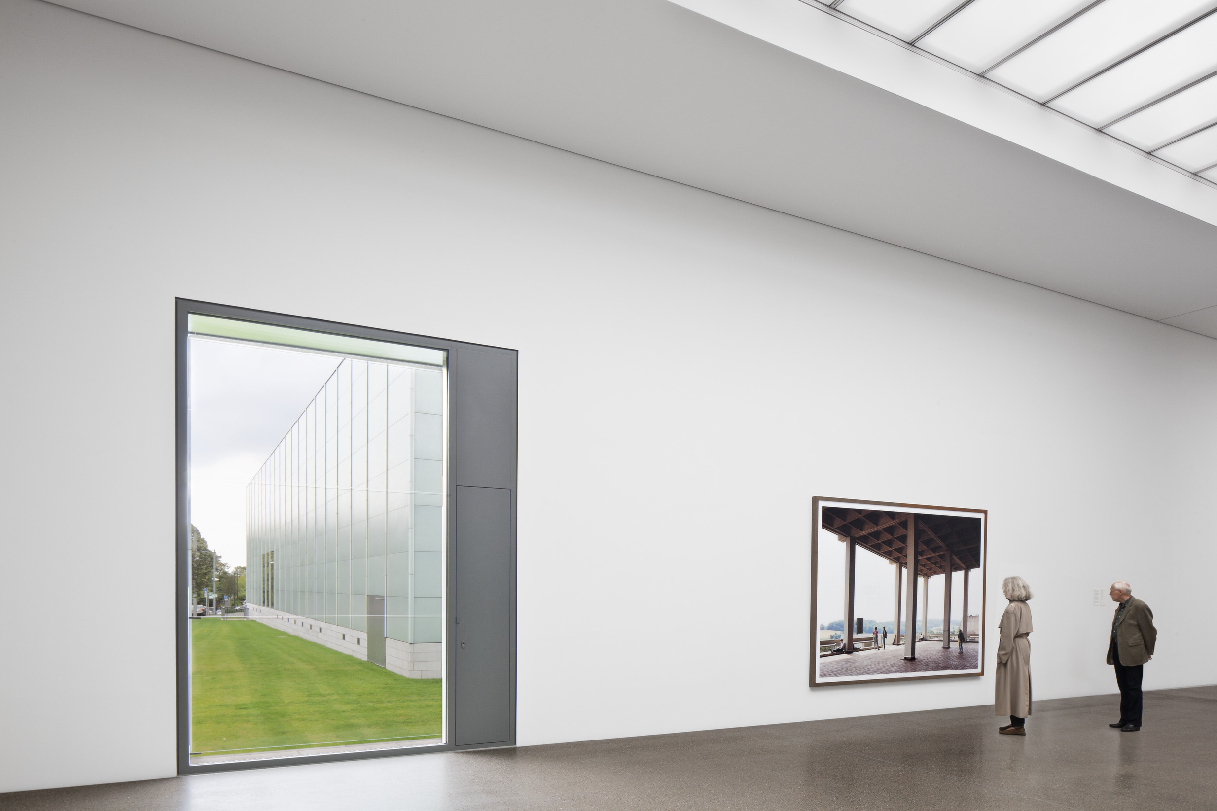
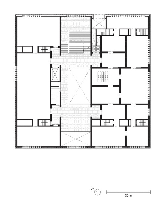
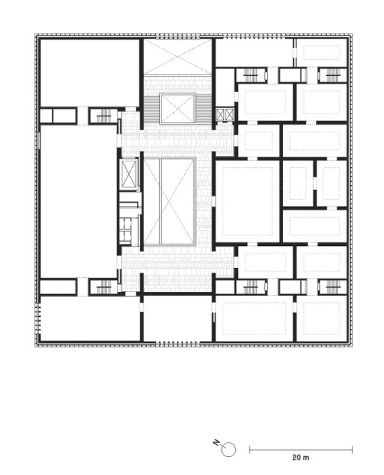
The internal organisation is based on the concept of a 'house of rooms'. This idea finds its expression in the different design of the rooms in terms of size, orientation, materiality and lighting, giving each room its own character and creating a diverse sequence of rooms. All public functions such as the café/bar, event hall, museum shop and museum education services are arranged around the central entrance hall at ground floor level, while the two upper floors are reserved exclusively for the display of art. The varyingly dimensioned exhibition spaces are characterised by a calm materiality and an abundance of daylight – side light on the first floor and skylight openings on the second floor – placing the immediate experience of art at the centre of the museum visit.
Data and credits
- Competition
- 2008
- Project start
- 2009
- Construction start
- 2015
- Completion
- 2020
- Opening
- 2021
- Gross floor area
- 23,300m²
- Client
- Einfache Gesellschaft Kunsthaus Erweiterung – EGKE
- User
- Kunsthaus Zürich | Zürcher Kunstgesellschaft
- Architect
- David Chipperfield Architects Berlin
- Partners
- David Chipperfield, Christoph Felger (Design lead), Harald Müller
- Project architect
- Hans Krause (Competition, Concept design), Barbara Koller (Schematic design, Design development, Technical design), Jan Parth (Technical design, Site design supervision), Markus Bauer (Deputy project architect, 2009 – 2014), Robert Westphal (Deputy project architect, 2015 – 2020)
- Project team
- Wolfgang Baumeister, Leander Bulst, Beate Dauth, Kristen Finke, Pavel Frank, Anne Hengst, Ludwig Jahn, Frithjof Kahl, Guido Kappius, Jan-Philipp Neuer, Mariska Rohde, Diana Schaffrannek, Eva-Maria Stadelmann, Marc Warrington;
Graphics, Visualisation: Konrad Basan, Dalia Liksaite, Maude Orban, Ken Polster, Antonia Schlegel, Simon Wiesmaier, Ute Zscharnt - Competition team
- Ivan Dimitrov, Kristen Finke, Annette Flohrschütz, Pavel Frank, Gesche Gerber, Peter von Matuschka, Sebastian von Oppen, Mariska Rohde, Franziska Rusch, Lilli Scherner, Lani Tran Duc, Marc Warrington; Graphics, Visualisation: Dalia Liksaite, Antonia Schlegel, Ute Zscharnt
- Executive architect
- b + p baurealisation ag, Zurich (Procurement, Construction supervision), Project architects: David Michel, Christian Gruober
- Overall management
- Niels Hochuli, Dreicon AG, Zurich
- Landscape architect
- Wirtz International nv, Schoten
KOLB Landschaftsarchitektur GmbH, Zurich - Structural engineer
- IGB Ingenieurgruppe Bauen, Karlsruhe
dsp - Ingenieure & Planer AG, Greifensee
Ingenieurgemeinschaft Kunsthauserweiterung, Zurich - Services engineer
- Polke, Ziege, von Moos AG, Zurich
Hefti. Hess. Martignoni. Holding AG, Aarau - Façade consultant
- Emmer Pfenninger Partner AG, Munchenstein
- Building physics
- Kopitsis Bauphysik AG, Wohlen
- Fire consultant
- Gruner AG, Basel
ContiSwiss, Zurich - Lighting consultant
- matí AG Lichtgestaltung, Adliswil (Artificial light)
Institut für Tageslichttechnik, Stuttgart (Daylight) - Signage
- L2M3 Kommunikationsdesign GmbH, Stuttgart
- Photography
- Noshe
- Selected Awards
- Auszeichnung für gute Bauten der Stadt Zürich, 2021
- Links
- kunsthaus.ch
- film (external)
